(5 years and 3152 days ago)
1 Source:
- 1: street
Photography and photoshop contests
We are a community of people with
a passion for photography, graphics and art in general.
Every day new photoshop
and photography contests are posted to compete in. We also have one weekly drawing contest
and one weekly 3D contest!
Participation is 100% free!
Just
register and get
started!
Good luck!
© 2015 Pxleyes.com. All rights reserved.

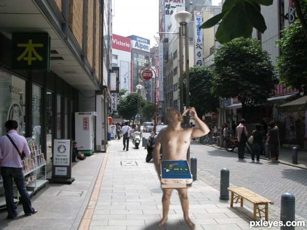
The shadows on magicsteve do not correspond with the drop shadow beneath him - one is lit from the side, and one from above...If you also look at the other people in the background, you do not see such heavy shadows on one side of them, general ambient lighting is stronger.
You can try using the Dodge tool or Image>Adjustments>Selective Color>Blacks to try to bring it more into line with the rest of the image.
one way to do minimal change is to convert the pizza-guy to a signage instead, with white edges all-round (a cut-out look)
Howdie stranger!
If you want to rate this picture or participate in this contest, just:
LOGIN HERE or REGISTER FOR FREE