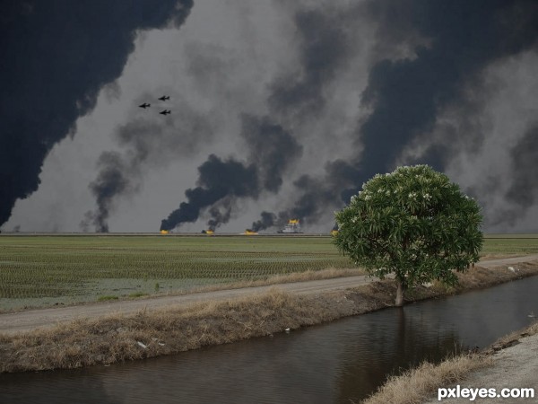
Aircraft making a counterstrike, on an afghan terror cell hideout...or not. paint brush, polygon selection tool, color correction. (5 years and 3353 days ago)
- 1: BG

(5 years and 3419 days ago)
Creative!
You may want to upload a less dimensionally thick image .. the HIGH RES is very blurry (natural effect of size enlargement without the proper DPI or PPI) if you use the ACTUAL PIXELS view option in PS, it is very helpful in deciding what size to save the image as.. the concept is very enjoyable, (imagine this image in downtown bar in the Village ... woo hoo) hehehe
I'm sorry to say I don't have a better image -
use your ACTUAL PIXELS VIEWER and you won't have a better image problem.. unless you built this image ALL in low res.. then I have no way of helping you... (this image would be so impressive if it was in high res, because it could be reproduced in extra large formation)
Imagine it on a giant fabric print up the side of a building.. woo hoo.. but that is just IMHO.. good luck and great form
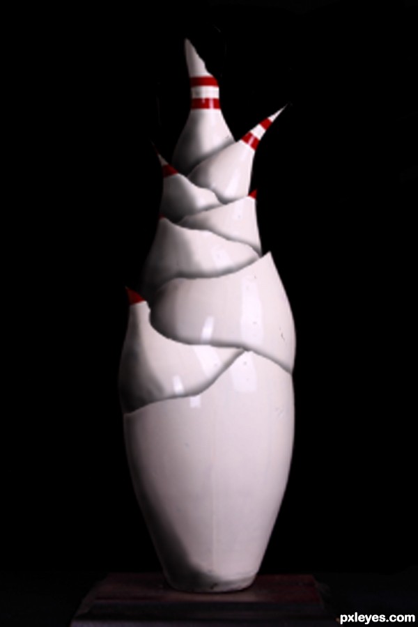
driven..would the sharpening tool help? this photo is too amazing to be voted low simply because its too pixelated.. i love how it looks like someone broke a bowling pin then neatly put it all back together like humpty dumpty lol..author i will try and see how i can help you out..give me a few minutes to think it through
Thanks for the complements. I did this with a imagize size of 2000 by 2000 pxl's but screwed up by saving it again after chaning the size to meet the 600 pxl width for the sbs. I can do it over if that is what you guys really need/ want.
yesss please author..upload the original image!
Too blurry image, author. It would have been better if not so blurry.
This could be so much cooler, don't worry in time you'll get there.
i first started photoshop on jan 1st this year. I'm not worried about where I will be - I just want to be there now 
There is a high def image in my photoshop album if you would like to see...
Howdie stranger!
If you want to rate this picture or participate in this contest, just:
LOGIN HERE or REGISTER FOR FREE

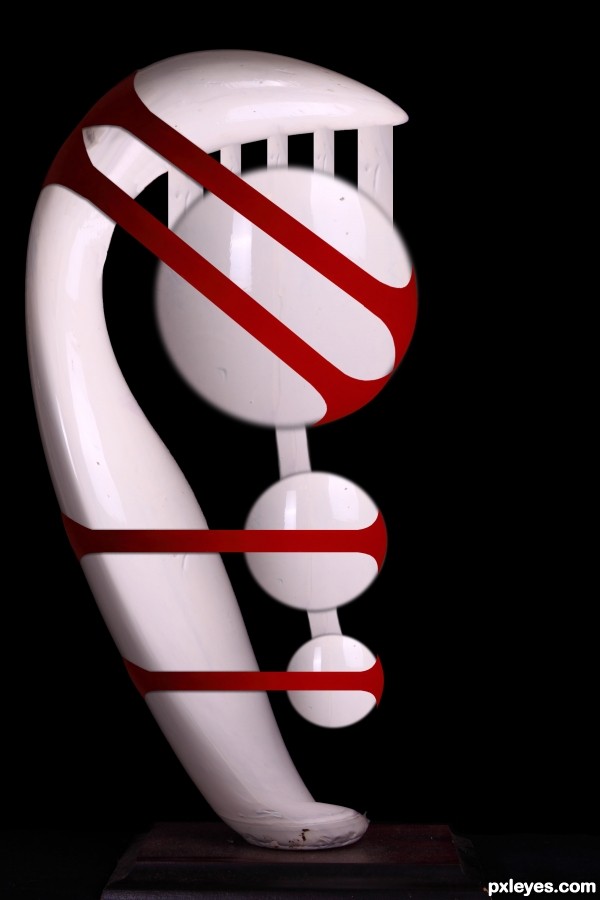
Sculpture for the kitchen table (5 years and 3419 days ago)
This reminds me of one of those really bizarre sculptures you would expect to see in a gallery for some astronomical price. Good choice for a title. GL! 
love it
Thanks for the kind words
Howdie stranger!
If you want to rate this picture or participate in this contest, just:
LOGIN HERE or REGISTER FOR FREE

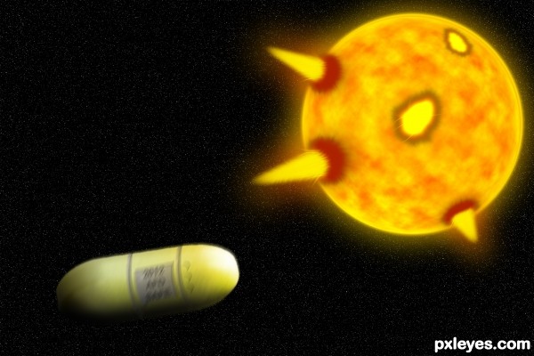
I took a pill and escaped from death. (5 years and 3732 days ago)
I like the idea, but i feel like the whole image could;ve been executed a little better. You could try smaller stars at full opacity, and also try experimenting with different colours and blend modes for the solar flares. Good luck!
Haha, thanks for help, I'm lucky I saved the psd so I can re-edit it... Thanks again.
I confess I don't really understand this. I completely agree with ponti55, however. I would also observe that your gray additions to the pill assume that it's a cylindrical sausage when in fact it has a much more interesting shape with a flat band encircling it. A solar flare or two on the right side of the sun might add some balance.
To make it look more realistic, I would add some motion blur to the capsule (not too much though or you would distort the capsule too much) 
I like it! I think it's pretty good! Nice job! 
I would agree to the fact of giving a bit motion blur to the capsule...Also the opacity is kept higher for the stars is better as it gives a feel of DOF of the capsule and the stars and sun...Overall a nice effort.....
nice idea , gl author 
There, It's fixed, if you would like something else added, leave a comment. Thanks for comments.
The solar flares still look extremely unconvincing, if you can't make them look more realistic, maybe remove them all together and simply have the capsule and the sun.
It's not the sun it's planet Earth in lava and fire! And those are not solar flares, those are powerful explosions, witch are dragging in!
nice effort.good luck.
hopefully......good luck
Howdie stranger!
If you want to rate this picture or participate in this contest, just:
LOGIN HERE or REGISTER FOR FREE
very realistic! well done! good luck!
Howdie stranger!
If you want to rate this picture or participate in this contest, just:
LOGIN HERE or REGISTER FOR FREE