
Source only (5 years and 3154 days ago)
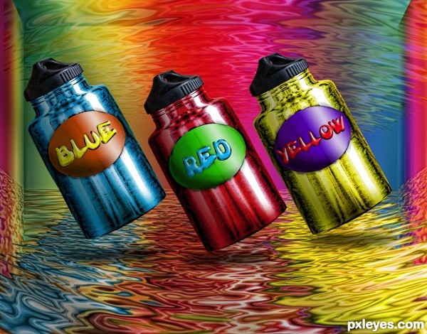
filter
flood
bevel
emboss
drop shadow
gaussian blur (5 years and 3159 days ago)
Pretty cool author, love the metallic look man.
I've sat here for a few minutes trying to figure out another way to say this, but I can't. This is so pretty! It is! I especially like that the colors are different from the words of the colors.
very colorful and wonderful work author
all your entry deserve is a fav and high score
good luck
Colorful and powerful image! Cool shop author! Best of luck!
Howdie stranger!
If you want to rate this picture or participate in this contest, just:
LOGIN HERE or REGISTER FOR FREE
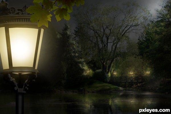
Primary source is my own photo (step 1)
Update: Front lantern was brightened. (Thanks, Androla!) (5 years and 3225 days ago)
what a peaceful nite.......!
wonderful picture! the only suggestion is that you should make the front lantern brighter! much brighter! good luck!
Thank you both. I was afraid that would over-dominate the entire scene, Androla. But I will give it a try. Thank you so much!
Beautiful work ... lovely source image and wonderful conversion to night. Your lighting is perfect!
looks really much better!!!!!! awesome entry!!!
Lovely up through about Step 15, but the introduction of the foreground lamp with a vanishing point much lower than that of the background makes it look simply like a lamp in front of a painted backdrop.
OK, Dan, light lifted. Better? Thank you!
Yes, it is better (although I would eliminate the foreground lamp's underside glow and raise the underside's far edge).
The foreground lamp and leaves are a good way to add depth to the image. The brightness of the foreground lamp makes it the focus, however. I would move it to the left so only half of it at best is visible in the frame.
Thank you, Dan, I appreciate your advice. I moved the lamp off some, but think its lines and curves make it quite a beautiful piece by itself, worthy of discovery.
beautiful scene author...very well done
Great job, GL!
Beautiful work...best of luck!!
Congratulations on a lovely entry!
Howdie stranger!
If you want to rate this picture or participate in this contest, just:
LOGIN HERE or REGISTER FOR FREE
(5 years and 3262 days ago)
VERY CRISPY!!! AWESOME!!! good luck
tnx Drivenslush!
This is my first colored work
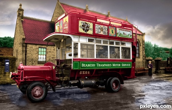
Flipping it horizontally has thrown the composition off. It's now too heavy on the left, especially with the red pulling the eye to that side of the image.
Nice coloring work, but the balance is off.
mossyb please...this is amazing colorization, i think you are totally missing the concept. good luck author, good vote from me!
Author I think you did a fantastic job! The colorization is wonderfully done with the truck still being the focal point of the image  Best of Luck, and a good vote from me as well
NIce work...the reflection on the bus windows of the trees should be green though.
Pristine! You had to flip all that type to be right reading too! You have more patience than I.
How many comments .......
Thanks so much for your advice
Fantastic job author...really really effective work...remind me on HDR photo...well done and best of luck
thnx erathion!
looks very good
thnx Glockman!
very very nice 
thnx ramensan!
Congrats for your first place, Mazanda!
thnx..........I do not believe it!
congrats on 1st place
Congratulations 
Congratulations for 1st
Congrats, well done 
Congratulations 
Congrats!!
Thnx
Nice Job Congrats
thnx Chuch
thnx Chuch
Howdie stranger!
If you want to rate this picture or participate in this contest, just:
LOGIN HERE or REGISTER FOR FREE
(5 years and 3274 days ago)
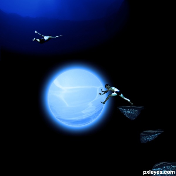
Nice take on a tired concept...good luck! 
Thank you 
Thinking outside the box always works for me! 
Howdie stranger!
If you want to rate this picture or participate in this contest, just:
LOGIN HERE or REGISTER FOR FREE
Beautifully done author. Best of luck...
Nice...I love it
Great new forms
Howdie stranger!
If you want to rate this picture or participate in this contest, just:
LOGIN HERE or REGISTER FOR FREE