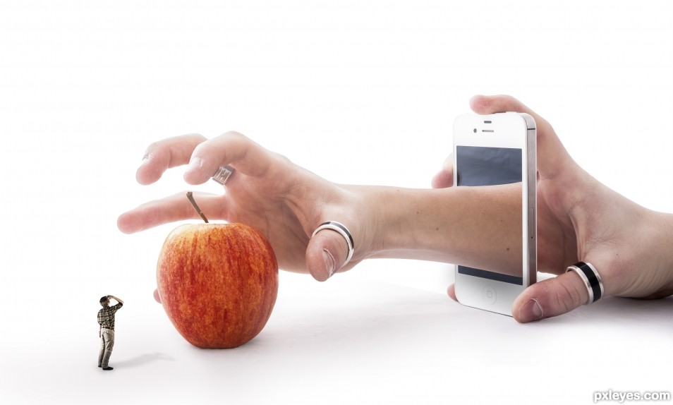
This image is based and created on my own pictures, and I have all rights reserved but still under PxLeyes.com's condition. My image may therefore not be reproduced in any form without my written permission. (5 years and 2473 days ago)
(5 years and 2578 days ago)
High resolution version would be nice 
fixed thank you
Okay, I'm having a terrible blonde moment, author, please help me out.
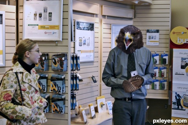
How does the eagle fit into the title, or conversely, how is the title supposed to relate to the image? Thx!
~M
you see an eagle (probably because I labelled it) I saw a squawking bird...screaming about something .. In this case the telephone salesman .. who favours android ...is complaining about apple (Iphone in his hand) ..a common phrase is "Isheep"...denoting all the apple users as a bunch sheep following each other..because of the "I" branding.. and not taking advantage of the possibilities that another phone (or other Non apple devices)offer in both customization and technical superiority
does that help?
I'm a cell-phone Luddite. I use a Trac-phone that doesn't even access the Internet...
But thank you, I understand your image better now, although the politics behind it are still somewhat foggy, but that's the cell phone industry, not your chop...lol!
Best of luck, author!http://www.pxleyes.com/#
As a Luddite you must find it hard to oppose the technology on the one hand and do digital art on the other. must lead you into many moral quandries.LMAO
Great attention to lighting, and including the feathers in place of hands. Hi res would have been nice though.
it was 
Howdie stranger!
If you want to rate this picture or participate in this contest, just:
LOGIN HERE or REGISTER FOR FREE
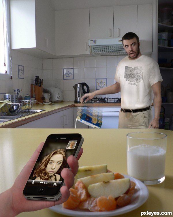
Father's FaceTime Floozie Fiasco!
Such a pretty face - I couldn't harm it, so instead I've turned her into a home wrecker!
my photos used for:
kitchen, milk, male head, child, shown in SBS (5 years and 2806 days ago)
Rut Roh (Giggle snort)
nice blend and manipulation of all the sources..good job
Very nice work, author, and great idea for source. 
i thought this shouldve won 1st place..congrats for 3rd
Congrats Valerie, great humor and originality!!
Howdie stranger!
If you want to rate this picture or participate in this contest, just:
LOGIN HERE or REGISTER FOR FREE
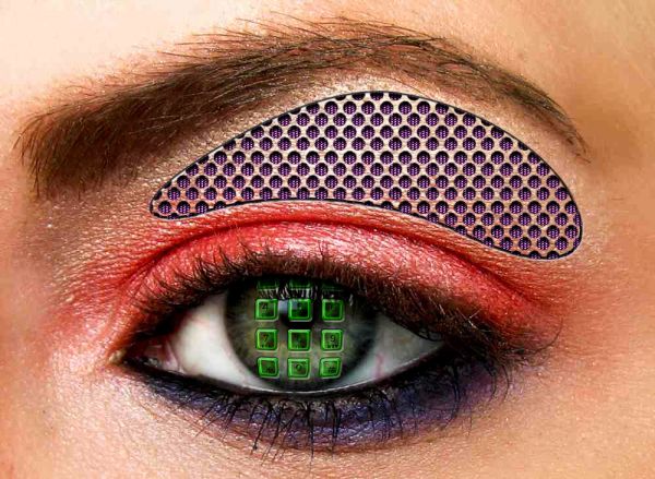
With 'internal' speaker! ... 2nd Contest, hope you like it peeps... Comments greatly appreciated, Pix (5 years and 3689 days ago)
lol nice idea 
It's different! But where's the link of speaker? Or how did you do it?
Just make shape, set fill to 0 ... then change settings in the layer effect pop-up ... gthen when you paint the dots on there, THEY don't show up, but the EFFECT does (inner shadow, bev/emb texture etc)
WOW thanks for the fave vote 
Howdie stranger!
If you want to rate this picture or participate in this contest, just:
LOGIN HERE or REGISTER FOR FREE
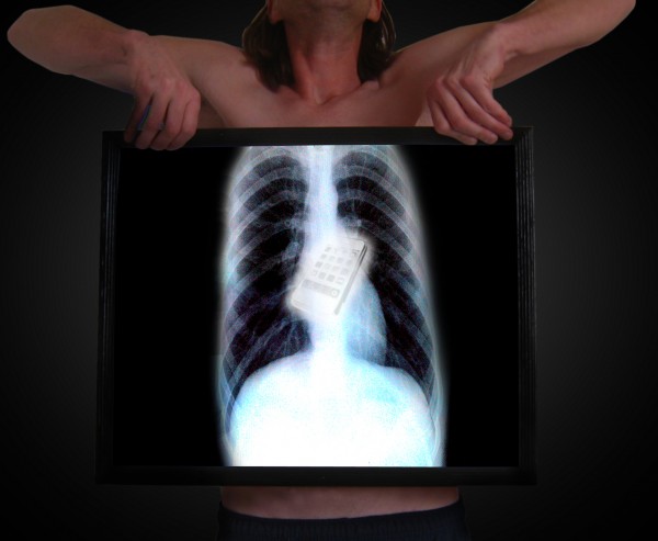
(5 years and 3798 days ago)
Must have been painful  . is it possible to make the iPhone somewhat more part of inside the xrays view? Right now it looks a bit too much on top. Dunno..maybe a bit more bright, a bit of ghost image and some noise (as in the real xrays scan)? Good luck!
I was thinking about that but at the same time I think the iphone would stand out more. I'll see what I can do. 
Edits made.
Not bad,but ribs cant be this low...good luck
anatomy of patient is not so good, however this is an art comp not Biology therefore, this is a nice image... One wonders how person swollowed phone. 
erathion: You WEREN'T supposed to noticed that!  I was dealing with limited sources. Like scratzilla1 said, I was going for the general effect.
I agree100% and because of that,and fabulous imagination u'r got high marks from me...
Wow! How did you manage to swallow that?! 
Howdie stranger!
If you want to rate this picture or participate in this contest, just:
LOGIN HERE or REGISTER FOR FREE
You might want to smooth/blur a few hard/ jagged edges.
Author, you need to post each of your photos uncut in a step-by-step guide. (SBS).
5.3. Use of Personal Images as Source: If you use your own personal images, the uncut source must be placed in the step by step with an explanation that it is your image.
Please take time to read http://www.pxleyes.com/guidelines/photoshop/
Thanks! It has all been fixed by now.
I can't see the images in your sbs... just a progression of your work.
you should place each original image uncut as a seperate step, this way it's much clearer.
Sure, I will show you as fast I reach my computer, I'm at work you see.
Clean up looks good, nice work overall!
Thank you so much Spaceranger!!
Good job author, good luck
Well thank you very much James, I hope for the best!
Clearly Photoshopped per the contest requirements, but I wish I understood the point of the image. The title makes sense without the little you. Alternatively, a little you also reaching for the apple with a new title could be intriguing (and more fun).
Given that the title references the iPhone, it should be crisper to stand out more.
I think replacing the variegated apple with a more-solid-colored red delicious or golden delicious apple would add a smooth texture and a stronger focal point.
The shadows are too strong IMO. The little you has a much more intense shadow than the apple. The slightly vague arm/apple shadow (that inexplicably extends far into the bottom left corner of the image) is way too expansive.
Thanks! I Well, I did not figured out any good name so it end up with this.. If you have any ideas, please, feel free to share them!
I just did turned up the colors on the apple a bit but I wont do it more then so since it's gonna look to extreme.
Yes, I agree with you that the shadows were looking to strong and therefore I did changes them, how about now?
Great take on the theme... I love the abstraction
It's nice to hear that you like it, Bob, thank you so much!!
Congrats!!
Thank you so much!!
congrats .....
Thank you!
Howdie stranger!
If you want to rate this picture or participate in this contest, just:
LOGIN HERE or REGISTER FOR FREE