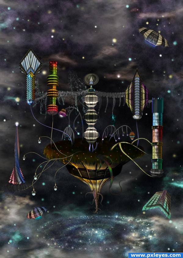
Source only, the universe background was created in PS CS4. (5 years and 3832 days ago)
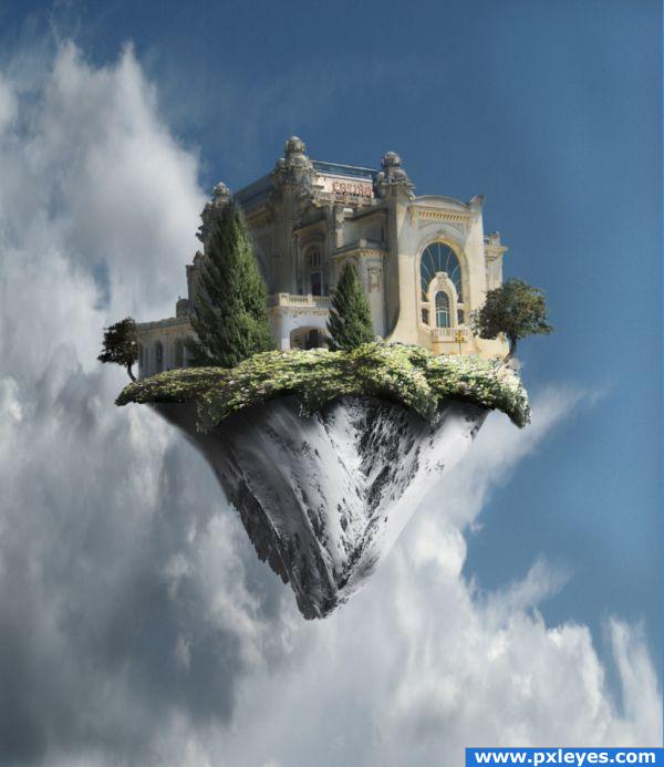
I have always wanted to attempt making one of these. I am pleased with the outcome - critique appreciated!
(5 years and 3861 days ago)
LOL...not another one...well, it's not bad.
I know its "another one" but I wanted to try MY hand at it 
i feel this needs a positive comment after that one because people tend to bias their opinion on others comments...excellent job
thank you very much 
i think some of the shadows are a tad harsh, but the finished image looks great 
wow, looks excellent, really great work. It has a great feel.
I'm staring at it almost expecting angels to fly out.
good work!
glad u like it 
beautiful. GL!
A nice change from all the others. And "your hand "is very good at this type of image. GL
I would say your attempt was successful! It's looks very good!  The mountain as the lower part of the island was a very good choice. Good luck
Congrats for your second place, Anjii!
Congratulations for 2nd
Congrats 
Congrats!!
Congrat Anjii ^_^
Howdie stranger!
If you want to rate this picture or participate in this contest, just:
LOGIN HERE or REGISTER FOR FREE
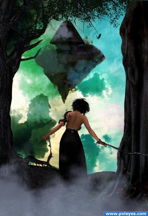
Image is done with a mix of the source and stock images.
trees are a mix of the stock images and the source image.
also done alot of editing to the original sky image to make it look different.
i also placed trees from the source image on the island. along with the bird house.
island is from another entry i did and modified to fit this scene . I will post the source for that in the red flag to keep the image anonymous.
hope you guys enjoy it :) had alot of fun making this one.
Edit : im still waiting on source 1's response to use the stock outside of da. once i9 hear back ill upload to sbs. if i don't hear from them by Friday ill change the girl in the image :) (5 years and 3892 days ago)
Good image indeed...maybe blur the edges of the floating island...nice mood & color.
forbidden girl!  cheers!
Looks very nice, maybe darken up the bottom of the birdhouse a bit? Good job otherwise.
It's awesome but the perspective is off for the house on the floating island.
thanks all for the suggestions  blurred island edges, fixed bottom of bird house. repaird left tree edges , and left side of island to get rid of the chopped look
  any other suggestions let me know id love to hear them. i didn't change the perspective on the birdhouse as i think that looks right.
Really nice.
Perspective looks fine to me...
fixed one of the color overlays , missed a spot with it. thanks for the heads up fille! 
Yeah the house looks much better now. Awesome job!
Congratulations for 3rd
Congrats for your third place, Evan! 
Congrats!
congrats!!
Congrats on 3rd!!
Howdie stranger!
If you want to rate this picture or participate in this contest, just:
LOGIN HERE or REGISTER FOR FREE
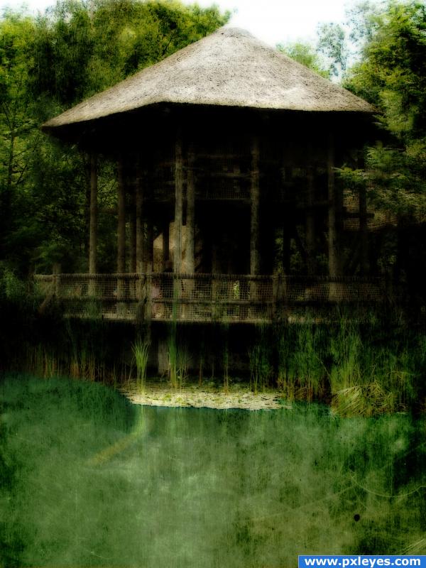
This is my first time entering so I hope I do this right :)
Steps I took:
-unsharpen mask
-cleaned up the water and changed it to a blueish/green
-messed with hue/saturation on entire pic
-added a texture
-added gaussian blur to entire pic (5 years and 3914 days ago)
errmm.. if you have the gaussian blur on it's own seperate layer, lower the opacity. and/or try "soft light" on that layer. i'm interested in how that would turn out 
the image really doesnt make sence to me!
Maybe you didnt do a lot with the image, but the effect is not bad..
Howdie stranger!
If you want to rate this picture or participate in this contest, just:
LOGIN HERE or REGISTER FOR FREE
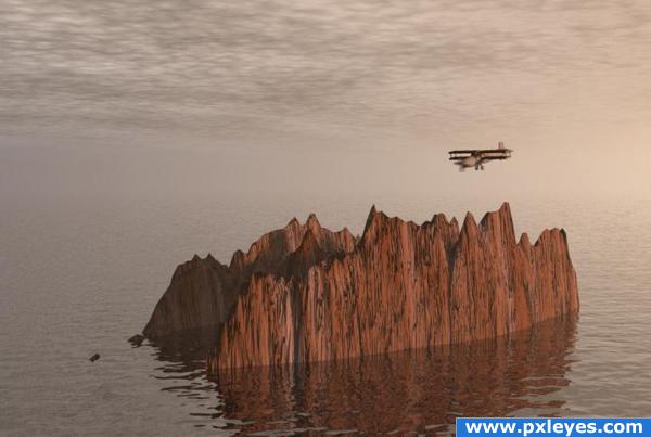
The job of a rocky island aviator is to discover, explore and land on the rocky islands. Usually they are hired for a single mission, no life insurance included..
Bryce 5.5 and 3DS Max.
My first contact with Bryce 5.5 , a free and friendly 3D graphic software .
Also see a very good tutorial for beginners in Bryce made by Robvdn ( ? ) , here
http://www.pxleyes.com/tutorial/Photoshop/1218/Beginnersguide-to-Bryce.html
Edit. Using for the first time Bryce I used on this entrie some preset materials. Only today I discovered the fabulous Mat Laboratories which allow the user to make his own map and materials. Nothing against the rules but I'd like that you know what you vote. (5 years and 3921 days ago)
I don't think that would be the worst job.. it would be scary as all get up.. hehehe.. and you'd have to put a gun to my head to get me to do it LOL.. awesome job of getting the ball rolling author... GOOD LUCK!!!
great image!
Looks good.. not necessarily a bad job.. to make it seem worst you could add more cliffs.. a lot more.. Good luck!!
Good job. I think the propeller should be spinning, though...
terrific entry, CMYK has a point about the propeller, great sbs too 
I'm not sure about the sky and the ocean line, it should be more realistic. Good luck.
Thanks for comments. CMYK, the propeller is spinning now with some motion blur from Photoshop, thanks. But according to the pilot mission this will not be for long time 
japanese suicide airplane flying people would be perfect for this job 
Nice work on this....& top job for your first go with bryce! would have been nice to see some more rocky islands in the background just to break it up a bit....
Howdie stranger!
If you want to rate this picture or participate in this contest, just:
LOGIN HERE or REGISTER FOR FREE
amazing


Even though this type of thing has been seen a lot, you really managed to reinvent it. Congratulations, it;s a wonderful image,
nice!!
Very nice and detail work
GARBONZO BEANS SPREAD ON TOAST with RAW GARLIC AND FRESH AVOCADO'S (and sprig of basil with a big slice of buffalo mozzarella) Squeeze LIME Juice over the whole thing
Salt and pepper to taste (Tahini if you got it)
WOOOOOOOO HOOOOOOOO
STUNNING!!!!!
???...............lol..GolemAura, it's garbanzo, not garbonzo...........and what is that to do with this.......
wow, that is really cool! Love your colorful ideas. Good luck author.
Nice eye candy...good job. Perhaps if you soften some of your edges it will help this.
nice
Great work! I wish I had CS4 to work with.
Thanks to all for the nice comments and favs!
Superb work Author.....Good Luck.
great work
Cornelia..... congratulations for 3rd place..... nice to see your work among the first seven.......
Congratulations for 3rd
Congrats for your third place, Cornelia!
congrats Cornelia
congrat cornelia
Congrats
This was really great! Different style for you and you did it beautifully!
Howdie stranger!
If you want to rate this picture or participate in this contest, just:
LOGIN HERE or REGISTER FOR FREE