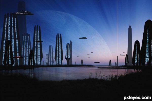
Still working on the rest of the SBS (5 years and 2983 days ago)
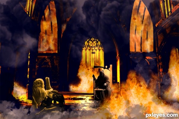
(5 years and 3250 days ago)
the plan was to find e devil source for the batle of the church but ditnot find one i like so , i com up whit this , thanks
Howdie stranger!
If you want to rate this picture or participate in this contest, just:
LOGIN HERE or REGISTER FOR FREE

forgot my sbs, but its all fairly simple. Thanks to MJranum, MnMCarta, and NightFateStock for the amazing stock images used to make this.
ANY critiques would be awesome, just try to be constructive.
****alright...thanks to a few opinions and ideas, i've reworked the entire piece...i am MUCH happier with it now than i was before. and bonus deal, i learned displacement maps. :D **** THANKS!! (5 years and 3445 days ago)
Lookin' good! I'd try to give the cracks more of a sense of depth, and warp them to the contours of the ear. GL author. 
awww...now now...don't count me down on the lack of sbs just yet. i'll be posting it soon enough, i just didn't have it with me today, and no internet at home makes it quite hard to keep up. :P SO.. SBS will be coming.
and ... thanks on the compliments.  i wasn't sure about that texture on the face, kept playing with it to try and get it to blend better. :P
If the texture is on the man on the right is on a separate layer, try completely desaturating it, since i assume the layer is set to soft light, the skin might look a bit more effective. To make the cracks seems stronger, maybe even try duplicating the texture.
OH..dang. added the SBS. 
and... changed it all up a bit.
should probably credit the tut for the displacement mapping, because without it i'd have been totally lost...
http://www.photoshopessentials.com/photo-effects/texture-map/
if you don't know how to do those sorts of things, check it out. way easy..and entirely helpful. 
Wow...great revision! 
Intense emotion in this! Sweet!
Nice use of the source! GL! 
Hey!!! it's You!! 
Great idea author...flaming head fits perfectly with his facial expression...gl
Howdie stranger!
If you want to rate this picture or participate in this contest, just:
LOGIN HERE or REGISTER FOR FREE
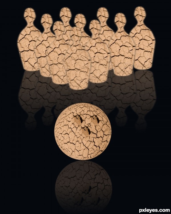
(5 years and 3447 days ago)
hehehe.. cute idea author.. IMHO.. if you take a soft large brush and use the BURN TOOL, gently shade each side of the pins and ball.. it will give them a bit more depth and enhance the image.. love the fact you used the natural hole in the source to represent the finger holes.. good luck 
Very nice idea author but demands a bit more work...Use big soft brush especially on the ball to create more realistic look and some 3D effect...select ball and on a new layer go around of the selection with big soft black brush...also with some white u could create some highlights...IMHO u should do the same on the pins too and create some space between them...sorry for the nagging...
Hey Thanks Drivenslush and erathion I did a redo hows it look now?
Author, the guys ment to paint the shadows & highlights on your objects. Make a new layer o ntop of your object, make it a clipping mask set a lower oppacity, and paint with a soft brush using black & white so that it looks 3d, like this pin and this ball. Make sure the light on all objects comes from the same direction.
http://www.elite-view.com/art/Sports_Athletics/Bowling/564222~Bowling-Pin-Posters.jpg
http://2.bp.blogspot.com/_iDA6dwYSASo/TScwKGvIAeI/AAAAAAAABC8/mjzSWcEk2hs/s1600/2.%2Bsphere.jpg
Also reflection of the right side pin is a bit wrong, but easy to fix.
Howdie stranger!
If you want to rate this picture or participate in this contest, just:
LOGIN HERE or REGISTER FOR FREE
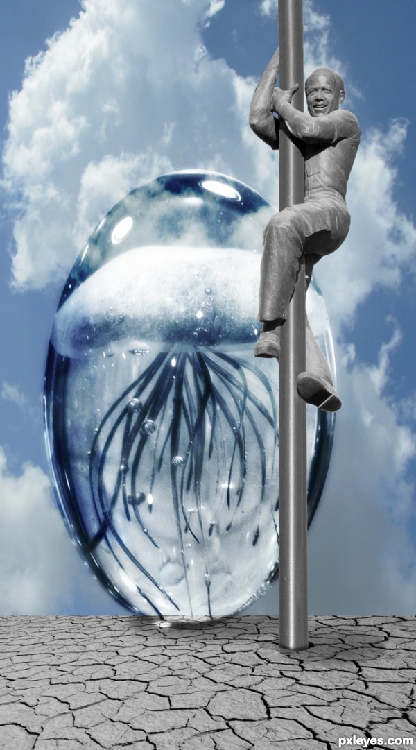
my photos and source (5 years and 3449 days ago)
super cool...climbing guy fits perfectly with the rest of the image....gl
Author please explain your second personal photo, that's one of the coolest things I've seen this year . What is it ?
@greymval, My second Photo is a picture of the sky outside a hospital window, if you are talking about the 3rd picture, It's a blown glass jelly fish paper weight (it comes in about 3 different sizes, and all the colors of the rainbow, this one is about the size of a softball and weighs about as much red brick. This one happens to glow in the dark. The smaller one is about the size of a baseball and the large one about the size of large grapefruit.
We used to get them the size of a bowling ball and they would have multiple jellyfish inside them but they became way to expensive and the company stopped producing them. (Mainly the shipping charges got very out of hand.)
The original ones were art pieces and sold for thousands of dollars, but when the Murano Glass blowers started to teach the Chinese glass manipulation, the prices plummeted and that was the end of that. You can still find the big ones at some museums, but because of the lowballing by the Chinese, many of the artist have turned to other designs.
http://www.satava.com/gallery/jellyfish/
This link above shows the really awesome ones, our gallery carried similar for a short period but the market couldn't handle the cost. Mainly because the economy is in the toilet 
Satava are one of the best ones out there though, sigh, I miss selling them, they were so cool and never two alike 
One draw back though.. you had to be very careful to check them before you put them out, you had to reject any brown/yellow tone ones because they literally looked like floating cat poop (we had to send several of them back LOL)
Wow, really impressive story, if you have more pics with the jelly, maybe you could suggest it as source. I don't know, it just looks amazing . If the company ever manages to produce again and make it popular, they could be the new Faberge eggs.
Oh there are TONS of glass jellyfish makers out there (just google Glass Jelllyfish and you'll see tons of companies that carry them, all different levels and costs, they are super cool
Howdie stranger!
If you want to rate this picture or participate in this contest, just:
LOGIN HERE or REGISTER FOR FREE
Pretty creative use of source, author. Nice colors and mood.
Thanx
wow good work pal
Howdie stranger!
If you want to rate this picture or participate in this contest, just:
LOGIN HERE or REGISTER FOR FREE