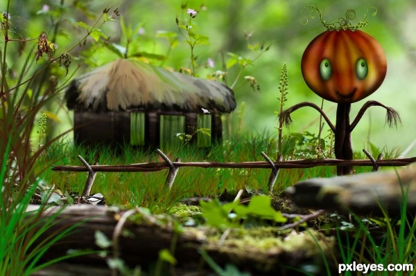
Small pumpkin lives in a small house in a tiny forest field. (5 years and 3602 days ago)
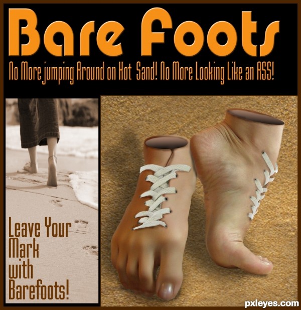
basic combination of 2 sources, used burn around the laces & lace holes to give depth, used eliptical marquee with a gradient fill for the shoe openings. (5 years and 3616 days ago)
nice idea, GL
Amazing, clever and funny!!!! Well done!!
Oh, my God, author, can you read thoughts? Better, did you read my thoughts? I was thinking of something alike to do, but now... 
It's a really really cool work, gl! 
Very funny!! Best of Luck 
awrsome!!!
definitely AWRSOME.. and awesome.. (love the way awrsome sounds better though  )
)
nice job
Great creepiness factor! The feet positions are odd when divorced from their source -- why not display the Barefoots on pedestals with a blurry sand background? I really like the concept of adding a level of content by making your entry an advertisement plus I think "Leave Your Mark" is a great slogan for these unconventional shoes. BUT The two pics on the bottom should have identical heights. The headline calls the product "Bare foots" (two words, initial cap only on the first word [I think]) while the text at the bottom refers to "Barefoots" (one word). Both lines of text at the top should be stretched so the left and right margins match the left and right edges of the double-pic montage underneath.
nice
original idea, well done 
Crazy idea! Pretty good executed too. Good luck!
Great idea author,and very nice execution...good luck
Great thought . . . . All d best to u . . . . 
Lol. I was going to create the same shoes. Great Job! 
Great concept.....G/L Author.
Congrats for your third place, Geexman!
Congratulations for 3rd
Congrats! for 3rd. Great idea and well executed. 

Congrats for 3rd place... great work!
innovative... congrats...
hehehe, so cool 
Howdie stranger!
If you want to rate this picture or participate in this contest, just:
LOGIN HERE or REGISTER FOR FREE
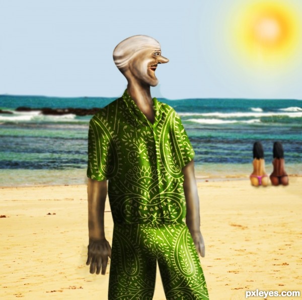
nice hot day on the beach :)
-----------------------------------------
i only used source and the beach image. everything else is drawing. (5 years and 3662 days ago)
.......nice idea...
the girls have cute buns.. hehehe GOOD LUCK author
Good job with the clothing
thanks 
I notice that you didn't give any hands to the girls..  hehe.. only the buns lolz.. and I see a raise in the guys pants..
  was it intentional...?
lol , i am glad somebody noticed that , or maybe others did, just they were too nice , so they wanted to think its a mistake.  again, of course its intentional, just i didnt wanted to work too much with details on that part. lol

hahahaha.. LOLz.. just couldn't resist laughing.. hey u mean I'm not nice..  haha.. nevermind.. thanks for the funny moment..
haha, maybe i didnt used the right word when i said nice ... perhaps "not enough naughty" would fit better 

i dont understand why has he such an ugly head, but the main idea was good
cool entry... great job! it made me smile... gl author 
yes that fits better..  yea even I have concern about the guys head..
Wow, something new !  great !
Howdie stranger!
If you want to rate this picture or participate in this contest, just:
LOGIN HERE or REGISTER FOR FREE
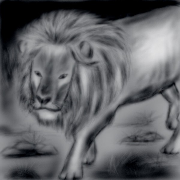
used my own sketch as reference... (5 years and 3791 days ago)
What a sweet lion. He looks so sad  Don't want to run, want to hug him
congrats ... 17th... all great entries. 
I forgot to say that this reminded me of Aslan from Narnia 
Howdie stranger!
If you want to rate this picture or participate in this contest, just:
LOGIN HERE or REGISTER FOR FREE
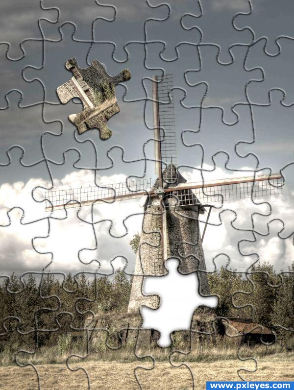
I took the source image and lightened using levels i then copied in the puzzle texture included within photoshop and free transformed it scale up to the correct size.
I then added a bevel and emboss style effect to the puzzle texture deleted the white background and reduced the fill level of this layer. (5 years and 3843 days ago)
Simple, but well done and creative. I like it.
Nice effect and look, however it seems like just an applied plug in for Photoshop...
Couldn't use the texturizer for this effect as photoshop wwould create puzzle pieces to small and not cover the whole image although the idea is the same but with the effect applied manually
cute
simple generic look but effective for the purpose... of just starting out... keeep on chopping and g/l
nice final outcome .. 
Would like to know what version of PS you have. I don't have this puzzle texture on mine. Nice entry.
Howdie stranger!
If you want to rate this picture or participate in this contest, just:
LOGIN HERE or REGISTER FOR FREE
very beautiful entry .......... pumpkin is so cute ........... all the best to u........

very nice job
So cute...good luck author...
Thank you guys! Glad that you liked it!
Howdie stranger!
If you want to rate this picture or participate in this contest, just:
LOGIN HERE or REGISTER FOR FREE