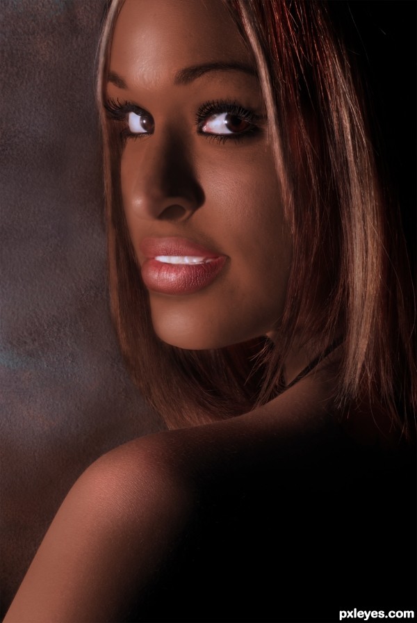
Thanks to queenofblood for the interesting portrait (5 years and 3172 days ago)
- 1: source1

Only source image and PS and now one external source. (5 years and 3963 days ago)
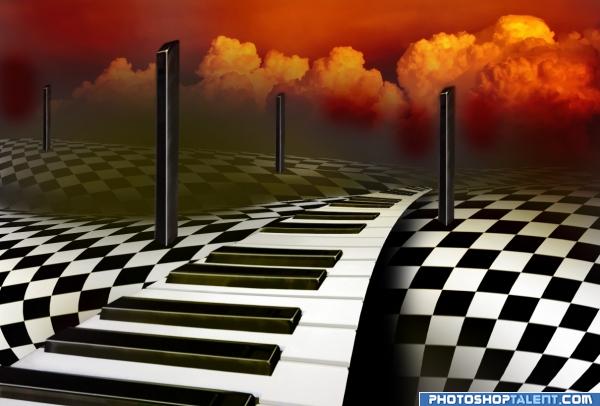
nice image but i dont like the render clouds
agree with nishagandi
Beautiful construction of the Road......Good Luck Author.
good stuff here, but you gotta nix the background clouds
exceptional!!!!
Yup, gotta find some good clouds...
Nice Depth of field
Nice work. Agree with above background is not suitable.
So, you don't like the background? OK, I have changed it now.
Nice idea good luck!
I like the road idea but not the light gray between the keys (should be darker) or the fact the white keys have no front edge (right side of image) and they wrap around the back edge (left side of image) of the black keys. The background (i.e., everything but the Old Ivory Road) is distracting and adds no insight into what the Old Ivory Road is about.
good work
very good
Yes these clouds look much better  great image
the image looks great now
great work , keep it up
COOL
LOL! OMG! I had the SAME idea!  ! But mine wouldn't been as good as yours
  Good Luck!
Yes...much better with new clouds! 
Good looking image nice sense of depth!!
gl
Are you truing to hypnotise us to vote high? 
Hey pthree, I never thought of that, look into my eyes, you are feeling sleepy....
Very good.
very nice
great job, wonderful sense of surreal art, keep up the good work
Very nice and neat image! These black piano keys remind me a Chimney! Maybe I would add smoke coming out from them Lol! Good job author!GL
Strong entry.. good luck !!!
Chess texture world, so nice and soft!
Congrats, lovely work 
Congratulations for 1st
Congratulations, I love this work
Congrats! Great job!
Congratulations.
congrats
I just loooove this one, congrats for the win!
Congrats for 1st 
congrats!
congrats sorry for late
Howdie stranger!
If you want to rate this picture or participate in this contest, just:
LOGIN HERE or REGISTER FOR FREE
Well done on the lips but it's a little bit blurry on the left, try to fix that ! However nice job on the skin color. Good luck author.
i dont think the plumping of the lips was necessary, it doesn't look as natural, good job on the color though
The eyes are a bit too bright and unnatural looking, and the nostril fold is a bit too thin, but I agree that the skin tones are very nice.
Doesn't look as natural compared to what? The original Caucasian? I looked at several pictures of pure black African women (not mixed race blacks) to determine the differences between Caucasian and Negroid features before making the changes I did. A criticism of the jaw angle would be appropriate - I don't feel I have that quite right; it doesn't protrude enough.

Mossy, I thought of you as I dealt with the eyes! I actually toned them down and "grayed" the whites from the original, believe it or not. They are not brightened in any way. Just darkening the skin made the eyes pop. I'll try to over compensate some more.
Very beautiful! Truly lovely work! I love this color a lot on her!
Nice job here, the color of skin and hair is very convincing,The eyes look fine to me...best part next to the lips, good job on those BTW.
Great job, author, especially on her lips.
Howdie stranger!
If you want to rate this picture or participate in this contest, just:
LOGIN HERE or REGISTER FOR FREE