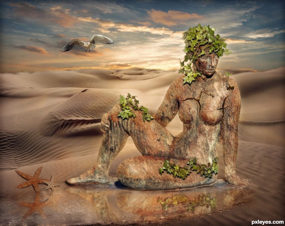
The Earth and Nature goddess. (5 years and 905 days ago)
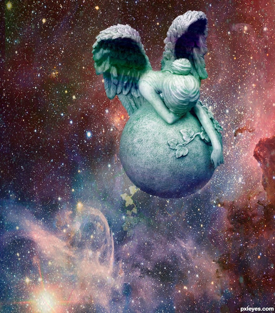
Thanks to European Space Observatory for background source (5 years and 2503 days ago)
Not sure what the straight lines are all about...
Where did you come from????? I didn't publish this yet!!! Still working on it!
Well, they're gone now. It was published when I commented, obviously. Something like step 6.
Howdie stranger!
If you want to rate this picture or participate in this contest, just:
LOGIN HERE or REGISTER FOR FREE
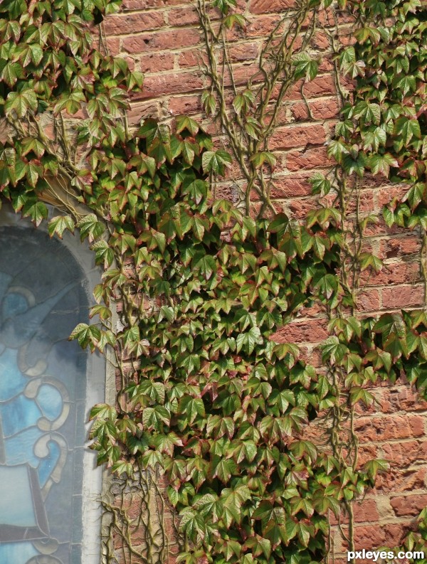
The background photo is mine. The ivy leaves are courtesy of ColinBroug via http://www.sxc.hu/photo/1360248 (5 years and 3046 days ago)
Very nice effect, but the shadows on the vines are too dark in comparison to the rest of the image. They are almost black compared to the shadows of the bricks they are attached to. If you lighten them just a bit, they will look a bit more realistic.
Very good idea for use of the source. In hi-res there are a few obvious straight crop lines, otherwise well done! 
Will get out the toolkit and see what happens. Thanks guys.
Edit: Cleaned up those crops. Wow that was sloppy for me. Also adjusted the vine shadow with bevel settings and shadow layer too.
At first I was thinking someone uploaded a photo to the wrong contest, but wow, was I wrong, how cool is this creation, well done.
Very clever use of source! 
Howdie stranger!
If you want to rate this picture or participate in this contest, just:
LOGIN HERE or REGISTER FOR FREE
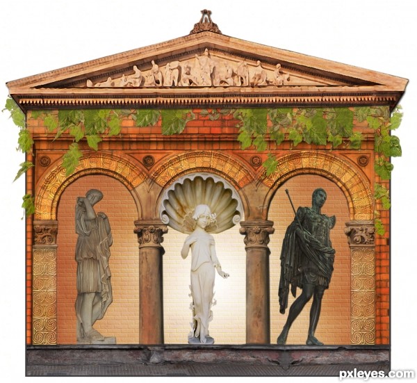
Roman-Greek Temple featuring:
1) Greek God, Adonis
2) Roman Goddess, Diana
3) Roman Emperor, Julies Caeser
Much effort and time was spent on details. (5 years and 3269 days ago)
The author of the photo of the Roman Mythology Goddess Diana is Luann Johson.
http://www.sxc.hu/profile/VroomBroom
The author of the photo of the Greek Mythology God Adonis is Hugo Humberto Plácido da Silva.
http://www.sxc.hu/profile/hugoslv
Both were notified by note.
in the place of gradient effect u have to put sm another background..... so maybe it look more real then now..
Taking your suggestion. I added a different back to replace the gradient.
Thank you.
Amazing work, and love the Greek and Roman Gods and Goddess. The shading is fantastic, and your use of scrolling is great. I can see myself entering a garden to look at this temple. Looking forward to seeing more of your work.
Something simple, sweet, and actually easy and pleasurable to view... nice work author!
why yr image is removed from competition many times....???
I am new to this website and did not understand the depth of the rules. I am also new to entering contests. I'm a beginner using Photoshop, completely self taught. Entering contest is something I had never tried before.
Yes the image was removed multiple times by the mods. I had to supply proof of purchase for other images used, an SBS guide and there was an issue with a brush and crediting an author.
I'm still a bit confused over all of it as I see many entries that do not have the requirements I needed to provide. But, I will understand in time with the wonderful help of the Mods in the forum.
The most important point is I am having a wonderful time and very much enjoying this website.
Thank you for asking.
Howdie stranger!
If you want to rate this picture or participate in this contest, just:
LOGIN HERE or REGISTER FOR FREE
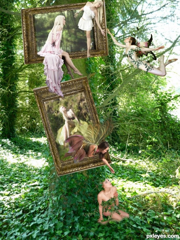
Took forever! Got half way through and accidently closed out everything I had worked on from a long ago save. I think it looked better the first round but there's nothing I can do about it now. I still love the way it turned out.
I created the wings for the bottom reaching fairy in Apophysis. When doing the SBS it would not let me load past 7. I'll try again later.
All artists have been notified.
In the same order of links below, thank you to the following artists at Deviant Art
tmm-textures
WanderingSoul-Stox
Mjranum-stock
Chamberstock
Lisajen-stock for 2 of the fairies
midnightstouchSTOCK
lialiaD-Stock
Bobbistock
and Heartdriven. (5 years and 3395 days ago)
Looks like a fun day! Pretty work here. 
Howdie stranger!
If you want to rate this picture or participate in this contest, just:
LOGIN HERE or REGISTER FOR FREE
Figure needs a reflection, shadows are wrong. Look at the shadow under the chin for original light source.
There are already reflections in the water. Can't you see them? It has the statue reflection and the starfish reflection and also the cloud reflection in the water. As for the shadows, they are following the same angle as the shadow on the knee and chin. See that knee shadow? It is heading slightly to the left. The chin shadow seems to be going straight down so I figured I needed to use both source shadows to make my own shadows. I made the ivy leaf and starfish shadows aim down and slightly left. The dark area you see above the leaves on the knee are cracks in the statue. Those areas are holes. The ivy is growing through those cracks.
Now if you still think the shadows are wrong, which way do you think they ought to go if not slightly down and to the left?
The light source is almost overhead. I'd make the shadows lower and more to the right. I'd also make the reflection more visible.
I moved the shadows 6 pixels more to the right and 3 pixels further down and made the reflection more visible for you.
Thanks for your help CMYK.
Congratulations...
Thanks George
Congrats
Thanks Sylvie.
Howdie stranger!
If you want to rate this picture or participate in this contest, just:
LOGIN HERE or REGISTER FOR FREE