(5 years and 3461 days ago)
2 Sources:
Photography and photoshop contests
We are a community of people with
a passion for photography, graphics and art in general.
Every day new photoshop
and photography contests are posted to compete in. We also have one weekly drawing contest
and one weekly 3D contest!
Participation is 100% free!
Just
register and get
started!
Good luck!
© 2015 Pxleyes.com. All rights reserved.

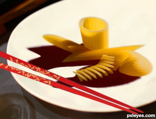
Chopsticks need a shadow also. (Pauzinhos precisa de uma sombra também.).
Very creative and fun concept, but the chopsticks are too small (and need a shadow as CMYK46 noted). [I'm afraid my português is very weak so I can't provide a translation like CMYK46 did. .]
.]
I use this for translations, Dan.
http://translation2.paralink.com/
They look al dente. a lot!
Good idea agree with cmyk46 about the chop sticks. They are floating a shadow will make them look more natural in the image. Good entry.
Not bad. I think the pasta is a bit distorted though. I would suggest resizing it using the transform tool by holding the shift key. GL !

(Não mal. Penso que a massa é um bocado alterada embora. Eu aconselharia alterar o tamanho dele usando o instrumento transformar mantendo a chave de turno.)
Pasta looks a tad...odd. Chopsticks look out of place. The idea is good.
Howdie stranger!
If you want to rate this picture or participate in this contest, just:
LOGIN HERE or REGISTER FOR FREE