(5 years and 2975 days ago)
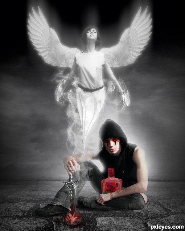
"He killed his lover for the Red rum" (5 years and 3217 days ago)
Nice one!
Well done ... works perfectly for the Palindrome! Not to mention a great image all by itself!
Nicely done, I like the contrast of the desat with the red.
The bottle is too large, otherwise a great image. 
I think that proportionality is the least important in light of an image so well prepared. Author, congratulations!
That is... a stop and have to look at it for everything it can be saying pic. Great work on the whole thing. I like the way you done the figure in the smoke. Can you share please your technique. It would be fun to try to do it with other subjects.
wonderful
Excellent author, GL!
Nice work author, very effective...gl
Amazing concept 
Congrats, well done 
Congratulation on your 1st place!
congrats!
Congratulations on 1st!
Congratulation, man!! Nicely done!
Congrats!!
Congrats on first place
very good job congrats!
Congrats (sorry about the lateness, I used to do this all the time but I've been very swamped in EBAY.. hehehe) great job 
Howdie stranger!
If you want to rate this picture or participate in this contest, just:
LOGIN HERE or REGISTER FOR FREE
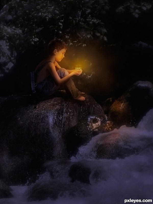
Thanks to George55 for the Jar (pxleyes stock) and Auroradreams for the boy. The background image is my own (see SBS for permission etc.) (5 years and 3220 days ago)
I find this piece very magical... I don't know why but it soothes my eyes... GL
Very well done ,lovely work.
Fantastic work, it's so beautiful. well done.
Really like the mood of this one! I would still like to see even brighter edges on the knee, hands and front of face. Up to you, Good luck!
Beautiful transformation, and good job!
@ George55 Thanks for the use of the stock! 
@ Chalty699 Thanks for the help!
After seeing my first upload I edited it and re-submitted a de-saturated/darkened version but I think you are right and have re-re-edited it and put some of the highlights back in as you suggested! 
Lovely and this one for the top!
Wonderful and beautiful lighting.....  You have the unique style and quality in your works.. welldone, good luck to you
I wondered what happened to Tinker Bell... very nice work
fantastic piece author...well done
Beautiful work author...best of luck!!
wonderful
Congrats on 2nd place!
Congrats!!
congrats
Howdie stranger!
If you want to rate this picture or participate in this contest, just:
LOGIN HERE or REGISTER FOR FREE
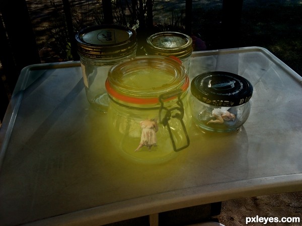
Thanks to Prophecygirl, lockstock, and jaymasee of DA for the use of their images and brushes (5 years and 3331 days ago)
Nice job!
The "dead" fairy lays pretty ok there (no pun intended), but if possible I'd replace the standing fairy for one that match better with the jar's perspective. Good luck!
interesting piece...gl
cool..... like the glowing.... good luck author!
Howdie stranger!
If you want to rate this picture or participate in this contest, just:
LOGIN HERE or REGISTER FOR FREE
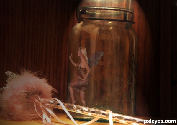
I did this a while back and have been waiting for a good contest to use it in.
If I was small I'd probably get myself into trouble and end up caught. All images are my own but there isn't really an sbs because it was made before I did those. I will try to recreate some stages though. (5 years and 3387 days ago)
I like how your hands are place, you really do look like you are touching the jar. And thank
you, glad you think this is a good contest = )
Very cool pic...thumbs up from me
Thanks for the nice comments!
wow...cool work with a very nice mood...well done
Howdie stranger!
If you want to rate this picture or participate in this contest, just:
LOGIN HERE or REGISTER FOR FREE
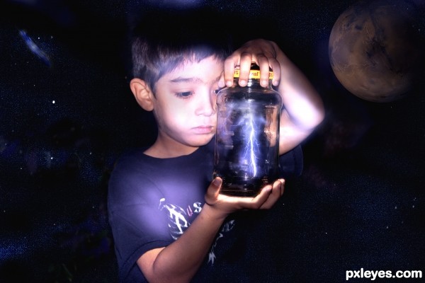
Good image author, but you need to post the original uncut photo in the SBS so we can see how you manipulated it.
EDIT: Thanks, now we can see your work.
Uncut is now up loaded.........sorry.
Really great idea but there's some room for improvement: the light casting on the boy is a bit oversaturated, specially on the right fore and upperarm.

What I see from the original photo of the boy that you even made the dark areas lighter, I think your profit is to be gained here. You can make the original photo a bit darker and use that as a blending layer over the original photo, so you make the lighter areas come out more. On top of that you could lighten the areas you want lighter a bit more.
Something else: in the high res there's a purple area over the boys thumb and the moon and the boy are transparent at some areas, these last 2 are easy fixes though
Cool idea. I admit I don't get the boy-in-outer-space thing unless this is supposed to be an ad for a sci-fi movie or something. As an alternative, I think if the boy's original hedge and tree-trunk background were retained and then augmented by the intense stars-and-Mars [or more-appropriately moon?} sky, this would be more understandably dramatic. [BTW what is the light source for the jar lid and his fingers holding it?]
Howdie stranger!
If you want to rate this picture or participate in this contest, just:
LOGIN HERE or REGISTER FOR FREE