(5 years and 2530 days ago)
(5 years and 3111 days ago)
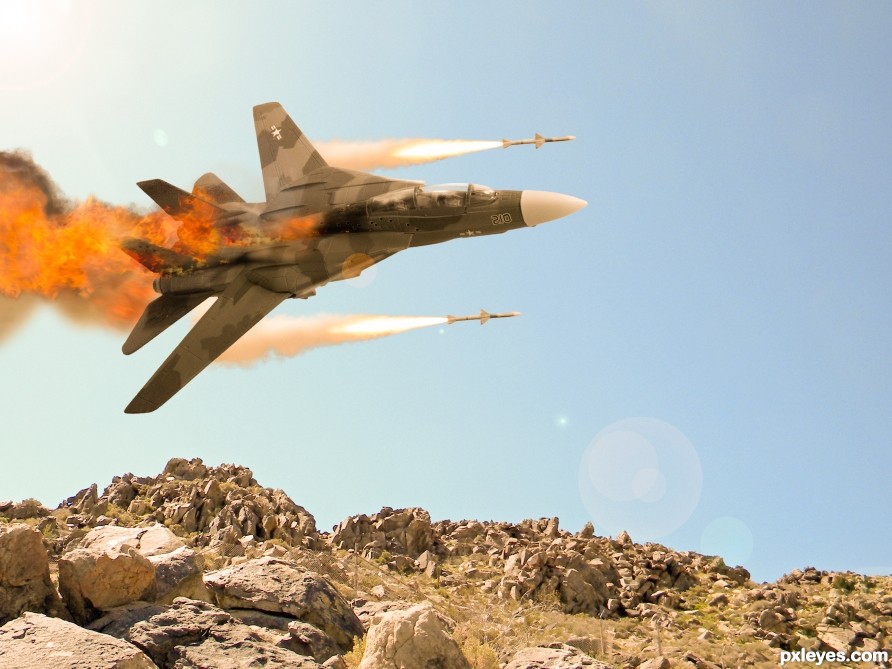
you could burn the edges of the base of the plane to give it a little more density.. my bad for not catching it earlier.. but it is a very nice chop.. good luck author.. and very good work  (Burning always gives more depth to an image.. but as always.. IMHO.. )
Good work.look well. 
Howdie stranger!
If you want to rate this picture or participate in this contest, just:
LOGIN HERE or REGISTER FOR FREE
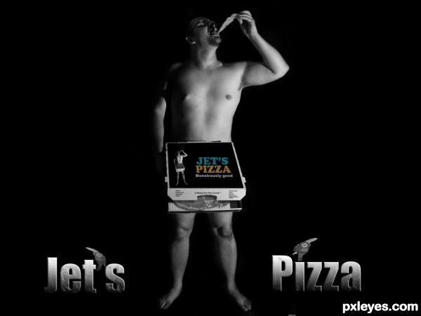
I saw that the box was empty so I decided to fill it a bit. In this one I cut the image into several layers. Then I changed the colour of the pizza to black and white with some adjustments and rotated it inside the box. I Then applied some shadows to the top cover of the box. (5 years and 3138 days ago)
Since you colored the text on the box, you should color the text at the bottom as well.
The shading is a bit too heavy, the bottom of the 'J' is almost completely obscured, and it does not correspond well with magicsteve's feet.
I think you should also move the words closer together.
Howdie stranger!
If you want to rate this picture or participate in this contest, just:
LOGIN HERE or REGISTER FOR FREE
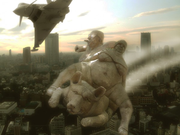
go go go... (5 years and 3766 days ago)
Pig?! Nice idea though.. very funny. I would personally remove the lens flare though, it distracts from the image. Good luck!
Very nice, like it 
Funny! 
no lensflare now...
Much better idea now, but try to sharpen the blurry edges...
Author, your concept is excellent. If your execution was as good I would give you an insanely high vote.
Great imagination.......would look even better if it wasnt a bit blurry
Great idea! I'm glad to see the back of them 
Howdie stranger!
If you want to rate this picture or participate in this contest, just:
LOGIN HERE or REGISTER FOR FREE
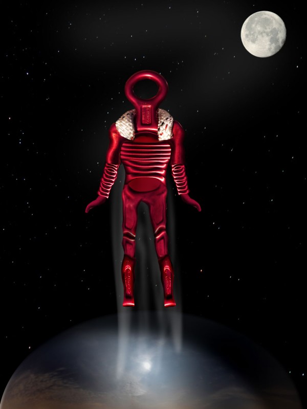
(5 years and 3773 days ago)
Good work.
Might be good to add a visor to the helmet...
Great idea,work a bit on the head to give more futuristic look
Howdie stranger!
If you want to rate this picture or participate in this contest, just:
LOGIN HERE or REGISTER FOR FREE
I think this is well put together and a good idea
Thanks!
Howdie stranger!
If you want to rate this picture or participate in this contest, just:
LOGIN HERE or REGISTER FOR FREE