
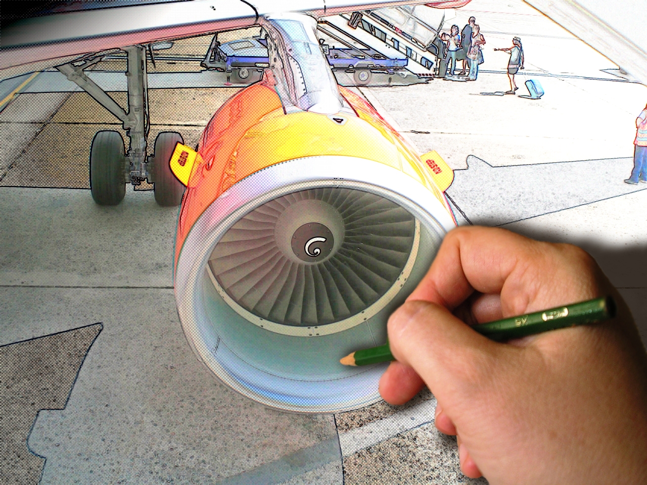
I should be using a smudge-guard when I sketch this to make sure my hand doesn't do anything to the image, but I don't feel like it. Also, I sketch really fast.
Hand from stock image from flickr posted by Cybergabi. (5 years and 3861 days ago)
I was inspired by the Toy Story series when I made this entry. Two toy planes flying under the moonlight...
"TO THE INFINITY... AND BEYOND!!!"
P.S. My own sources. (5 years and 3941 days ago)
high High HIGH MARK for using your own images.. just wonderful.. good luck
ohhh just a little more and it is perfect!
GL!
But thats really not very blue
i think this needs more blue in it
very nice
it looks more grey than blue??? will hold vote
Hey, folks... I know that it's not specified in the SBS, but after I composed the image, I desaturated it, then I applied the blue filter. That's it. Therefore, there aren't any other colours than blue there. Thank you...
It's perfect, but you should make it a bit more blue.
I still don't see how it doesn't fit the guidelines; I have tried other tones of blue, but they seemed very artificial for a moonlight feel, that's why I made the choice of just letting it as it is. Hope you understand. Thanks for the feedback anyway
nice job
WAY OFF THEME
That's pretty harsh, Christy... and by the way it is NOT off theme, since black and white are just the two extreme tones of ANY colour
Well, as a matter of fact white may be considered a colour, but if we take this into account we'll have most of the entries removed.
I wish there was less criticism here...
very nice mood
Nice mood indeed. If it's blue enough...ow well, depends on how you see it of course. Maybe on some screens this is more purple. As creation I like it, the only thing that's a bit off in style imo are the stars (a bit too stereotype, maybe if they'd look more like blurred dots it would fit better). But again, just my opinion. Good luck!
Howdie stranger!
If you want to rate this picture or participate in this contest, just:
LOGIN HERE or REGISTER FOR FREE
Nice idea, but i don;t really like the blur you applied, even if it's because you sketch really fast, but it's a good idea, so good luck!
Thanks for the input: I applied the blur because I couldn't get the edges of the hand to be smooth, and then I said I sketch fast to justify it.
great idia, nicly done
To get smooth edges you should applay a layer mask, and paint carefully wiht a smooth brush (black colour) around the hand. Good luck!
typical work for who dt have ideas!probably u new in this site good luck, and blur hand???? u should change that
Thanks isoflow: I fixed the edges and took off the blur.
The paper is laying flat,,,your index finger would be at least 4 inches above the sheet...why such a tight shad. You'd never see it, there should be no shad above the hand....and no depth to the sketch. Nice idea
From the look of the sketch the light is top right, ( though the hand doesn't justify this....it is was it is) ...longer shad at the bottom of the hand and drop a shad below the engine...bottom left . this will give the appearance of the the engine coming off the paper. Flat in background and depth in the foreground......Go for it my friend.
The blending is nice now, and the image got much better after you removed the blur!
Howdie stranger!
If you want to rate this picture or participate in this contest, just:
LOGIN HERE or REGISTER FOR FREE