(5 years and 3114 days ago)
7 Sources:
Spec Thanks to Perpetualplum for use of this picture found on Flickr photo sharing.com (5 years and 3158 days ago)
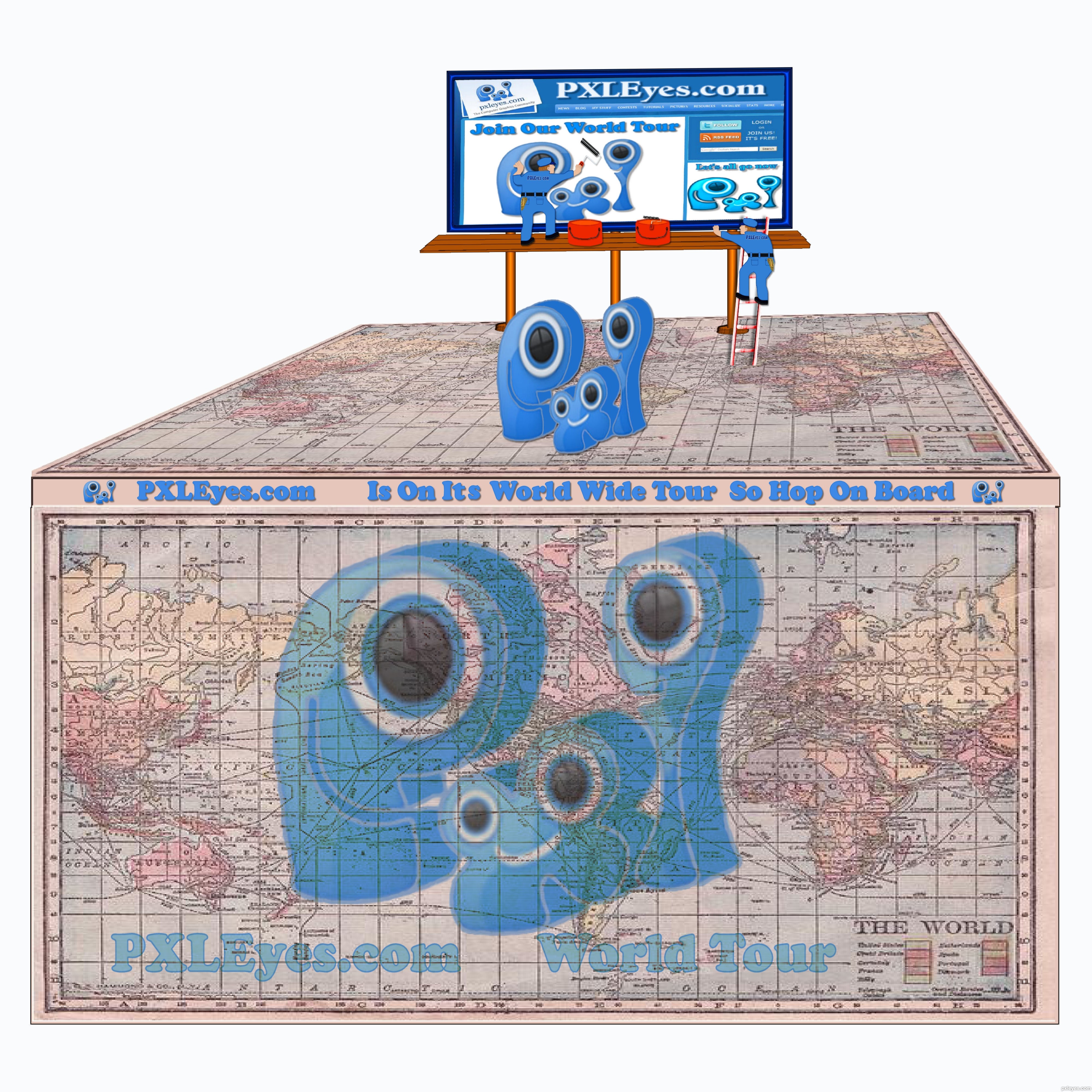
In my honest opinion, if it's any worth, this would work better with a white background. Not that the source is bad or something like that, but having "cartoony style" elements backed with a photograph... well, just doesn't do. Don't be affraid to try a second time and enhance your work! 
I think there is some great ideas here.. think outside the square author.. REMEMBER this is a t shirt image not a scene construction.
some ideas: ditch the background but keep the billboard.
The billboard is a great idea that will work on a shirt.
love that you have used the website page .
GOOD Luck . i look forward to see if you get time to rework this entry .
Fun concept but I don't get this as a T-shirt. It's mixture of cartoon and photo with blurry PXLEyes-Web-site screen shot (which should be the real focus) just doesn't work IMO.
I'm sorry I didn't get it was for a t-shiert I looked at it quick first time around I had jus redone But I will go back in again and get red of backround Thanks all
I think this would look cool if the map was your background
Ok all I did a redo I didn't see that it was for a t-shirt i hope I'm on the right path now. Thanks everyone for comments.Oh someone said a wh backround Now I understand why.
Oops, you made the same spelling mistake I made in my earlier comment (please slap some sense into me!): no apostrophe in possessive pronouns [his, hers, its, yours, ours, theirs].
This seems too detailed for a T-shirt plus I think more than one PXL logo is too many. The map is cool but the right edge needs cropping to match the other three sides. A simple billboard (no workmen) atop a much more tilted map could be compelling. "Less is more."
DanLundberg Thanks for pointing that out to me...lol I took care of the spelling mistake
Oh Yes I took care of the border...Thanks
Howdie stranger!
If you want to rate this picture or participate in this contest, just:
LOGIN HERE or REGISTER FOR FREE
Here is my entry for the contest, thanks to - serje ,saavem, freshleaf and curzie.
(5 years and 3199 days ago)
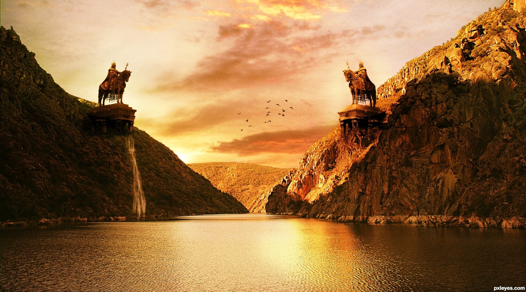
Beautiful!
the boat is distracting....
title should be "the duel"... more appropriate?
anyway, with the boat out of the picture, I will love it more
Interesting. More yellow than orange to my eye, however. The twin monumental St. Stephen sculptures make the small, unexpectedly unstaffed boat (surprisingly white in the very yellow light BTW) boat seem out of place. Actually, the boat seems oversized for the setting. With all the intense background light, the light on the front side of the statues seems odd.
Thank you everyone, I will update my entry and I will remove the boat for sure!
if no time, suggest just crop off the boat, the image will still look good
Lovely
Thank you everyone for support and suggestions.
@aheman and DanLundberg - Boat removed from the image.
Entry name updated as per suggestion by aheman.
@DanLundberg and everyone, I have updated the image let me know if you have any suggestions.
it's PERFECT now!
I guess the knight on the right (brighter one) will win
Hahaha... thank you my friend
Would love to have seen an SBS for this ... great image!
Thank you Arca for showing interest in my creation. I really want to post the SBS but because of busy schedule I don't think it will be possible, but I will try my best.
Howdie stranger!
If you want to rate this picture or participate in this contest, just:
LOGIN HERE or REGISTER FOR FREE

Thank to Katanaz stock that now is allowing use their picture outside DA.
Please, check their new rules in their journal: (please, see the print at SBS or go to their page.)
"USING OUTSIDE OF DA:
As of 28th of July 08, you now have permission to use our stock OUTSIDE of DeviantART!! This is brilliant news, and I'm sure many of you agree as in the past we'd sadly turned down hundreds of requests.
However, when using our stock outside of DeviantART you MUST include credit and a link back to our direct profile page here on DeviantART. - Also you may not use the stock images for website templates, or for commerical and/or profitable use. - You may also NOT use our stock on the website, Model Mayhem! We have had too many people claiming our pictures as their own and any of our images found on Model Mayhem will result in a warning, or a copyright fine! - As we're absolutely sick of seeing our images on there!!
Due to the amount of stock images we have, we haven't got through the process of changing all the rules on each image as we just don't have the time, so please abide by our journal rules, rather than the description rules for each of our images. - Thank you."
http://katanaz-stock.deviantart.com/
(5 years and 3516 days ago)
This raises the question as to what the distinction is between vampirism and walking dead. The simplistic answer is that since there was a separate vampirism contest just a few weeks ago, there must be a difference. Ergo, left woman must be a vampire while right woman is walking dead. Vampire woman is very well done although the eyes could maybe be even more intense. Walking-dead woman, however, may be blind but her skin is awfully flawless and healthy-looking.
Very interesting concept author...only thing is missing...me between them...
LOLOL.. erathion.. I guess it's just going to be you and your hand tonite... LOLOLOLOLOL...
(great job author )
I think it's really sweet that the undead can still show affection...
Give the undead girl some knarly undead veins while keeping her sexy and..... bam! You should make Lundberg happy (haha everytime I hear Lundberg I think of the guy from "Office Space" is that you Lundberg? "aaaahhh yeeaaahhhh, I'm gonna have you go ahead and make some adjustments to your chop this weekend.... uuhhh yeeeaaah" lol......
There is a difference between vampire and undead and the contest said you can only make one character walking dead.... so you have it here one undead and one vampire and they are both working here for me!
(ooopss my bad one undead vampire and a blind slave.... still works for me... g/l author)
Great job author!
Lundberg, Erathion, Drivenslush and Woodztockr,
Thank you all, for the comments. I am laughing a lot with the conversation between Erathion and Drivenslush! lol
Yeah... Lundberg is partially right... although I love vampires, this is not their "spot". So I made a vampire with a slave.
The tale says that a vampire use the "make" a walking dead to help them in the place that they can't enter: sunny places, churches, etc... The slaves don't think, they just follow the master. (that's why a made her blind)
The vampire is a Toreador (clan of vampires) and she just make as slave a beautiful person. They care a lot with appearance and fashion... So I tried not to make the walking dead ugly, just with some distortions (the silly smile). You can find more information at The Masquerade.
I apologize if my English has some mistakes. I know a lot about vampire's history and just a little about the Language. 
Interesting image, but the distortion of the mouth doesn't work for me.
Don't worry Ernie,i have one bloodsucker at my home,so...:P
Hmm... lustful creepiness!
Erathion ...lol
Erikuri... I completely agree...
Howdie stranger!
If you want to rate this picture or participate in this contest, just:
LOGIN HERE or REGISTER FOR FREE
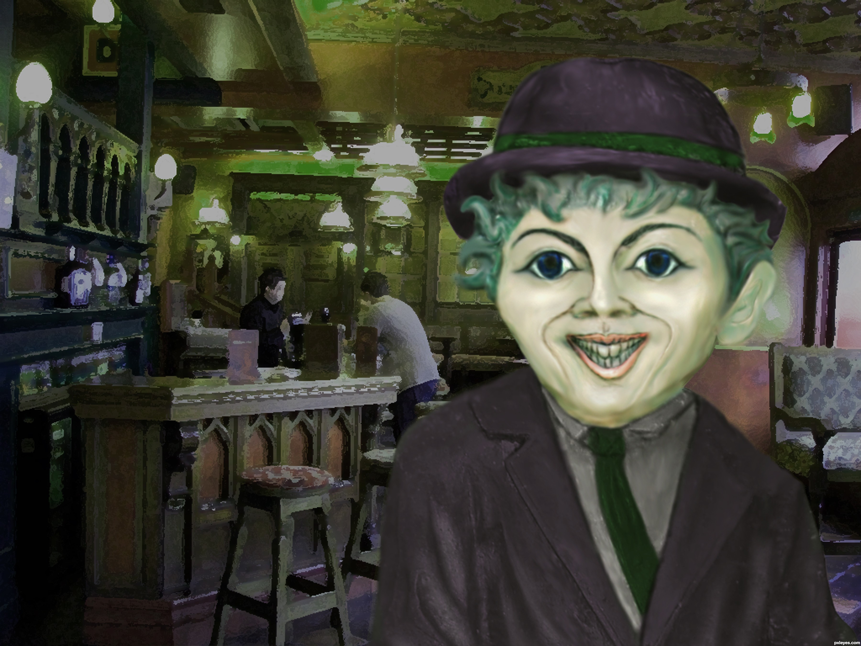
warping of the face, patching of the texture to get rid of the lichen growing on the statue. color overlay painted for color, then eyes burned and dodged with a color overlay for the eyes. Placed atop a background, thanks to R.Motti @ flickr.com ( http://www.flickr.com/photos/motti/183678981/sizes/l/ ) which i used paint daub filter and guassion blur to soften, along with a hue and saturation change. (5 years and 3559 days ago)
The statue got feminine traces... Nice entry and GL!... 
very cool
Yep nice entry and work.....shame that Charlie not more in focus and just the B.G. is blurred
Fabulous work author...well done
great job, author! good luck!
Yep this is a good for sure
Wow, nice mug!
Howdie stranger!
If you want to rate this picture or participate in this contest, just:
LOGIN HERE or REGISTER FOR FREE
Photography and photoshop contests
We are a community of people with
a passion for photography, graphics and art in general.
Every day new photoshop
and photography contests are posted to compete in. We also have one weekly drawing contest
and one weekly 3D contest!
Participation is 100% free!
Just
register and get
started!
Good luck!
© 2015 Pxleyes.com. All rights reserved.


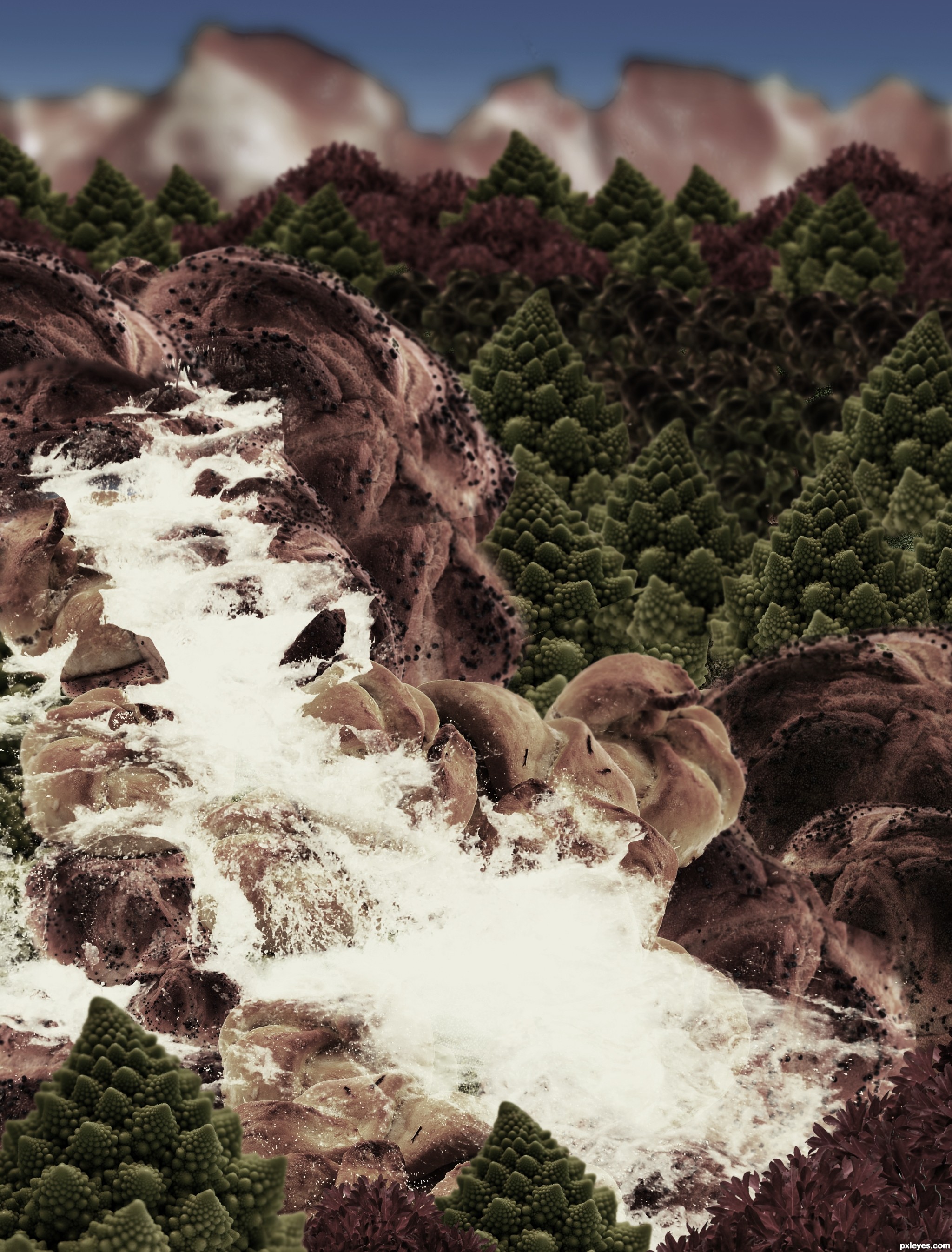
It's so dark and monochromatic, you can neither make out the differences between all the sources you used, nor appreciate the wide variety of different items creating the foodscape.
Carl Warner lets the food be the landscape, not hide it behind overly dark values. Perhaps lighten it up and allow some of the real color to show.
do u think that step 9 will be ok?
step Nine is much nicer then the dark version for being able to see the actual food.. IMHO
EDIT: Much Improved!!!
Thanks a lot Drivenslush!, I'll change it
I would drop the pizza, and I would go back to step 9, desaturate and colorize a little bit. If you blur the farther away parts and the farthest even more, it'll give it some depth. Also, in an actual landscape, the farther hills and mountains are from the camera, the gradually lighter and duller they look. Check out this picture you'll see what i mean
 hope this was helpful, best of luck!
http://www.redbubble.com/people/natureshues/art/2059066-blue-mountains-sunset
I think you have the pieces and everything for a great entry, just needs a little tweaking
Changed it, hope it's better now!
WOW! What a difference that made! MUCH much better, I'm glad I waited to vote. High score from me, you've done a wonderful job!
YAY! Absolutely great! What an awesome improvement! You take suggestion extremely well
Thanks for your comments
Howdie stranger!
If you want to rate this picture or participate in this contest, just:
LOGIN HERE or REGISTER FOR FREE