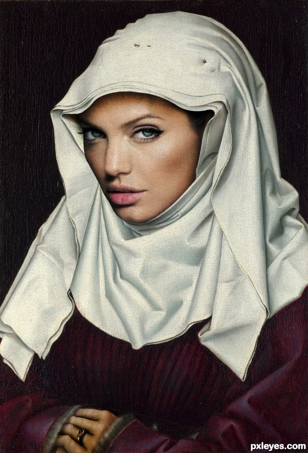
(5 years and 3185 days ago)
2 Sources:
- 1: angelina jolie
- 2: painting
Photography and photoshop contests
We are a community of people with
a passion for photography, graphics and art in general.
Every day new photoshop
and photography contests are posted to compete in. We also have one weekly drawing contest
and one weekly 3D contest!
Participation is 100% free!
Just
register and get
started!
Good luck!
© 2015 Pxleyes.com. All rights reserved.

Nice blending author. One suggestion would be to make the texture smaller on the face, similar to the veil.
I think now its better
Nice job...a couple of things though. On the upper right (face) there is an obvious line, brush that out and on the left soften the area between the face and the head wrap. Just suggestions. All the best!
Head is too big. Overlay the 2 images & compare.
The diagonal line along the wimple and down Angelina's cheek is too straight and distractive. The Angelina source you used was too severely photoshopped to remove all curvature of her cheekbone on that side. Perhaps you can find a bit more natural source, or reposition the face so that the line is not continuous along that diagonal.
The hair pins are very cool.. glad you kept them... very good job on this.. love that you used the extension of Jolie's face (it is a long one) good job all round author
Unlike the original painting, Angelina's viewer's-left-side of her face is in shadow so the lack of shadow on her wimple is off-putting.
Howdie stranger!
If you want to rate this picture or participate in this contest, just:
LOGIN HERE or REGISTER FOR FREE