Photoshop Pictures: Journey (page 2)


results 6 - 10 of 21

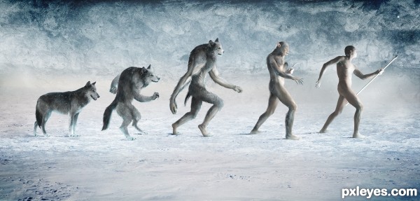
The Journey Begins - created by samanway


The Journey Begins
Favs: 10SBS: 4Hi-resRank: 2/4Score: 75.5% (41)13822 views

Well there was a problem uploading at first ..

About the image :
We all know about Apes to human so now i tried something different where apes were replaced by wolf , so hope you enjoy this entry

IMPORTANT: CHECK HIGH RES and SBS

\\\\\\\\\\\TEXTURES////////////:

Texture 1 :
http://www.cgtextures.com/texview.php?id=40607

Credits : CGTextures

Texture 2 :
http://www.cgtextures.com/texview.php?id=5648&PHPSESSID=7ag40do1tp7djpokgs6b8ugnv1

Credits : CGTextures


(5 years and 2745 days ago)

3 Sources:

avatar vipinm
vipinm says:

very fine work smartly done and i like your skills, good luck pal

author says:

Thank you so much , thanks for the fav too..

(5 years and 2745 days ago)


avatar nicehotcupoftea

Yep. You are a talented artist. Really like the background as well.

author says:

thank you

(5 years and 2745 days ago)


avatar hereisanoop

top quality work... well done with colors and entire concept... good luck my friend

author says:

Super thanks man , glad u like it !

(5 years and 2745 days ago)


author says:

glad its ur fav

(5 years and 2745 days ago)


avatar kushpatel
kushpatel says:

awesome love it

author says:

thanks man , thanks for the fav

(5 years and 2745 days ago)


avatar George55
George55 says:

Good work..... good luck!

avatar shaiju1974

Excellent Work !!!!

author says:

Thanks , glad u liked it , thanks for the fave too.

(5 years and 2744 days ago)


avatar DanielaOwergoor

OMG this is awesome!!! So well done! Good luck, author!
Fav.

author says:

Thank you so much also thanks for your sweet fav on my entry

(5 years and 2744 days ago)


avatar pearlie
pearlie says:

Great concept, fantastic work, interesting ear transition.

avatar Akassa
Akassa says:

Fantastic work! Very good SbS as well.

author says:

thank you soo much for the comment and fav , I ll try to make the SBS more better next time

(5 years and 2743 days ago)


avatar oana
oana says:

Congrats!

avatar robvdn
robvdn says:

Sorry you didn't make it to first place, taking all 4 rounds together you where better!
Next time you'll win!

avatar Lelaina
Lelaina says:

Congrats for a great second place!

avatar hereisanoop

just missed.... may be next time....

avatar spaceranger

Congrats!!

avatar George55
George55 says:

Congrats for second......!

Howdie stranger!
If you want to rate this picture or participate in this contest, just:

LOGIN HERE or REGISTER FOR FREE


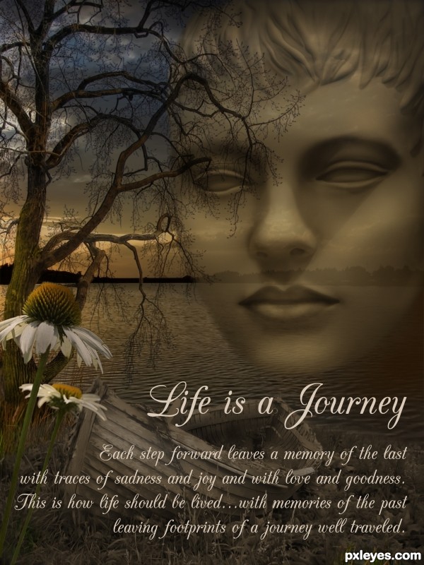
Life is a Journey - created by laulei


Life is a Journey
Favs: 0SBS: 3Hi-resRank: 4/4Score: 64.5% (0)9460 views

Re-submitting...I had to replace tree because my first tree was a 3-D render. Hope all is well now!! (5 years and 2893 days ago)

4 Sources:

avatar CMYK46
CMYK46 says:

Nice image...link to face model?

author says:

CMYK thanks. The face model is my own image. The transformation of the image into a statue is shown in steps 1 & 2. I purposely didn't show the image completely because I have used this model before and wanted to stay anonymous. Hope this is acceptable.

avatar Drivenslush

author, place the ORIGINAL image of the face with a black censor bar over the eyes.. that should cover your rump... trying to help.. very nice chop

author says:

Thanks Ernest. I have taken your advice and added another step for clarity.

Howdie stranger!
If you want to rate this picture or participate in this contest, just:

LOGIN HERE or REGISTER FOR FREE


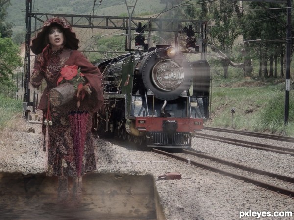
Journey Back with Me! - created by pearlie


Journey Back with Me!
Favs: 2SBS: 3Hi-resRank: 4/4Score: 62.4% (0)5039 views

Quickly, the portal is visibile now. Go back in time with me, but hurry, I'm already beginning to vapourize...

Photo of woman is one that I took at Disney World. Saturation lowered on background and woman. Flamingo head used for umbrella handle, with plastic filter. "Flood" added to old sink 'portal' under woman, and noise added to woman with masking. Additional sink drain used for light on engine, beams, glow and fog painted in. (5 years and 2983 days ago)

5 Sources:

avatar Drivenslush

wack a doo... and very interesting! fun fun fun (not sure about the sharp line on the right side.. could use a bit of softening or erase.. but that's just IMHO.. great job!

EDIT: GOT IT!! hehehe

author says:

Wow, good catch, Ernie! Thanks, fixed. (Palette must have been covering the edge and the layer had slid over - uploaded late...)

avatar CMYK46
CMYK46 says:

Good mood. Beams are at the wrong angle. See top edge of engine for correct perspective. To me it looks more like a motion blur as if the train were going backwards.

author says:

Thanks for the nudge, Bob, I was wrestling with those beams. This time I've duped the layer and blurred them, and widened at the right side. Looks better I think.

avatar CMYK46
CMYK46 says:

Lookin' better to me...GL!

avatar MossyB
MossyB says:

I can't make out the sink at all, it's too vague and/or transparent.

avatar lchappell
lchappell says:

Down in the southern part of the United States, we call a low spot a sink. And on a grander scale a "sink hole. in other words a sink is a catch basin for liquids. Now that wayfarer certainly looks like she is vaporizing into the sink hole. After looking at the source links the author has for damn sure used parts from TWO sinks.

avatar RIPSAW
RIPSAW says:

Howdie stranger!
If you want to rate this picture or participate in this contest, just:

LOGIN HERE or REGISTER FOR FREE


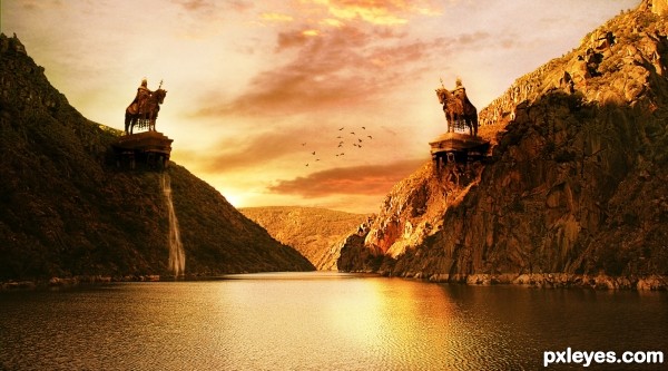
The duel - created by AdhirAnimator


The duel
Favs: 0SBS: n/aHi-resRank: 4/4Score: 62.6% (0)12638 views

Here is my entry for the contest, thanks to - serje ,saavem, freshleaf and curzie.
(5 years and 3043 days ago)

4 Sources:

avatar Draco
Draco says:

Beautiful!

avatar aheman
aheman says:

the boat is distracting....

title should be "the duel"... more appropriate?

anyway, with the boat out of the picture, I will love it more

avatar DanLundberg

Interesting. More yellow than orange to my eye, however. The twin monumental St. Stephen sculptures make the small, unexpectedly unstaffed boat (surprisingly white in the very yellow light BTW) boat seem out of place. Actually, the boat seems oversized for the setting. With all the intense background light, the light on the front side of the statues seems odd.

author says:

Thank you everyone, I will update my entry and I will remove the boat for sure!

avatar aheman
aheman says:

if no time, suggest just crop off the boat, the image will still look good

avatar niks1351
niks1351 says:

Lovely

author says:

Thank you everyone for support and suggestions.

@aheman and DanLundberg - Boat removed from the image.
Entry name updated as per suggestion by aheman.
@DanLundberg and everyone, I have updated the image let me know if you have any suggestions.

avatar aheman
aheman says:

it's PERFECT now!

I guess the knight on the right (brighter one) will win

author says:

Hahaha... thank you my friend

avatar arca
arca says:

Would love to have seen an SBS for this ... great image!

author says:

Thank you Arca for showing interest in my creation. I really want to post the SBS but because of busy schedule I don't think it will be possible, but I will try my best.

Howdie stranger!
If you want to rate this picture or participate in this contest, just:

LOGIN HERE or REGISTER FOR FREE


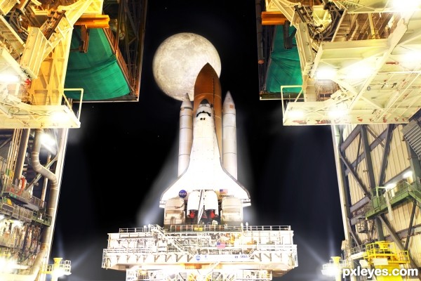
Last Journey Begins - created by lchappell


Last Journey Begins
Favs: 2SBS: n/aHi-resRank: 4/4Score: 59.2% (0)6119 views

Masking, layer blend and light rendering techniques. (5 years and 3074 days ago)

2 Sources:

no avatar
happyme27 says:

the original photo looks like it was taken at night...

author says:

happyme....perhaps right at dusk or maybe even dawn.

avatar Tuckinator

YEEEEAHHH good one

avatar demi
demi says:

great entry

avatar erathion
erathion says:

superb entry author...well done

avatar ramesan
ramesan says:

very good entry author....GL!!

Howdie stranger!
If you want to rate this picture or participate in this contest, just:

LOGIN HERE or REGISTER FOR FREE