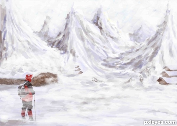
lone hiker looking on contemplating the long journey ahead of him.. many have perished... he can see the frozen bodies..the houses long abandoned...but there is no turning back
Onwards through the snowy waste (5 years and 3363 days ago)
(5 years and 3411 days ago)
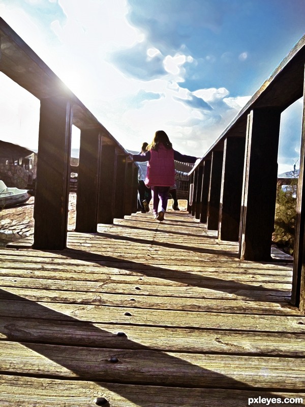
I would have leveled out the horizon...
i appreciate your feedback, still i left the horizon this way intentionally.
i thing its giving the image a kind of a different dimension look
its like the kids are crossing over to the other place
nice
Howdie stranger!
If you want to rate this picture or participate in this contest, just:
LOGIN HERE or REGISTER FOR FREE
(5 years and 3560 days ago)
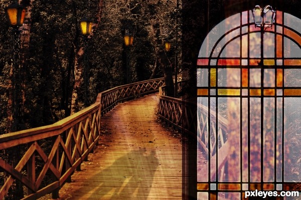
I really like this but I am not sure if I like the stained glass. It is technically well added but I keep coming back and looking at it because I just can't decide what I don't like about it. I think it distracts from the rest of the image. And, although I know rules are made to be broken ... it is not a great placement for the overall composition; pulls the eye away from the image???
Love the rest ... it has a very mysterious feel to it with the shadows!
Thank you very much for your comment Arca, at least you bothered to look at it - several times even. I know perfectly well what you mean by the glass distracting the picture, but for me it adds something which I wanted to bring into the picture. I'm glad you like the lightning and shadows.
No problem ... it was a personal thing ... not a real critique on the work ... that is why I kept coming back to it ...and I still can't say that I don't like it??? It did not effect my vote either way though 
Howdie stranger!
If you want to rate this picture or participate in this contest, just:
LOGIN HERE or REGISTER FOR FREE
thx
Steve Hillebrand, U.S. Fish and Wildlife Service
Art traub (5 years and 3595 days ago)
Howdie stranger!
If you want to rate this picture or participate in this contest, just:
LOGIN HERE or REGISTER FOR FREE
Thanks to Falln-Stock
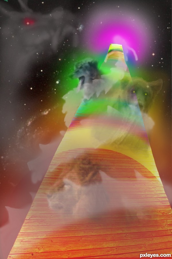
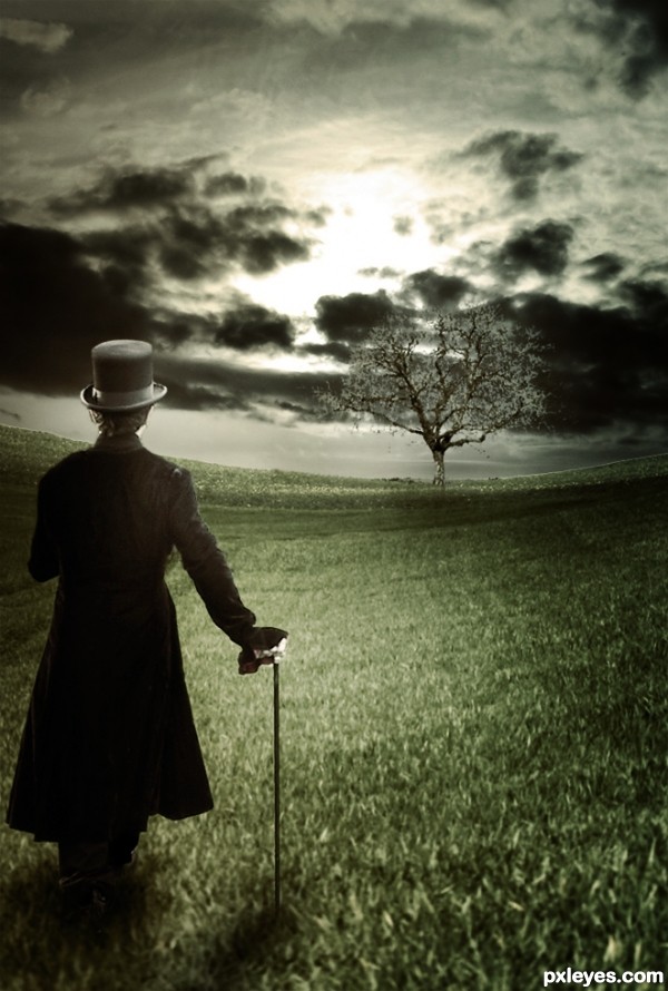
Background cropped and warped, sky replaced, etc. Sorry about the lack of an SBS. (5 years and 3675 days ago)
this is a wonderful entry!!... somethin around the base where the person meets the grass looks a little off to me though... could just be me.. nice work though
all the best to u ......... 
The man reminds me of Willy Wonka.  Nice chop. I like the element of surrealism. GL!
Very good use of lightness & shadows. Best of Luck !
I love the feeling in this creation. Great job. Shows that sometimes less color is more!! GL
Good idea Willy Wonka yup 
very nice work author...good luck
This is yet another beaut!!
Awesome
Lol that would have been awesome to get first second and thrid  Good work this week!
Howdie stranger!
If you want to rate this picture or participate in this contest, just:
LOGIN HERE or REGISTER FOR FREE
author in your SBS u did not show how u created the mountains. They are main part of the image and u have to show how u made them. Now is in every step same picture of that part...Image itself is very nice but u have to show how u made it...GL
Actually i did... paintbrush with chalk brush... i painted the whole thing using mostly whites and greys
Actually i did... paintbrush with chalk brush... i painted the whole thing using mostly whites and greys
No author u did not show how u made the mountains...u'r wrote how u made them but in your SBS in every single step mountains are the same...When u create something like this u have to show how u made that, maybe not every single step but the main job how to be documented...
The mountains are a bit crudely painted, and do not correspond very well with th photographic elements.
you can try with small smudge brush with strokes along the painted strokes to make more landscape feel
cool painting
thnx... js likd d effect dis way... wil try more realistic next time
Howdie stranger!
If you want to rate this picture or participate in this contest, just:
LOGIN HERE or REGISTER FOR FREE