just one source used
(5 years and 2425 days ago)
- 1: eagle source

(5 years and 2747 days ago)
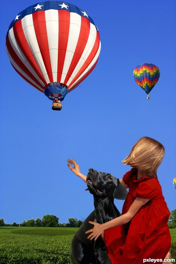
Looks pretty good. To make it even better, just a few things in hi res: The top edge of the girl's foreground arm is transparent, there's a white smudge behind her head, and white edges on the background trees. GL author. 
Thank you again. That's the second time you've helped me. I really do appreciate it.
Very unexpected! Nice job.
Congrats!!
Howdie stranger!
If you want to rate this picture or participate in this contest, just:
LOGIN HERE or REGISTER FOR FREE

Credit to ea8322 for the lovely picture: http://www.pxleyes.com/picture/9010/4aafd9410d01d.html;
full size: http://www.pxleyes.com/images/users/e/ea8322/688/fullsize/4aafd9410d01d.jpg (5 years and 3532 days ago)
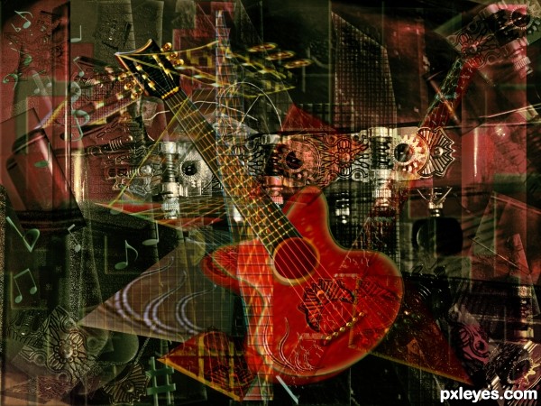
Great work. There is so much going on yet the composition makes the image very easy on the eye. Nice sbs too!
coolness!
Another masterpiece, love your illustration and borrowing of parts! Pretty cool work - did you count the layers? LOL 
This could not be better than . good luck
very neat work author...best of luck
Amazing work, full of delicacy.
Another master peace 

Many thanks to all for the nice comments and favs! 
Howdie stranger!
If you want to rate this picture or participate in this contest, just:
LOGIN HERE or REGISTER FOR FREE
good work....
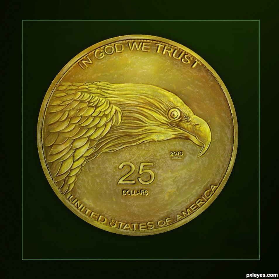
Nicely done indeed. My only suggestion would be to add more highlights...gold coins are nice & shiny. GL author.
DONE.
Entry and SBS are both well done, effect looks pretty realistic. Good luck!
THANK'S WAZ.
Howdie stranger!
If you want to rate this picture or participate in this contest, just:
LOGIN HERE or REGISTER FOR FREE