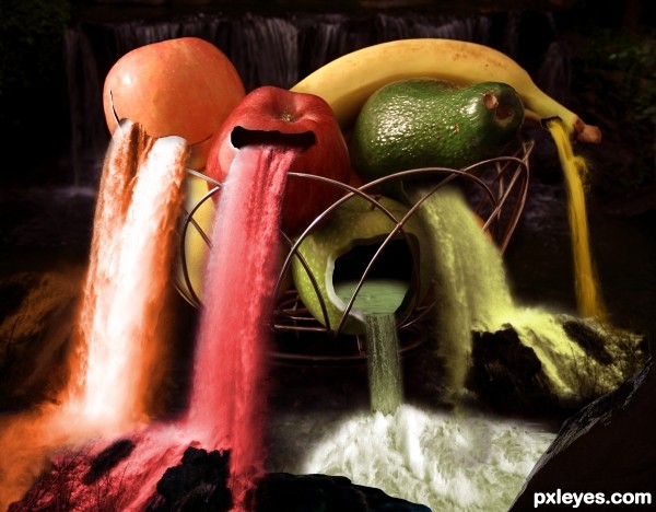
(5 years and 2589 days ago)
- 1: Waterfall 1
- 2: Waterfall 2
- 3: Waterfall 3
- 4: river
- 5: water inside the apple
- 6: rocks
- 7: rock
- 8: background picture

(5 years and 2589 days ago)
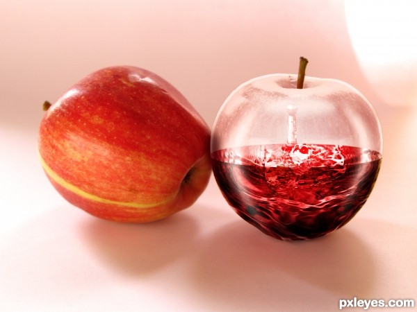
I'd like to thank biewoef (http://www.sxc.hu/profile/biewoef) and dennislang (http://www.sxc.hu/profile/dennislang) for their stock (5 years and 2970 days ago)
Is there a reason you left the original stem on the glass apple?
yes, to make it look more like an apple. without it, it looked kind of like a glass sphere.
Howdie stranger!
If you want to rate this picture or participate in this contest, just:
LOGIN HERE or REGISTER FOR FREE
(5 years and 2970 days ago)
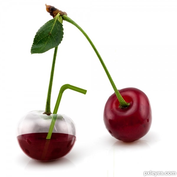
great work on the glass -- just wonder if there should be a bit of lateral shift of the straw after it passes thru the glass
Thanks Alan!!
Actually I was thinking the same when I was doing the image so I went to my kitchen and I put several straws in different glasses to see the effect. In the end, as I wasn't convinced, I left it as is.
Maybe I will try it later on!!
I'm with Alan on that one, and the juice would be more transparent. We'd see the straw in it. Nice work otherwise. 
Ok, I've done some refraction on the straw as it goes through the glass and through the liquid.
Hope it's better now.
Thank you for your tips!! 
Looks great now! 
can i order a drink now  great work author.
Great Job! Good Luck
Congrats!!
Congrats!
Thank you all!!
Howdie stranger!
If you want to rate this picture or participate in this contest, just:
LOGIN HERE or REGISTER FOR FREE
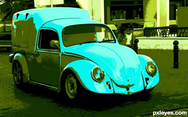
Indexed 9 Colors
Edit: Added more diverse colour palette and increased saturation of colours used. (5 years and 3203 days ago)
Fun image. Narrow palette range is kind of blah, however. More contrast or saturation might increase the impact.
Thanks Dan ... I enhanced it and adjusted the colors. Still 9 but a little more diverse. I did not want to change it too much as I was going for a retro look. Not sure if I achieved it but it was fun trying! 
i like it 
Howdie stranger!
If you want to rate this picture or participate in this contest, just:
LOGIN HERE or REGISTER FOR FREE
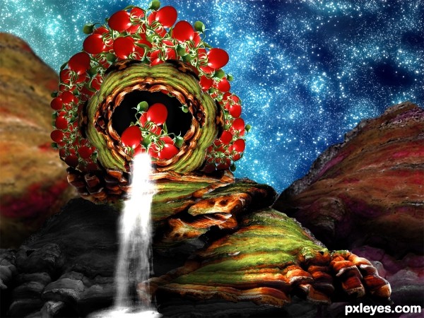
my photo combined with waterfall and star brushes (5 years and 3315 days ago)
The clearest tomato juice known to man! Nice job, author...I particularly like the blue background you made!
(Response to a deleted comment, not Pixelkids)
tomato juice is any color you want it to be, I chose clear refreshing water running over their surface, chilling the water.. It's my tomato juice.. if you want nightshade red,make it yourself, thanks anyway LOL
"Tomato" juice is the color of the tomato, generally...your liquid is too high contrast, whatever it is, especially near the top of your tomato grouping.
The LH side is also distractingly blurry compared to the rest of the image.
Parts of this show decent chopping skills, but then it veers off towards somewhat goofy, and the skilled parts get lost in the jumble.
Mess with the Bull you get the HORN!!


I liked the idea, but you might have worked better, better colors and shadows to achieve a better realism in your image. Good Luck!
Fantastic work author.background is piece of art...IMHO would be even great if u could create water/juice in some kind of red color...just an idea...gl
WOW! very creative idea! GL!
Howdie stranger!
If you want to rate this picture or participate in this contest, just:
LOGIN HERE or REGISTER FOR FREE
awsome
Thank you.
Now I want some juice. Excellent idea & execution!
Congrats!!
Thank you!
Congrats for the nice composition!
Thank you!
Howdie stranger!
If you want to rate this picture or participate in this contest, just:
LOGIN HERE or REGISTER FOR FREE