Logo and label design in Illustrator and remaining work in Photoshop (5 years and 3506 days ago)

I used lips from my own picture, otherwise no other sources.
Thanks nasirkhan for the great tutorial! (5 years and 3630 days ago)
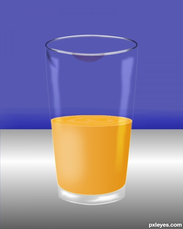
very good job....... but the perspective of the juice is a little different from the top of the glass
true
nice job ! 
Howdie stranger!
If you want to rate this picture or participate in this contest, just:
LOGIN HERE or REGISTER FOR FREE

(5 years and 3675 days ago)
I really like this one.. specially the font effect.. its cool.. good luck author..
imo good technique, colors, font, placements... good luck.
It makes me want to drink an iced orange juice... 
Colorful and juicy, yes. You may want to delete the 2nd L in "real". Good luck!
Edit: fixed 
Thanks!! wazowski one more time you right, now is "real"
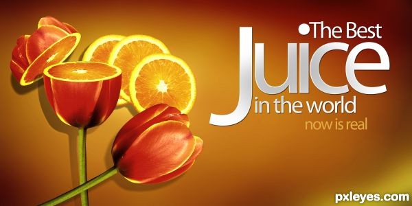
Very nice, but it would be even nicer if I knew what tulips had to do with juice, let alone how tulips make juice real. (BTW I would echo iquraishi's comment on the font effect and wish you had addressed that in your SBS.)
Fabulous work author...one of the best for sure...high marks
I would rather say "The Best Juice in the world is now real" than "The Best Juice now is real".. Either ways if 'now is real' is a part of the other text or separate i think it flows better with 'is now real' .. other than that it's really nice.. GL
niccceee!
Interestingly odd. Looks like a real advertisement, though! Nice one, author.
one of the best
Howdie stranger!
If you want to rate this picture or participate in this contest, just:
LOGIN HERE or REGISTER FOR FREE

I used one external source of girl (jumping)
Thanks to http://www.sxc.hu/photo/1058054, Author: lusi (5 years and 3799 days ago)
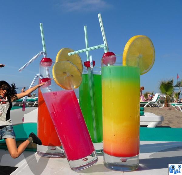
I hope the giants who made the drinks squash her like a bug...
interesting image. is girl suppose to look tiny?
I see what you were trying to do author and it's not abad idea but the girl you used is not the same resolution as the glass and her hand doesn't quite grab the rim of the glass, only noticable in high res.
Howdie stranger!
If you want to rate this picture or participate in this contest, just:
LOGIN HERE or REGISTER FOR FREE
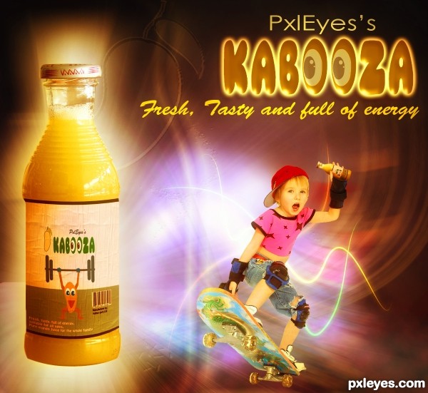
Mango Man is kind of cute. Distorting the source bottle was a nice idea, but the end result is a misshapened, asymmetric container with an ill-fitting label [label's horizon line has wrong curvature]. I don't get why the woman is chest-bumping the bottle while her less-energetic clone looks on in shocked amazement or what the guy in back is looking at/jumping over. All the different type fonts and styles makes for a very busy feel.
Very nice entry author...i like your view,whole image,is filled with brightness and positive energy...and i like to see that in this kind of contests...well done
Nice typo and very interesting color scheme. watermark of mango clipart (between the jumping people) is not jelling with the entire look & feel. good luck
@ DanLundberg. Thanks for your helpful suggesstions. I have made bottle normal shape as it was. Removed extra font. Removed jumping people and added another model

@ Gopan, I have removed mango clip from background
Thanks Erathion for your comment.
This is so much better. The skateboarding kid is consistent with the whimsical logo and cartoon Mango Man, plus being able to see the kid's face is much more involving for us viewers.
Very cute and naïve entry (among a lot of ethilic entries!) Nice...
Congrats for the 4th
Howdie stranger!
If you want to rate this picture or participate in this contest, just:
LOGIN HERE or REGISTER FOR FREE