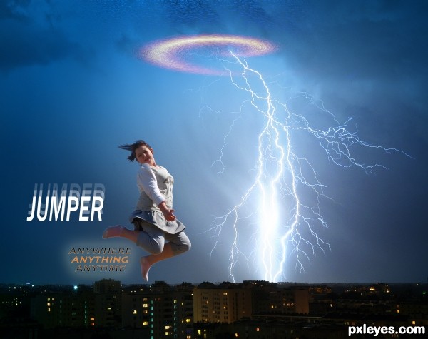
thanks to steved_np3 and aiao-pl for girl and Thunderstorm pics (5 years and 2598 days ago)
- 1: Girl Jumping
- 2: Thunderstorm

thanks to steved_np3 and aiao-pl for girl and Thunderstorm pics (5 years and 2598 days ago)
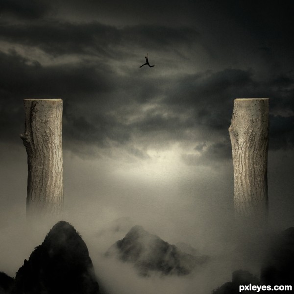
"The greatest risk is really to take no risk at all. You've got to go out there, jump off the cliff, and take chances."
.
Patrick Warburton
(5 years and 3009 days ago)
lol ,very nice idea author..Gl
Good idea, great mood! 
Great surreal work! I love the colors and mood! Very well done!
according to the height its seems is not going to make it. i hope there is a safety net )-:
other then that nice work
Best image in the contest.
Thanks you all for your lovely words.
Howdie stranger!
If you want to rate this picture or participate in this contest, just:
LOGIN HERE or REGISTER FOR FREE
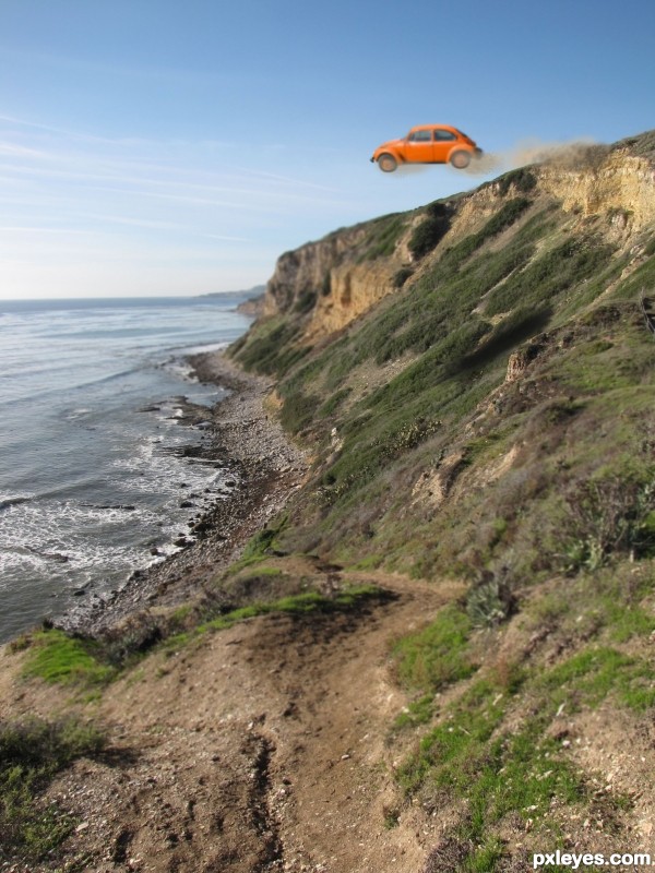
No breaks, he wanted to, life is hard, its an empty car...you choose. (5 years and 3254 days ago)
Howdie stranger!
If you want to rate this picture or participate in this contest, just:
LOGIN HERE or REGISTER FOR FREE
(5 years and 3610 days ago)
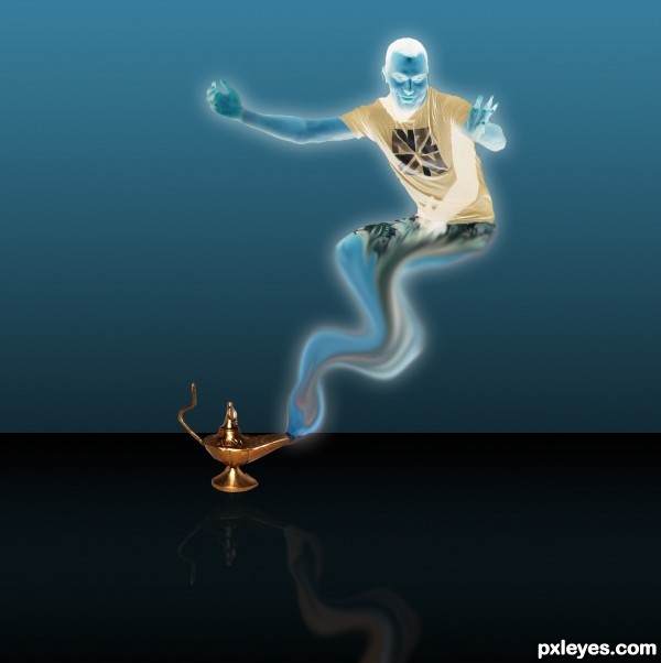
this is really neat, but two suggestions: one, in high resolution you can see that the edges are really jagged--just soften the edges some. two, his left hand (the one we see on the right) needs to be fixed.
nice idea, good luck
Lamp's reflection is wrong... but the whole image is nice! 
nice
Howdie stranger!
If you want to rate this picture or participate in this contest, just:
LOGIN HERE or REGISTER FOR FREE
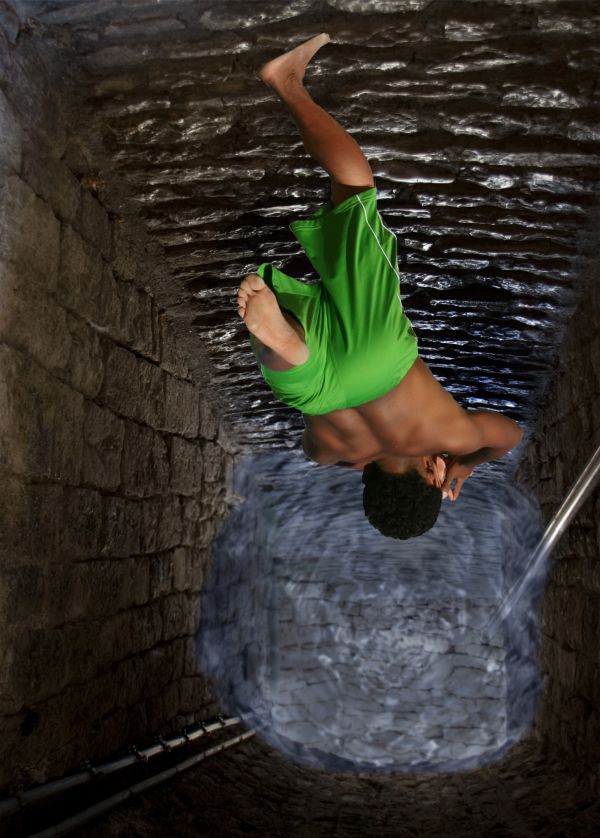
its simple used pic for passage and added water effect to it masked the source and now he is jumping in (5 years and 3731 days ago)
cool idea and good job too 
The water looks really fake but it's a really good idea  You should put it more transparent.
the water, as well as looking fake, is also too light for the depth it is at!
You could have selected a better source picture for the background.. a picture of a well or something. I like the idea, but a lot of more work needed.
great,gl
Well nice idea and nice use of the source but the water beneath if would have been made sort of a twister then it would have been the best....a superman tag on the fellow would also have added some funny part i guess....
Not bad, blur the wter edges a bit, and use the smudge brush to make them, look like they are actully touching the walls...also try making the water a bit darker and his shadow a tad smaller..GL
so what about it now hope to be good than the first one
yes thats better ..good job 
Howdie stranger!
If you want to rate this picture or participate in this contest, just:
LOGIN HERE or REGISTER FOR FREE
IMO the title should be larger & higher. Try to remove the white edges around her legs. You might want to look at real movie posters to get an idea of the format.
I think rainbow effect around lightning is of no use .
hahaaa
Howdie stranger!
If you want to rate this picture or participate in this contest, just:
LOGIN HERE or REGISTER FOR FREE