(5 years and 4022 days ago)

(5 years and 4025 days ago)
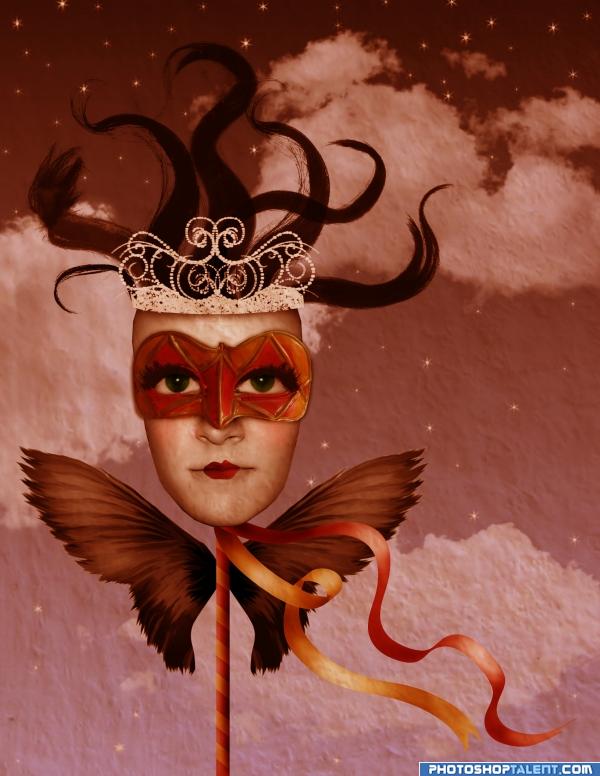
when you added the stars the background went all flat cotton.. if that was your intent.. then kudos.. if now.. you might want to put the clouds back.. I kinda like both versions.. so I'm on the fence.. good luck
i forgot to mention on one of the steps about the texture, it was taken from the wall of the source image. that is what probably makes it flat cotton as golemaura mentioned, so, yes, it was intentional.
Not bad, but the crooked head drives me crazy...
Very nice use of colors and nice composition. 
good work, crown is not in centre.
Very nice...
unique  goodluck!

Nice mood here ilike it good luck!
very nice 
thanks for the comments. fixed the crown.
nice!!
cool 
Wonderful job  Good luck author
looks somewhat surrealistic great imagination
wow.
Just what you need to cheer you up after a bad day! Good work, and high marks from me.
this is so beautiful...
very nice
always good to have a little surrealism in the contests
Howdie stranger!
If you want to rate this picture or participate in this contest, just:
LOGIN HERE or REGISTER FOR FREE
creepy and damn it I love it , well done
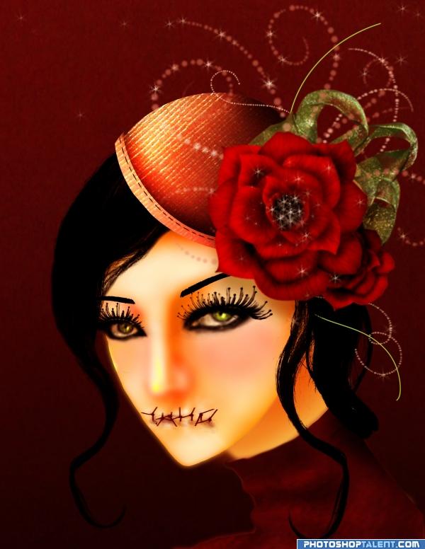
I think the eye lashes are too large, but i like all the rest. Great message
Awesome work here, the eyes are a little blurry compared to the rest of the image but i like it overall. Good work!
I don't know why u decided to spoil this beautiful image with these absolutely horrible lashes and the dreadful stitches.. But overall - LOVE IT!!! I especially love the rose, very very very nice!! Eye make-up needs to be reduced, especially in the inner corners, the low line is begging to be fine. Oh how I love that rose! )
)
great job on making the roses and the girl sketch looks very Japanese like
the eyes have the smokey effect makeup on. was going for a dark, gothic feel to the image , that is why i added the lashes. glad you like the rose
nice job
I love what you did with her mouth. And i say this not because its every males dream, its because its wellcreepy and im familiar with this feeling
Ok, let me put it this way - i LOVE the idea, but with this kind of line it looks sloppy, not gothic schick.. especially with these lashes and it is such a minor thing to fix.. Please don't get upset, author, I only mean well And only bother to try to help u improve the image - I actually participate in this contest myself, so imagine just how much I like your entry that i'm trying to help at my own expence so to say
i am not upset. i appreciate the comment. is ok if you don't see gothic, is fine. sloppy though, i don't agree. i would gladly change the entry if the suggestion was a technical one or a proportion or design problem. i understand that you don't like it and see it as a flaw, i like it that way. not going to change it, but thanks for you concern, i appreciate your honesty. best wishes on your entry!
very nice work. There is something for thinking....GL
great job
beautiful
@ anatole: whats this about every males dream??
I don't mean to offend, but when I look at this image I don't feel like she holding it all inside, but more like she doesn't want anything to come in, because she's anorexic. The colors and overall look are great! Good luck...
nice job author ... GL
thank you for your comments! it is great to see many reactions and points of view on work i've created. btw, she is not anorexic, she is just sad, so many things to say and not able to...
I understand... great image!
Nice work very thought-provoking image super stuff!!
Congratulations for 2nd
Congrats
congrats!!
Congrats!!
congrats!!

Congraaaats ... Nicely done!
thank you all!
Howdie stranger!
If you want to rate this picture or participate in this contest, just:
LOGIN HERE or REGISTER FOR FREE