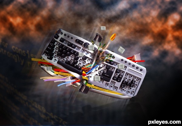
(5 years and 3022 days ago)
- 1: 1
- 2: 2 -holez - thanks to idoloclast
- 3: 3
- 4: 4
- 5: 5
- 6: 6
- 7: Keyboard -thanks to (pinkfloyd)
- 8: blue moiree thanks to costi
- 9: system

(5 years and 3022 days ago)
(5 years and 3093 days ago)
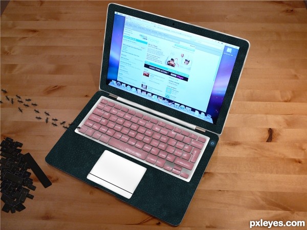
creative use
Howdie stranger!
If you want to rate this picture or participate in this contest, just:
LOGIN HERE or REGISTER FOR FREE
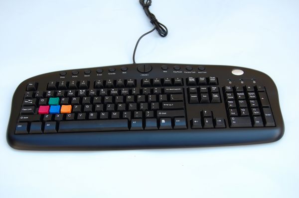
Thanks to vali_bv
Cloning cut out text, warp and scale to fit new keys (5 years and 3672 days ago)
Nice, but: Not clear why the colored keys are colored, let alone why they don't have letters on them. Also, why aren't the numbers centered on their keys (especially noticeable on the keypad)?
maybe the colored keys suggests that the user is a gamer, w a s d being the common movement keys in most games...
Kinda agree with the numbers that are not centered
Check the source -- numbers are not centred on the keys
t's really a nice idea! 
I feel that 101 and 110 on key pad needs a bit of warping..
Nice job...gl
good idea, well done
Made some adjustments to the number pad -- thanks iquraishi
no problem..  it looks really good now..
cool
Looks really good. The only thing I have to say about it is that the zeros are a bit bigger than the 1's so that kinda stands out a bit, to me anyway. Other than that I think it is well done 
Howdie stranger!
If you want to rate this picture or participate in this contest, just:
LOGIN HERE or REGISTER FOR FREE
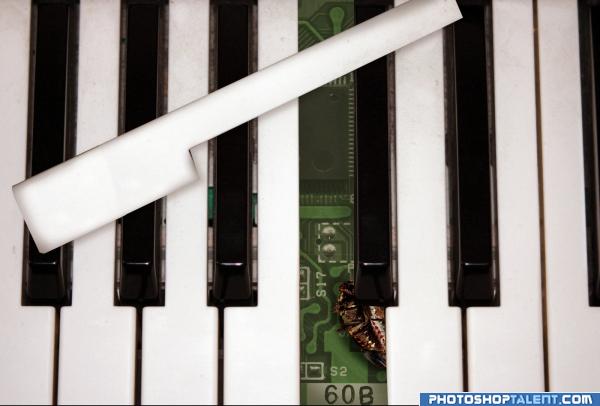
I was confounded that why C note of my keyboard was not sounding, but when I removed that key and found a dead bug, which was causing problem.
Oh yes, after software Debugging now its time for keyboard Debugging ;-) (5 years and 3959 days ago)
whoops..thought the missing key was a toothbrush at first..thank god for high res...love the peak a boo effect.. good luck author...
Clever and Funny....Well Done and Good Luck 
hehe nice!  gl
gl
Very clever and well done.
Greta idea!
nice!!
Good idea...made me smile. 
Kudos for recognizing that the source image apparently was not of an old-fashioned analog piano. The white piano key you claim to have removed seems narrower than the opening left behind. The shadows on the edges of that white key are not uniform and contribute to its fake feeling.
good idea
really awesome technique
now that is good imagination
Nice and clever! Good thinking author, I like original ideas, gl!
Great idea for sure, great work!
Howdie stranger!
If you want to rate this picture or participate in this contest, just:
LOGIN HERE or REGISTER FOR FREE
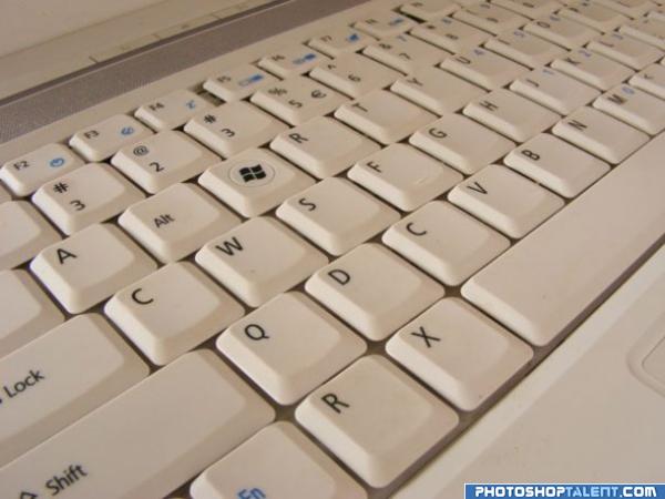
what's with QWERTY? Can i have my own keyboard set? (5 years and 3973 days ago)
welcome back and good luck!
Cool idea!
Lol nice idea! I guess it's a way for us all who uses computers decorate the key's place, anywhere :P
Any reason why you have 2 C's or 2 R's or 2 3's?? That means there are a few missing letters in there somewhere?? Good L ck! 
@animmax: Yeah. I didn't notice that. I guess that's what happen if you make your own keyboard layout 
doesnt stop you doing the rearranging though? just add the others back in - in different places? You may have to use additional sources for perspective?
very cool idea and well done good luck!
 do you need "any key" too?
  just kidding! cool! good luck!
so practical 
Very simple and nice 
hehe awesome 
good
good job and good luck
Very good!
Howdie stranger!
If you want to rate this picture or participate in this contest, just:
LOGIN HERE or REGISTER FOR FREE
I'd use a real background...rendered clouds always look cheesy. Looks good, but I'd add some more flying keys.
Pretty cool !! Have to agree with CMYK46 on the background though !
GL
Not to mention the fact you haven't provided a link to the body of the keyboard.
An improvement indeed author !!
GL
Woooow
Howdie stranger!
If you want to rate this picture or participate in this contest, just:
LOGIN HERE or REGISTER FOR FREE