Photoshop Pictures: Kid


results 1 - 5 of 30

Hiii - created by hereisanoop


Hiii
Favs: 7SBS: 1Hi-resRank: 1/13Score: 72.2% (43)22680 views

Please see in high resolution ..
Drawn in ps with wacom tablet, Used a metal background for the texture to paint the face. (5 years and 1496 days ago)

1 Source:

avatar Verikakis
Verikakis says:

I can see that the tail is ready for communication )), well done excellent work !.

author says:

Thanks for the nice comment Verikakis

(5 years and 1496 days ago)


avatar CMYK46
CMYK46 says:

Good drawing, but it's the perspective that really makes it!

author says:

Thank you bob...

(5 years and 1495 days ago)


avatar Drivenslush

Cutie Patootie Head!

author says:

thanks buddy

(5 years and 1495 days ago)


avatar George55
George55 says:

Lovely creature.... well done!!!

author says:

Thanks for the kind words and fav George

(5 years and 1495 days ago)


avatar madamemonty

Wonderful work

author says:

Thank you

(5 years and 1495 days ago)


avatar RickLaMesa

excellent animation and drawing

author says:

Thank you Rick

(5 years and 1495 days ago)


avatar Mambo5
Mambo5 says:

Well done author! Good luck!!

author says:

Thanks

(5 years and 1489 days ago)


avatar madamemonty

Congrats Anoop

author says:

Thank you

(5 years and 1489 days ago)


avatar George55
George55 says:

Congratulations...beautiful image.

author says:

Thank you

(5 years and 1489 days ago)


avatar oziipop
oziipop says:

Ooooh nice job! Love it!

author says:

Thanks

(5 years and 1489 days ago)


avatar Drivenslush

Congrats!

author says:

Thank you slushy

(5 years and 1489 days ago)


avatar CMYK46
CMYK46 says:

Congrats!

author says:

Thanks Bob

(5 years and 1489 days ago)


avatar nishagandhi

Cool work . congrats. well done!

author says:

Thank you Nisha

(5 years and 1489 days ago)


avatar spaceranger

Congrats Anoop! Really fine work!

author says:

Thank you

(5 years and 1488 days ago)


Howdie stranger!
If you want to rate this picture or participate in this contest, just:

LOGIN HERE or REGISTER FOR FREE


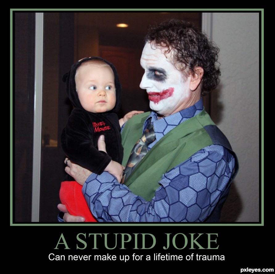
A Stupid Joke - created by rturnbow


A Stupid Joke
Favs: 0SBS: 1Hi-resRank: 13/13Score: 61.6% (0)13565 views

(5 years and 2379 days ago)

No comments yet... Be the first!joker, kid, costume, trauma, halloween

Howdie stranger!
If you want to rate this picture or participate in this contest, just:

LOGIN HERE or REGISTER FOR FREE


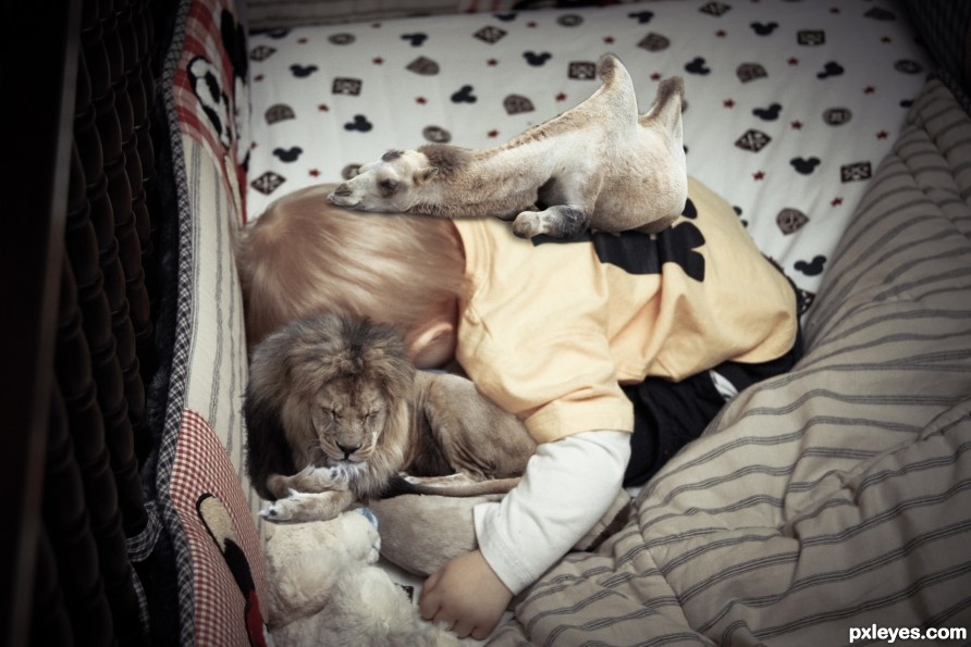
Comfy Cozy - created by rturnbow


Comfy Cozy
Favs: 2SBS: 2Hi-resRank: 6/13Score: 66.5% (2)17358 views

Add a description... (5 years and 2386 days ago)

2 Sources:

avatar kcinsti
kcinsti says:

You might want to soften the edges of the camel to match the sharpness of the surrounding image.

Also when adding shadows make the 'connection' of the two surfaces similar in darkness. i.e. the camel looks a bit like it's floating because the darkness of the shadow you made doesn't match the parts of the camel that are meant to be in contact.

The shadows are about right in strength, you just need to add that much darkness to the camel as well, or lighten it up where it's darker. If you don't understand what I mean (which wouldn't surprise me because sometimes I don't express myself very well send me a PM so I can illustrate.

PS: Just want to help!

no avatar

Hee-hee! Sweet!

author says:

Thanks!

(5 years and 2379 days ago)


Howdie stranger!
If you want to rate this picture or participate in this contest, just:

LOGIN HERE or REGISTER FOR FREE


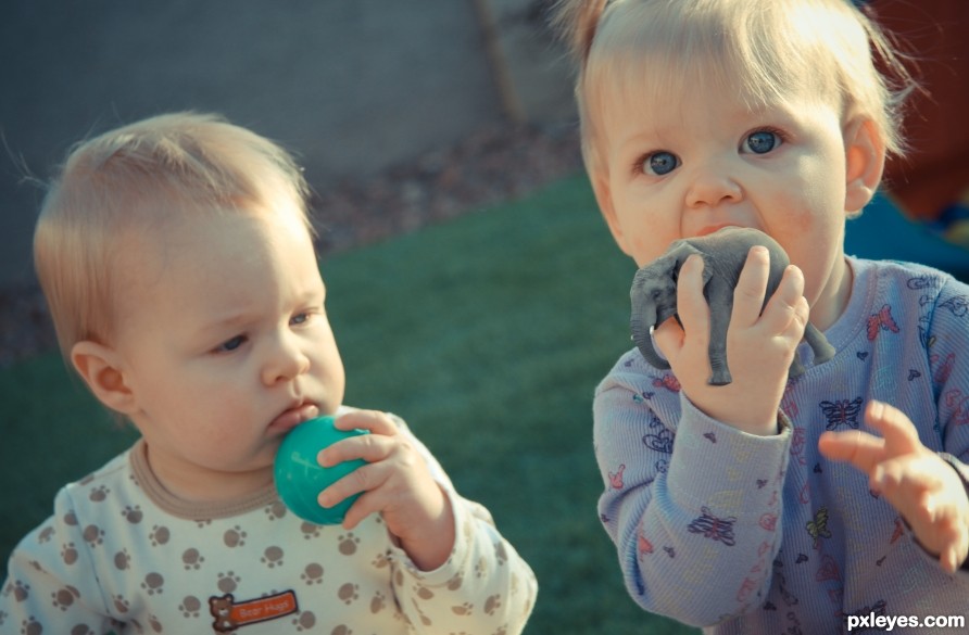
Wanna Trade? - created by rturnbow


Wanna Trade?
Favs: 1SBS: 3Hi-resRank: 13/13Score: 62.6% (0)17435 views

Would you rather lick a plastic ball or a tiny Elephant? (5 years and 2387 days ago)

1 Source:

avatar robvdn
robvdn says:

The shadow of the elephant on the hand is of a color which doesn't fit (give the shadow a darker color of the hand and not gray! A shadow is lack of light on the reflecting object and not a black light projected on that object ).
Another thing which can be improved is that the elephant is way sharper then the hand which makes it stand out.

I do like the photo you used of your children though the expression on the face of the little one fits perfect. Besides that the elephant in the hand is a good find.

author says:

Thanks for the comments. Agree with the shadow, adjusted it. The Elephant is actually not drastically different in noise and blur as the hand, it just stands out more. Note the butterflies on the shirt, they look less blurred as well. Blurring that size element at 1 pixel can make a big difference.

(5 years and 2388 days ago)


avatar kcinsti
kcinsti says:

I think the issue isn't sharpness it's the levels of darkness/shadow

no avatar

No.....!!! Don't eat him! I wonder if elephants taste like peanuts? LOL. This is cute. Great idea.

author says:

Lol, they taste like chicken, but she's only sucking on him, no worries!

(5 years and 2379 days ago)


Howdie stranger!
If you want to rate this picture or participate in this contest, just:

LOGIN HERE or REGISTER FOR FREE


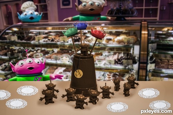
Alien Kid in a Candy Shoppe - created by rturnbow


Alien Kid in a Candy Shoppe
Favs: 0SBS: 6Hi-resRank: 2/13Score: 66.3% (32)27637 views

(5 years and 2404 days ago)

3 Sources:

avatar Chrys Rizzo

sweet, why most winner at photoshop contest are authors of dark compositions? I love to see something in this way. Good luck

author says:

It is "sweet", lol. Thanks for the kind comment.

(5 years and 2404 days ago)


avatar Chrys Rizzo

Very nice and deserved. Nice week for you!

author says:

Thanks once more!

(5 years and 2399 days ago)


Howdie stranger!
If you want to rate this picture or participate in this contest, just:

LOGIN HERE or REGISTER FOR FREE