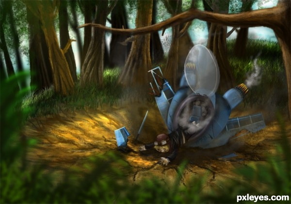
No outside sources used.
Don't worry, he's not dead :] (5 years and 2974 days ago)
(5 years and 3009 days ago)
reminds me of anime  good luck!
Nice work.
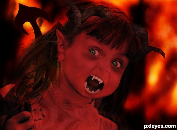
this lil devil looks more scared then anything lol :P
Howdie stranger!
If you want to rate this picture or participate in this contest, just:
LOGIN HERE or REGISTER FOR FREE
(5 years and 3025 days ago)
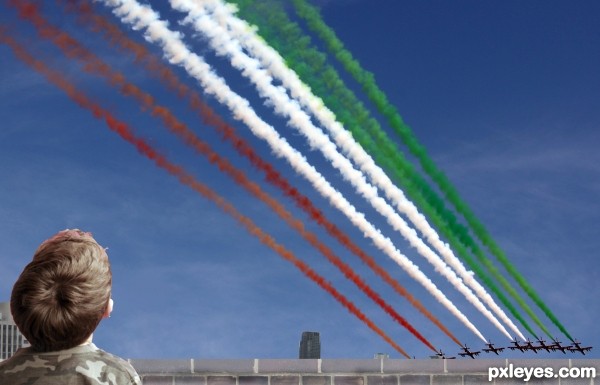
Don't use the magic wand for selections, use the pen tool or lasso tool. You have plenty of time to clean this up and resubmit.
LTL LAZY THATS Y 
I DNT KNW WAT U MEAN
Don't use ALL CAPS...it's considered shouting, and rude. And text speak isn't so great either.
oh i am sorry i didnt know that caps ve some meaning like that
Nice image author!
try to blend a little more the cute boy,with the rest of image
some color balance..would help.
i ll try thank u

Howdie stranger!
If you want to rate this picture or participate in this contest, just:
LOGIN HERE or REGISTER FOR FREE

original image: http://www.pxleyes.com/photoshop-picture/4e3ae3c4c4bac/The-Words.html (5 years and 3078 days ago)
Well done 
magic entry author.. right on theme... original collector of stock images made a great choice and you have done them a great service. .
Beautiful re-work, excellent image!
Wow! I couldn't believe you made my old entry more beautiful... Really awesome author. Best of luck!

Bravo koukla, excellent work! Congrats!!!
congrats on 2nd , a close race- all great entries
Congrats
Nice Congrats
Howdie stranger!
If you want to rate this picture or participate in this contest, just:
LOGIN HERE or REGISTER FOR FREE
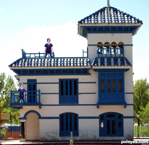
i used the erase too and i a little imagination and made it look like his in the house lol (""kinda')
i got my resource from http://www.morguefile.com/archive/display/631390
witch was free to use/.:D (5 years and 3089 days ago)
Using a Noise/Blur/filter on the boy would help in blending (to match the source image) be aware of his size as well, he's looking quite cut and paste at the moment, which can cost you vote score..(his lack of shin and feet is a bit weird) the concept is interesting, just needs a little tender care to blend better.. (you may want to delete the BRIGHT edges around him or at least burn the edges so he looks INSIDE the house.. the same with the boy image on the second floor, as his outer brightness could blend better.. good luck though and as always IMHO
follow up Drivenslush.what he tells is really helpfull for you.
Howdie stranger!
If you want to rate this picture or participate in this contest, just:
LOGIN HERE or REGISTER FOR FREE
That looks absolutely stunning! Is there any chance that the guy there is ezrael? Lol xD
Wish i had that talent great chop.
WOO HOO, Finding Nemo meets Shrek LOL great illustration
Nice drawing! However, I can not see much of the original image,
great
Thanks for the feedbacks! @ MijongE If you look at the SBS, you can see the plane is not painted but chopped from original source image
Pretty cool illustration and use of parts of source, could be used in a kid's book.
congrats
Congrats Kid awesome work
@Kid I know you used the source. You did an amazing job but maybe its a personal preference but I like images more where I can actually see the source image without looking at the SBS (in this contest for example the players or a football theme), otherwise it is more like a drawing instead of a photo manipulation. Anyway congrats
Thanks!!
@Mjonge I guess it is personal preference because I find that entries that use sources in a creative way (not just cut and blend with other photos which is what you're talking about) are usually more appealing and stand out more from the other entries.
Howdie stranger!
If you want to rate this picture or participate in this contest, just:
LOGIN HERE or REGISTER FOR FREE