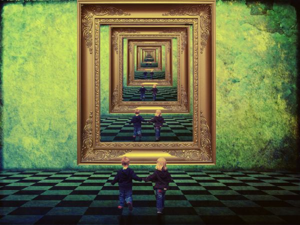
Comment... =] (5 years and 3668 days ago)
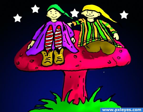
I thought it would be fun to redraw the mushroom reflection. I traced the picuture, transformed shape, and colored it in. My daughters picked the colors. (5 years and 3791 days ago)
Very cute! Also nice colors. Good luck 
Definitely a unique take on the theme.
and the source is???
and the source is???
why would the author need a source for this image?? It is clearly just the image from the themepost.
very nice 
Congrats, nice work 
Congratulations on 1st place. Nice job!
Congratulations for 1st
Congrats for your first place, Blaine!
Congrats 
Wow, 1st place (just as I thought  ) Well, congratulation!
Howdie stranger!
If you want to rate this picture or participate in this contest, just:
LOGIN HERE or REGISTER FOR FREE
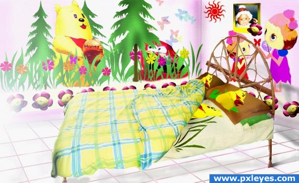
tried to create something different.suggestions & comments are most welcomed.i lack in shadows so plz do suggest any improvement in that area if u feel so.
Thanks to www.freeimages.co.uk for the image of the bed.
(5 years and 3863 days ago)
good idea, although it looks more like a hospital room, i have to say. Maybe try adding some sort of carpet. just to give it a more cosy feel. Good luck!
thanks for the comment.i will definately add one and make the changes
I had Winnie the Pooh wall hangings when I was a little kid. My Winnie held balloons, too!
Very nice creation. I think a floor element of some type would pull things together and make the other things really pop.
I love this idea!
Howdie stranger!
If you want to rate this picture or participate in this contest, just:
LOGIN HERE or REGISTER FOR FREE
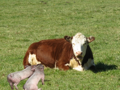
Bebe's kids on the loose again..Where's their mother!
Thanks to Julie Wenskinski for the cow at freedigitalphotos.net
(5 years and 3876 days ago)
cool pic! awesome!
Howdie stranger!
If you want to rate this picture or participate in this contest, just:
LOGIN HERE or REGISTER FOR FREE
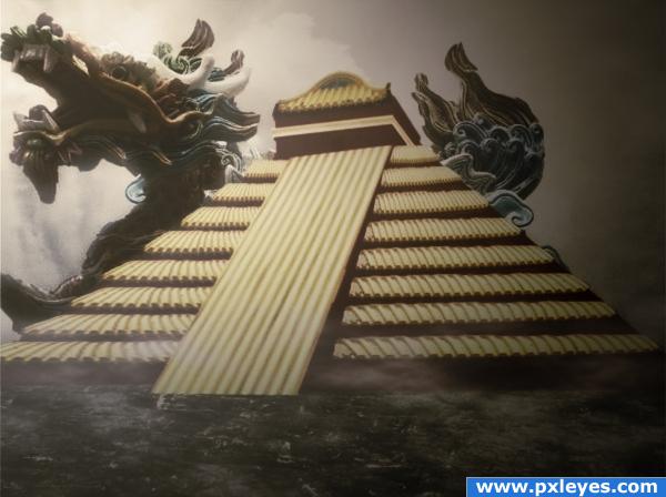
I saw a kind of Chinese influence
Thanks to Jayne Shives,
~Atropo-Stock and
~vio-stock
all from Deviant art... (5 years and 3878 days ago)
i have now notified the stock owners that i've used their pieces as you can see in the final step of my SBS, i did the same thing for the 4th source too.
i like the feel of this.. very effective. Good luck!
very awesome!
Looks very nice, i think you should add some more saturation/vibrance tho 
good idea!
Interesting image, but there should be steps on the ramp leading to the top of the pyramid...
neat
I loke how you used the source and how everything fits together; the foggy atmoshere is like the cherry on a cake
Congrats for your third place!
Congrats!
Congratulations for 3rd
Congrats!
Howdie stranger!
If you want to rate this picture or participate in this contest, just:
LOGIN HERE or REGISTER FOR FREE
I like this one very much! The background gives it a magical feeling. Love to see a high res.
VERY nice, indeed! Hansel and Gretel come to mind, for some reason.
looks good
Beautiful.
Why did you change the background? I actually liked it even better before.
If childrens were not repeated ...it would have looked like a door way...which would give better meaning to it....
The pxl team tell me that i must change the backround because :
The image used for source 2, the floor and curtain, has been manipulated and enhanced by the author. Rules state:"DON'T use an image that has been previously manipulated into artwork, satire etc, even if it is offered under creative commons." You must replace that image with one that has not been manipulated and is also free of copyright.
Nice image, obvious background though, nothing really surprising, good luck author
It would have looked better if the repeated image were more centered as it repeated but it's not too obvious. GL!
I like this very much...good luck author
Howdie stranger!
If you want to rate this picture or participate in this contest, just:
LOGIN HERE or REGISTER FOR FREE