(5 years and 783 days ago)
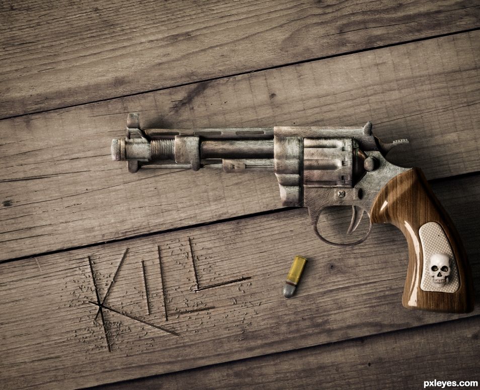
- 1: metal texture
- 2: wood
- 3: wood2
- 4: skull
- 5: bullet
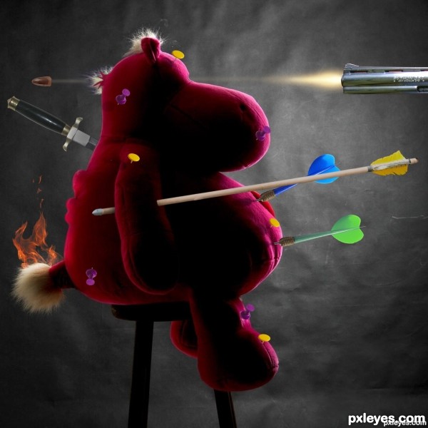
Quentin Tarantino's sequel to the Kill Bill movies. (All in fun, of course). (5 years and 2748 days ago)
Whoa you must have a mean streak, hope it made you feel better, LOL, Nice work
nice 1
LOL this a sequel to Death to Smoochy.
Howdie stranger!
If you want to rate this picture or participate in this contest, just:
LOGIN HERE or REGISTER FOR FREE
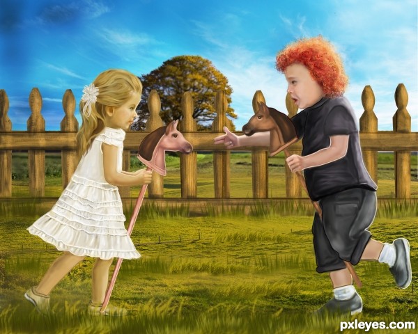
Bang Bang(My Baby shot me down) by Cher. The same year, the song was covered by Nancy Sinatra.
This song was used in the opening scenes of the 2003 movie Kill Bill Volume 1.
I was five and he was six
We rode on horses made of sticks
He wore black and I wore white
He would always win the fight
Bang bang, he shot me down
Bang bang, I hit the ground
Bang bang, that awful sound
Bang bang, my baby shot me down. (5 years and 2785 days ago)
Cool one..., love it
Thank you Anoop
awesome 
Thanks 
Looks very good, well drawn. I like the bright colors.
Really appreciate the comment and fav 
Congrats, this is so cute 
Thanks a lot guys for the votes/comments/favs 
Congrats, well done!!
congrats 
Howdie stranger!
If you want to rate this picture or participate in this contest, just:
LOGIN HERE or REGISTER FOR FREE
(5 years and 2983 days ago)
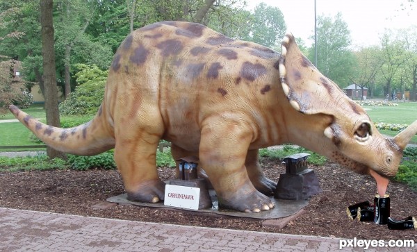
Whatever you wrote on the sign is too small to be visible. Post a hi res image.
Oops it says on sign ... " Caffineasaur"
thanks for comment will figure that bit out :OD
lol! funny and original one! I also imagine it drinking the coke with a straw and also makes me laugh!
Howdie stranger!
If you want to rate this picture or participate in this contest, just:
LOGIN HERE or REGISTER FOR FREE
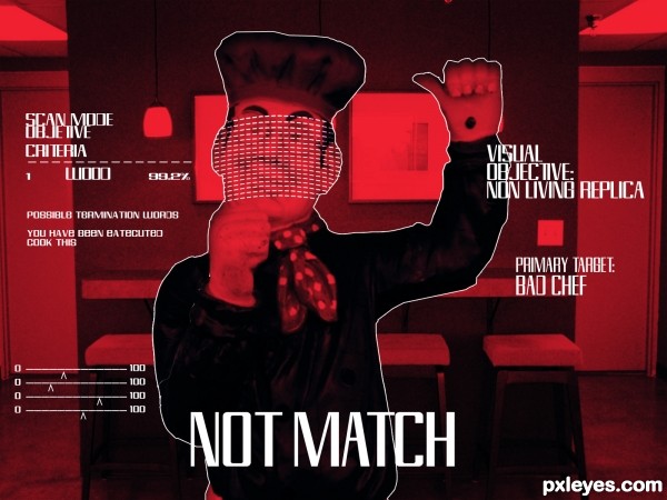
Sent to the pass terminated a famous bad chef (5 years and 3019 days ago)
Creative idea. However, the small chef seems out of place with the size of the background and gets overwhelmed by the text. And why isn't the target symbol centered in the image if this is the view through the aiming scope of a weapon? The font for the text is cool except it doesn't fit the stereotypical Courier-type font I've come to expect computer-aided weaponry to 'talk' to the user in [based on the movies I've seen], but then you haven't used the classic (tired?) green night-goggle look either.
believe me ive seen all of t movies and its the font that fits with t2. I'd thank bout the chef size i gonna fix it. The scope is searching for a heart buts a wood replica. I gona think about thanx for comment!
The new bigger, clearly-foreground chef is more realistic to my mind. The grid-like thing over his face is inspired. I think putting that over all of the chef would hide the fact that he's not real. And bringing back the target symbol in the perfect middle of the image would provide a context for all the text. [The shooter (viewer) is still in the process of aiming so the crosshairs need not be perfectly on target.]
I love the "non living replica" part lol
I love the "non living replica" part lol
Howdie stranger!
If you want to rate this picture or participate in this contest, just:
LOGIN HERE or REGISTER FOR FREE
Good texturizing...the shiny wood grip seems incongruous with the funky metal, though.
It's a restauration
Happy Texture Work!!! It almost looks like dusty chocolate.. woo HOO!!!
Nicely done but I agree with CMYK about the handle being too shiny.
I like the scratched text effect in the wood. Well done.
Good texture work.
they say that when an image touches you on an emotive level that you have created art. I really hate this upload and the message KILL.... especially with all the killings going on in the news. It makes me hate guns....however, it is for this very reason, the reason being that I have been affected by the message that makes this a really strong image, full of impact. As far as the photoshopping goes, it looks good but can you see how that shiny handle is incongruous to the whole ?
Howdie stranger!
If you want to rate this picture or participate in this contest, just:
LOGIN HERE or REGISTER FOR FREE