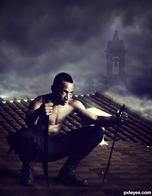
Thanks to mjranum: http://mjranum-stock.deviantart.com/ (5 years and 3092 days ago)
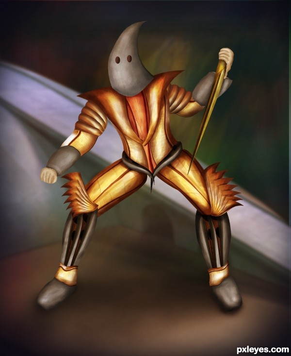
Only source used (5 years and 3194 days ago)
Cool concept.

The anatomy is somewhat off - Hands too small, eye holes too high, legs disproportionately and inconsistently fat/thin, but a creative idea.
Howdie stranger!
If you want to rate this picture or participate in this contest, just:
LOGIN HERE or REGISTER FOR FREE
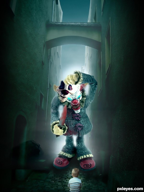
thanks to
fodor
&
annalog85
(sxc.hu)
(5 years and 3268 days ago)
Scary stuff. Nice job!
Nice work!
Howdie stranger!
If you want to rate this picture or participate in this contest, just:
LOGIN HERE or REGISTER FOR FREE
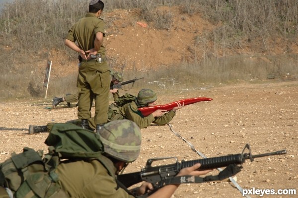
source picture is mine to use. (5 years and 3508 days ago)
simple and funny,.....LOLs.......
Ha! The best part is the guy in the foreground...you can almost see his expression... nice job on the chop too. My only little suggestion (after looking at the hi-res) would be to add some shadows on the pepper at his hands, and possibly on his arm, where the pepper stem flares up. Good luck author! 
Good idea. Soldiers can try this in war-fields.
Very good work and idea. GL ! 
Humorous, simple & effective....that gets my vote everytime
Spicy gun LOL! 
ahahahhahaahhaha great imagination!
Congrats for another third place! 
Congrats!
thanks everyone!
Congrats!!
Congrats 

Congrats
Congrats!!
Howdie stranger!
If you want to rate this picture or participate in this contest, just:
LOGIN HERE or REGISTER FOR FREE
(5 years and 3520 days ago)
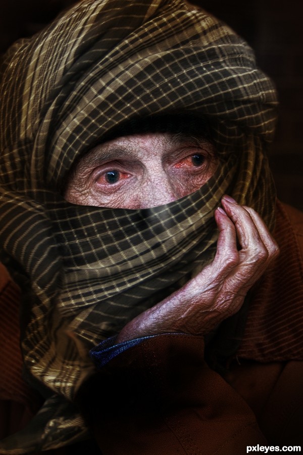
Great idea, but in high res there are a lot of bad edges, and hair from his beard showing, like on his palm. Take some time to look this over & do some cleanup, and you'll have a great image. 
CMYK46 _ Thanks for the guidance ! Image has been fix
Look over the high res again. There's a bad edge on the head scarf on his nose, and more of his beard showing at mid left, as well as a transparent edge where 2 parts of the scarf overlap.
I think you didn't need to touch on the sleeve.
Man give the poor guy some eyedrops hahaha
Image I've tried to fix up again. I think now would be fine.! Thanks all for comment .
Oh yeah IRONCOW I'll give it eyedrop ...ha ha ha
very cool...he is a thirsty day walker...
Howdie stranger!
If you want to rate this picture or participate in this contest, just:
LOGIN HERE or REGISTER FOR FREE
this is an awesome composition. the color tones are perfect for this manipulation and i personally loved that foggy background with the church bell tower etc.
lighting is awesome
Thank you for your effective evaluation!

It is very important to me. Thanks!
nice work.. Liked how you blend church in the clouds.
Ù‹WWWOOOOOOOWWWWW Perfect
Thank you, Sukh and Mina!
Your shadows and lighting are brilliant, nice composition
Thank you, stacer!!
A well done masterpiece if I were to say. Agree with @Everyone, the tones are just perfect. Good luck author
Thank you very much, nbaztec!
Nice mood author..
Thanks Jordy!
Well fit and dangerous guy
Thanks Cornelia!
Another winner!!! Congrats!
Thank you, dear!
Congrats!!
Howdie stranger!
If you want to rate this picture or participate in this contest, just:
LOGIN HERE or REGISTER FOR FREE