Photoshop Pictures: King (page 6)


results 26 - 30 of 69

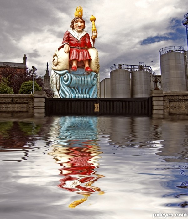
King Arthur - created by Dubhy63


King Arthur
Favs: 0SBS: 4Hi-resRank: 6/11Score: 58.5% (0)4699 views

The 'sea king' was cut out with Vertus Fluid mask.
Adjustment layers for :
- shadows & highlights
- brightness & contrast
- hue & saturation
The water was created with the Flood plugin

Sources used:
Sea King image and own stockimage. (5 years and 3101 days ago)

avatar arca
arca says:

Very interesting image!

author says:

Thank you,I use Photoshop mainly for photo editing,but try do a bit of 'art' at times.

avatar CorneliaMladenova

Nice work on the reflection

author says:

Thank you,the reflection refers to life outside the safe walls,in the legend of King Arthur and in modern life.It was/is more or less plain sailing inside the walls of Camelot / brewery,it was/is a different story on the other side of the gates.

avatar valzart
valzart says:

Very unique! but would have liked to see a more romantic backdrop for him ;D

author says:

Things can get romantic after a few pints of the black stuff ;D

Howdie stranger!
If you want to rate this picture or participate in this contest, just:

LOGIN HERE or REGISTER FOR FREE


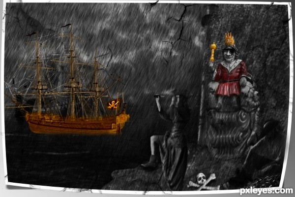
King Of Pirates - created by sasikanth123


King Of Pirates
Favs: 0SBS: n/aHi-resRank: 11/11Score: 56.2% (0)7965 views

thanks and credits to NovStock,mizzd-stock,Fairiegoodmother,mjranum-stock,PirateLotus-Stock,CAStock,Moonchilde-Stock (5 years and 3103 days ago)

7 Sources:

avatar MossyB
MossyB says:

This image is very inconsistent and poorly put together. The perspective and proportions of the skeleton are too stretched. The entire image looks like it is being projected onto a gauze curtain (is it supposed to be raining?) and the woman and lighthouse are totally out of place for the image - They are both lit from the left, while the skeleton in front is lit from above, the sea king is lit from the right top, and the ship is lit from the mid to lower right. The figure in the lower RH corner is backlit and almost impossible to clearly make out at all.

It's an interesting concept, but it needs a lot of clean up with more attention to detail.

avatar Hayato
Hayato says:

Ouch, MossyB, really ouch... but agreed with the corrections. Esp the fire... I don't know how to describe, a little yellowish white of true fire would make those fires realistic.

Agreed with the interesting concept. Looks so glooomy though. Good luck~!

author says:

tried and changed the fire....@Hayato,MossyB's comment is made on the image which i changed entirely.........thanks for the suggestions guys. actualy iam new to photoshop and also new to pxlyse.

avatar MossyB
MossyB says:

Hayato says:
"Ouch, MossyB, really ouch..."

That's exactly my sentiment! Since this is a competition, rather than a display website, entries need more attention to basics like lighting and composition and consistency...
Getting rid of the lighthouse and the stretched skeleton helped the composition a LOT, but the woman is still too brightly lit from the opposite side of your other main elements. Her leg could be a lighthouse by itself...

The rain looks much better, but the yellow smudgy strokes in the corners are distracting, and the totally desaturated image except for the king and the yellow smudges does not give the image an overall integrated feeling.

Better, though.

author says:

thanks MossyB, i have worked on it.....

avatar MossyB
MossyB says:

Really better now! Good effort!

avatar hereisanoop

thumbs up to mossy... good luck author

author says:

all credits to mossy....

Howdie stranger!
If you want to rate this picture or participate in this contest, just:

LOGIN HERE or REGISTER FOR FREE


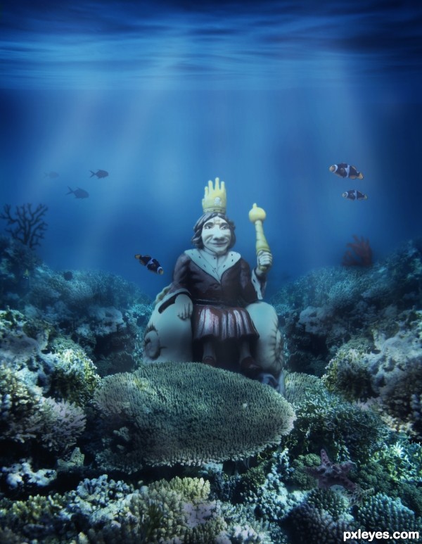
King of the seabed - created by theodosiou


King of the seabed
Favs: 0SBS: 3Hi-resRank: 4/11Score: 60.5% (20)11810 views

(5 years and 3106 days ago)

5 Sources:

no avatar

nice ocean colours and floor choice.

avatar enblanco
enblanco says:

Well blended, GL!

avatar RIPSAW
RIPSAW says:

author says:

Many thanks!!!

Howdie stranger!
If you want to rate this picture or participate in this contest, just:

LOGIN HERE or REGISTER FOR FREE


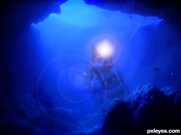
submerged sea king - created by lbadge320


submerged sea king
Favs: 0SBS: 5Hi-resRank: 9/11Score: 56.7% (0)7264 views

(5 years and 3107 days ago)

1 Source:

no avatar

love the cave, nice water colour... personally, i find the bright light a little distracting.. maybe a sparkle instead...

NOTE: that your entry is great just the way it is ...and the light is just my opinion.

author says:

Thanks, appreciate your feedback.

avatar enblanco
enblanco says:

Nice point of view, GL!

Howdie stranger!
If you want to rate this picture or participate in this contest, just:

LOGIN HERE or REGISTER FOR FREE


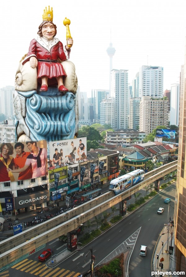
king of city - created by wooyuenfoo


king of city
Favs: 0SBS: 1Hi-resRank: 7/11Score: 57.7% (0)4693 views

(5 years and 3108 days ago)

avatar MossyB
MossyB says:

The sky is too bright, appearing almost white (overexposed).
The statue is also too forward facing in comparison to the rest of your background.

Edit>Transform>Skew would help you adjust to face a bit more to the RH side for better consistency.

Howdie stranger!
If you want to rate this picture or participate in this contest, just:

LOGIN HERE or REGISTER FOR FREE