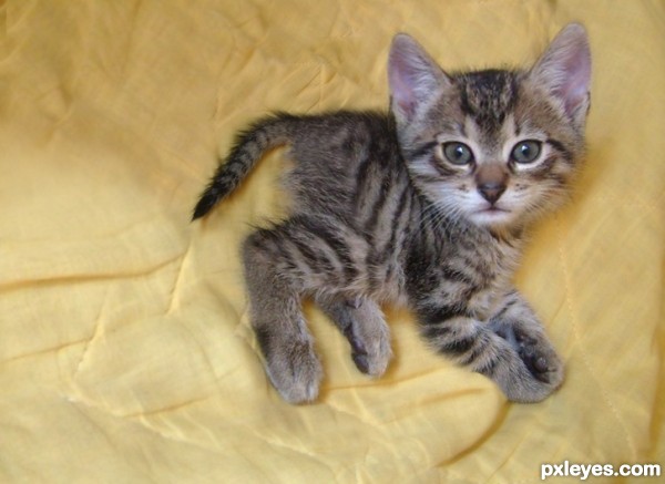
Only one left. (5 years and 2841 days ago)
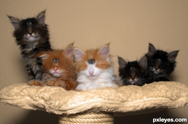
(5 years and 3120 days ago)
this is so ccccuuuuUUuuUUUuUUUUTTttttTTTTTEEEEEeeeee... hehehe
Good job removing the existing eyes. The cyclop eyes are less convincing. Skulls have eye sockets. The cyclop eyes just look pasted on.
try to make some eye socket, hope it looks better now, any suggestions welcome 
high five for this one.-- all in favor say eye.
very very cute.............. 


Howdie stranger!
If you want to rate this picture or participate in this contest, just:
LOGIN HERE or REGISTER FOR FREE
(5 years and 3170 days ago)
Kitties!!!
I'm a cat person, so almost any image with a cat or kitten gets my attention...
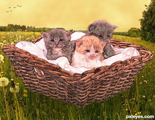
This came out well, the texture of the basket weave is very nice!
thx Mos, im a cat lover to, thats why i choose this image 
Howdie stranger!
If you want to rate this picture or participate in this contest, just:
LOGIN HERE or REGISTER FOR FREE
(5 years and 3540 days ago)
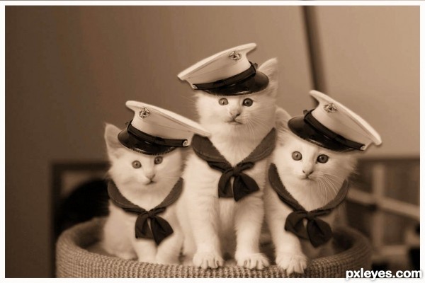
Quite cute, but I wouldnt point the hats all in the same direction. Also, I'd remove the dropshadow and instead only some shadow from the hat on their heads. Good luck!
Yep, I agree with Waz; changing the directions you make them more natural looking, and the kitty on the left is OOF, so hat also has to be a bit OOF. GL! 
I totally agree with the others. Use your edit/transform/flip horiz. tool to turn at least one of the hats the other direction. Rotate will also help give a different angle to one of them. Will make a world of difference in a really cute entry. GL
thanks all for comments I have changed it
hmm you should flip the hats on the first two cats. and make them slightly bigger
Cute little kitty kitties, I like the way you did the scarf's around their necks. Nice idea. 
Very nice and cute work...blur the hats just a bit to match with the cats...best of luck author
AWWWWWWWWWWWWW!
Howdie stranger!
If you want to rate this picture or participate in this contest, just:
LOGIN HERE or REGISTER FOR FREE
(5 years and 3550 days ago)
Cute... 
i like this, maybe make the cat's head coming out of the bulb and increase its size just a little
This is really cute 
this would look better if you cropped around the kitten to draw more attention to it
Why the zipper? The cat's head could be coming out of the bottom opening.
Thanks for the comments and votes, I considered having the kitten coming from the bottom of the bulb as CMYK mentioned but i just wanted to add something more so i went with the zipper.
add some concrete shadow on the mouth and nose of the cat, make it gradient from bottom to head and fading in it's way upward, cat can not be so lightened in it's current case, good luck 
Howdie stranger!
If you want to rate this picture or participate in this contest, just:
LOGIN HERE or REGISTER FOR FREE
tiny hiney!
Yes it is, lol.
fine..
for the autor
http://www.youtube.com/watch?v=L6yzjDXp_og...a joke
lol, I think this kitten was in there.
That is a cute little guy....I am sure you will sell them.... Good luck author...nice job!
Howdie stranger!
If you want to rate this picture or participate in this contest, just:
LOGIN HERE or REGISTER FOR FREE