NOTE: This entry has been edited, so it no longer features external sources. Instead, it's been applied a little noise on it. (5 years and 3237 days ago)
(5 years and 3623 days ago)
What does this have to do with the contest theme?

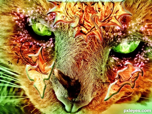
Lol Hello Kitty turned into Hell Kitty?
Hmm... I think you'll affect some cat lovers here... and they aren't few.
sigh
for waht reason
kevin
do wahtever u wanna
good goes bad
good goes bad
good goes bad
good goes bad
Relax author, as long as you are happy with your entry that is all that matters.
http://www.youtube.com/watch?v=TBENS3GL4nY&feature=fvw
grrrrrrrrrrrrrrrrrrr
relax relax
relax relax relax relax
phew
as long as you are happy with your entry that is all that matters.
thanks alot
now i know what i should do
big smile
im happy that i made it throught my skill, my imagination
done and done
big smile
I see the idea behind this image, even though it's not eye catching. I have few suggestions, maybe they are helpful to you:
(1) the use of blending options in this kind of work normally don't make the nice effect (shadow, glowing, etc.), because they looks very artificial and they add the uniform effect on the whole layer. You can do the same thing by brush (that's the way I always prefer to do), if you have a tablet, that'll be great.
(2) I saw that you use the brush to colorize the eyes, but we still see the rough edges of the brushes. I suggest to use the low opacity, low flow brush, so each click of your mouse doesn't make noticeable effect on the image. With that setting, you can control the intensity of the color easily and it's like you're painting, just cost you a bit more time to repeat the action.
(3) to make the glowing dusts, you can use the scatter setting in the brush setting. Notice that to make the nice glowing effect, just choose the Range of 100%, so the light from the object will be gradually reduced from the center to the out side.
Keep trying, we're here to help.
who sees, from which side and where .... so .. keep working. GL 
not bad
Howdie stranger!
If you want to rate this picture or participate in this contest, just:
LOGIN HERE or REGISTER FOR FREE
(5 years and 3635 days ago)
Great blend...really dramatic image! 
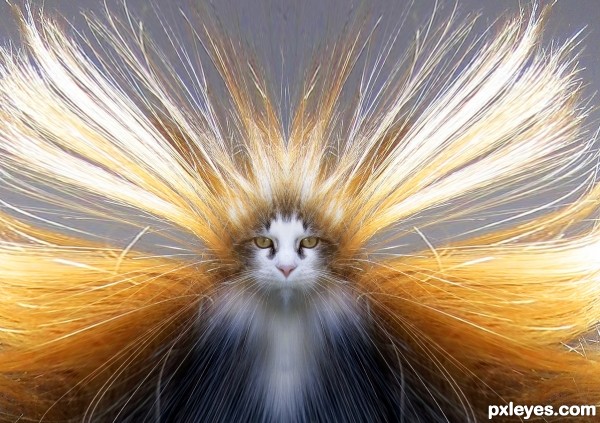
great but way too simetrical ...
it is very nice and sweet ,good luck
Electrical cat! Nice one...
good luck !
Yeah.. it's a bit symmetrical. But not that much of a problem. I would lose the hair below its eyes and show some ears to make it appear a bit more realistic. Very nice idea and indeed a dramatic effect..
wow, i like it its very cool
Hahahaha....fantastic...extra points for humor author...well done
Nice blending and cute kitty. 
I'd hate to see the face on the groomer LOLOL.. great job
so cool and dramatic!
LOL, static cling to the max!
very nice work
talk about having a wild hair day. GL!
Cute.......Nice job Author. G/L.
Howdie stranger!
If you want to rate this picture or participate in this contest, just:
LOGIN HERE or REGISTER FOR FREE
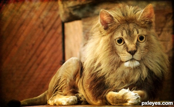
Here I used photo filters to match the colors of both pictures. Next I blended the two pictures together. I used transform to match up the pictures, and I earsed all the unwanted parts. My final touch was a texture. (5 years and 3665 days ago)
very well blended
hahahaha lol
Haha, great result, my suggestion would be to draw the whiskers back in. Other than that you've done great!
Thanks and you're right, I didn't noticed the luck of whiskers.
Funny lion! With cat's eyes it got cartoonish! 
very nice
i love this, very nicely done! this could also fit in nicely to the "compeact animals" comp should you happen to be 8+ oc, all the best 
Thank you very much =)
Nice thought and nice work...
Gud.. I love this.......
Good blend.
Congrats, EmiK! 
Congratulations for 2nd
Congrats for 2nd
Howdie stranger!
If you want to rate this picture or participate in this contest, just:
LOGIN HERE or REGISTER FOR FREE
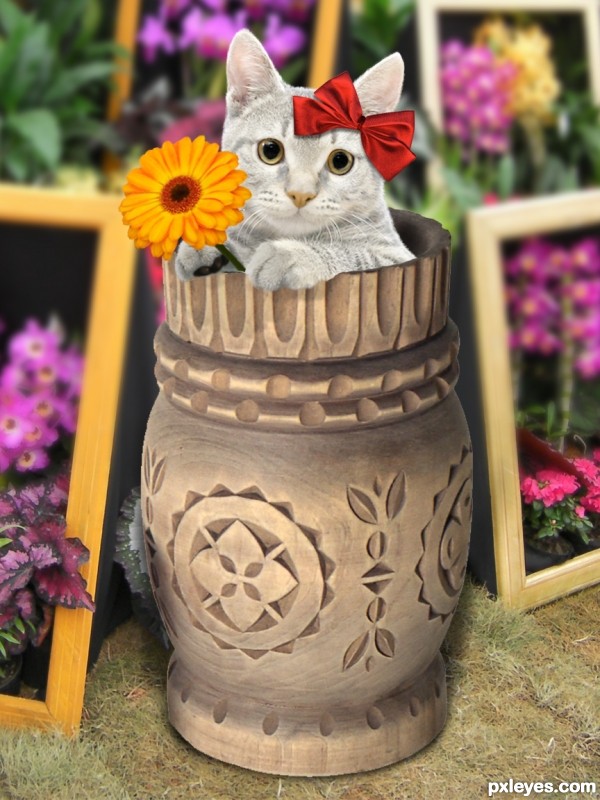
Thanks to:
- Aleksandr Popov @ Photoxpress;
- Ale Paiva @ sxc.hu.
Two images are from my personal stock. (5 years and 3666 days ago)
I like how you changed the color of the fur, and the flower and bow, really cute.
Cute 
Aww ain't that special, I'm liking it 

Cat is too desaturated.
@ CMYK: I think you're talking about the two layers over cat image... 
Howdie stranger!
If you want to rate this picture or participate in this contest, just:
LOGIN HERE or REGISTER FOR FREE
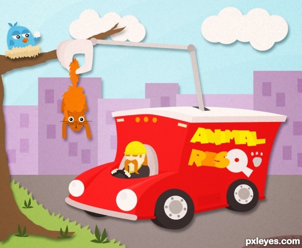
This is cute, but would have been better if the newspaper ads were about pets, rather than real estate...
Hehe I know, but sources weren't so gentle this time!
Very cute. I find the newspaper ads distracting. I'm not so keen about the paper texture either, especially when it makes it appear that the tree, grass, road, truck, skyline, and sky are the same piece of paper and not different layers after all. I prefer Step 8 (with maybe slightly stronger shadows).
Granted! No more textures! How is it looking now?
Nice to see the newsprint gone. It's a lot cleaner looking.
I like the stronger shadows but the texture is still distracting 'noise' to me. I think the texture needs to be just barely noticeable so the surface doesn't seem to be quite perfectly flat. I would also like the different blue bands in the sky shine through. (More contrast could add more punch overall.)
On closer scrutiny, why doesn't the claw 'thumb' cast a shadow on the squirrel tail? And the truck driver could cast some shadow on the truck.
My concept was to have something like pieces of paper that together forms the image. The truck plus the driver and the claw along are a layer, the cat's another, the bird's another... you get it. The shadows are there because without them I found my composition pretty dull, same for the noise filter.
Thank you! That was the idea
nice ......... nice ..................... nice ---------- ok I'll stop .................. (( nice ))
cute idea author
very nice work love it
good luck
Very neat cartoon image, love it
Howdie stranger!
If you want to rate this picture or participate in this contest, just:
LOGIN HERE or REGISTER FOR FREE