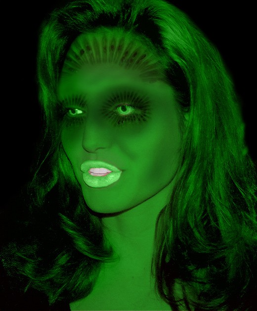
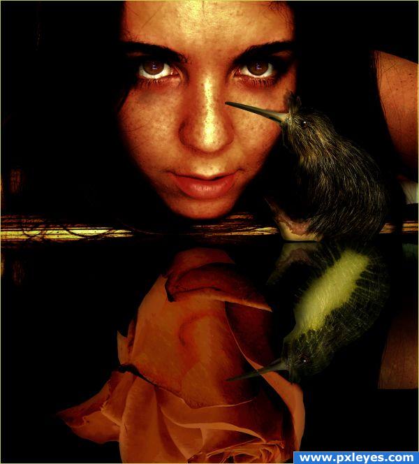
kiwi monster (5 years and 3765 days ago)
- 1: source1
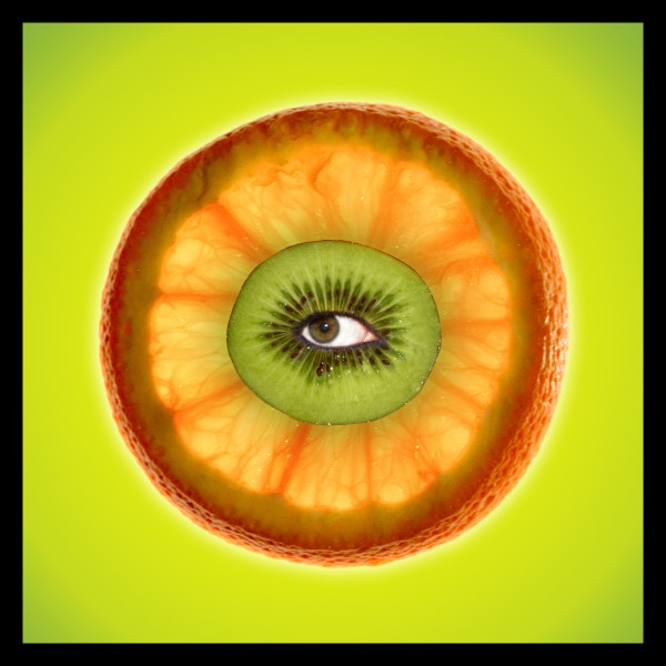
(5 years and 3767 days ago)
Howdie stranger!
If you want to rate this picture or participate in this contest, just:
LOGIN HERE or REGISTER FOR FREE
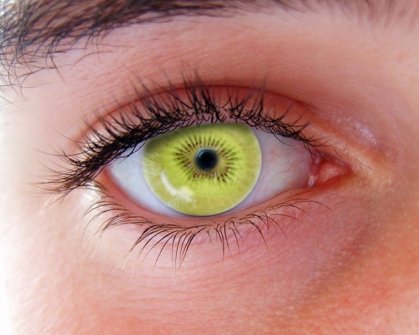
no need for an sbs.
1. select a kiwi
2. make a copy
3. erase edge of the copy for blending and erase the middle of both kiwis
4. add dodge tool (5 years and 3768 days ago)
Not bad, but maybe there's a bit of shading needed on top of the kiwi (just under the upper eyelashes). Good luck!
fixed, i don't know why i missed that haha thanks
seems like a lens to me.. looks like it on top of the eye. if thats your point, well done
Outer edge should be darker, not lighter, and blurred a bit...look at the source pic.
agree with cmyk...................................do correct tht...n it will look more convncin...gl
pretty similar entry...
actually jawshoewhah i posted my entry before the other one. they copied me. they will probably get more votes because its better than mine... which is not fair.
Howdie stranger!
If you want to rate this picture or participate in this contest, just:
LOGIN HERE or REGISTER FOR FREE
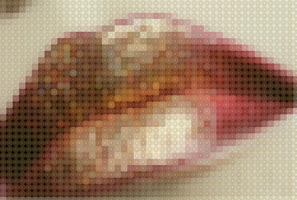
i know i don't need a SBS but incase you were wondering here's what I did
1. I selected a kiwi from the Source image
2. Made a circle (elliptical marquee tool) with a fixed ratio of 15px X 15px
3. Then I put the circle around the kiwi
4. I inversed the selection (shift+cntrl+i) and deleted the rest of the kiwi
5 I cropped image of the kiwi
6. For some reason though I made the circle a fixed ratio the canvas size was still more than 15px like I wanted it so I free transformed it and cropped it until it was 15px X 15px.
7. then I went edit> define pattern and named it
8. then I opened a new file and placed the lips
9.I added a filter (filter>pixelate>mosaic, 15px)
10. Then I added a new layer and clicked edit>fill (it says that you can click shift f5 but for me it just turns up my sound...)
11. I filled it with my pattern and lowered the opacity a bit until I liked it
hope you like it too :P (5 years and 3770 days ago)
Very creative
The different colors look very nice.
Really nice idea!
thanks! :P
interesting
This is a great image, very different!
Very good definitly better than mine. Hope u get first place 
I wish there was a higher resolution.
Thank you all for your comments, the make me feel so good inside  and i also saved a full resolution image
very nice!, I think you know, but if you don't you can change you'r keyboard shortcuts by clicking Edit > keyboard shortcuts..
Good luck! I think that you have a greate chance to win! ;D
thank you for the tip andersk
good wrk...........................
great job 
creative work!
Thanks for the higher res. GL.
Howdie stranger!
If you want to rate this picture or participate in this contest, just:
LOGIN HERE or REGISTER FOR FREE
(5 years and 3848 days ago)
Very, very nice work.
I love it, good luck


 Good thinking!
Excellent pic - is the kiwi reflection a bud?
This is another favorite of mine. I love the concept. Great color matching and one has to look to see that the rose is not a reflection. Again.. Very nice
Very cool one!
Oh, great! 
Congrats for your third place, Lolu
Congrats.... 
Congrats!!!!
congrats..
Howdie stranger!
If you want to rate this picture or participate in this contest, just:
LOGIN HERE or REGISTER FOR FREE
her lips are too bright and the edges look jaged
her teeth is too white i think.. make it a bit more green and .. i agree with kayak
Howdie stranger!
If you want to rate this picture or participate in this contest, just:
LOGIN HERE or REGISTER FOR FREE