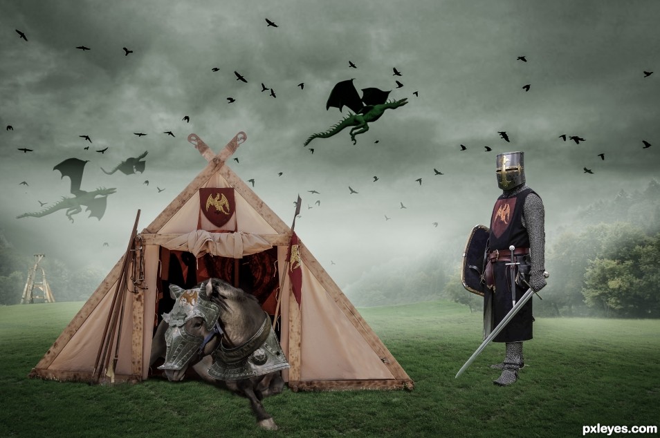
(5 years and 2336 days ago)
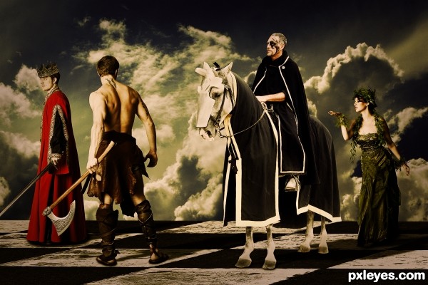
One of my older pieces that is fitting for this contest.
Thanks to all the DeviantArt stock providers:
mjranum-stock - http://mjranum-stock.deviantart.com/
dearx - http://dearx.deviantart.com/
Stock-gallery - http://stock-gallery.deviantart.com/
Mind-Matter - http://mind-matter.deviantart.com/
ArrsistableStock - http://arrsistablestock.deviantart.com/ (5 years and 2505 days ago)
Nice!! 
a major force in the characters.
bravo
Howdie stranger!
If you want to rate this picture or participate in this contest, just:
LOGIN HERE or REGISTER FOR FREE
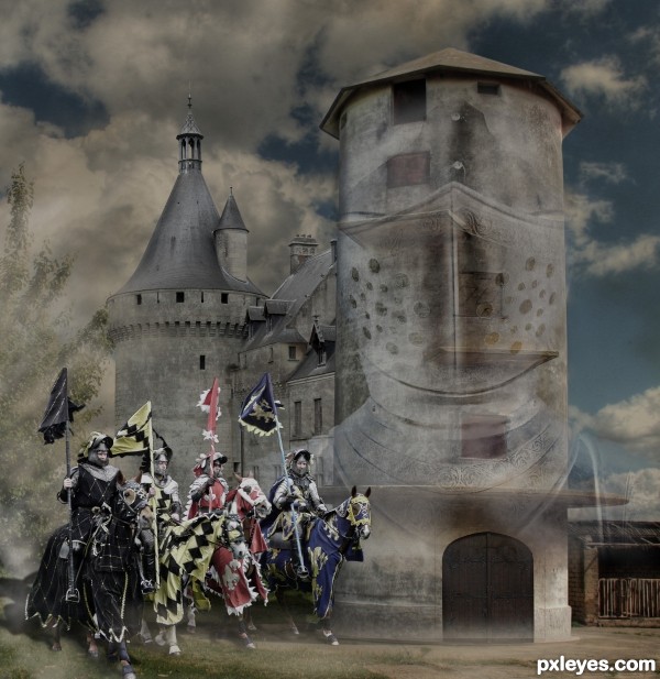
Layer masking, cleaned up silo and used its texture on castle in several pieces, blending modes Darken; painted in shadows under horses, and mist; helmet masked, Darken, opacity lowered. (5 years and 2740 days ago)
Like your idea of turning the silo into a castle. Would you consider getting rid of the little building on the right? (Maybe put another tree there or something) 
Removed second silo, good suggestion,but not much time left to mess with a tree. Thank you for your comment!
What are those holes on the castle?
Check the source image list, Akassa, it's the helmet. I've reduced and inverted it, tho, to see it more easily.
Knights are gigantic compared to the door next to them. 
It's called 'subject in the foreground,' and although those doors were big, it is further back, as is the silo part of the castle.
looks like an illustration modernized in a Monty Python feel.. I like it!
Hadn't thought of that, but yes, I see how it could be Python-ish. Thanks, Ernie! 
Howdie stranger!
If you want to rate this picture or participate in this contest, just:
LOGIN HERE or REGISTER FOR FREE
(5 years and 2835 days ago)
cool...
cool...
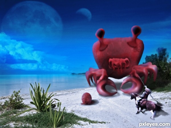
Would be much better without the knight. He looks like a toy compared to the vegetation. Nice monster, though. 
Perhaps lighten the furthest area of shadow behind the creature...this will help imo. Nice job, author!
Howdie stranger!
If you want to rate this picture or participate in this contest, just:
LOGIN HERE or REGISTER FOR FREE
(5 years and 2840 days ago)
Perfect!..
Thanks Jordy!
Good image; doesn't look retro to me, more like modern.
Why do the white gulls call? hehehe.. great job 
Not that retro.
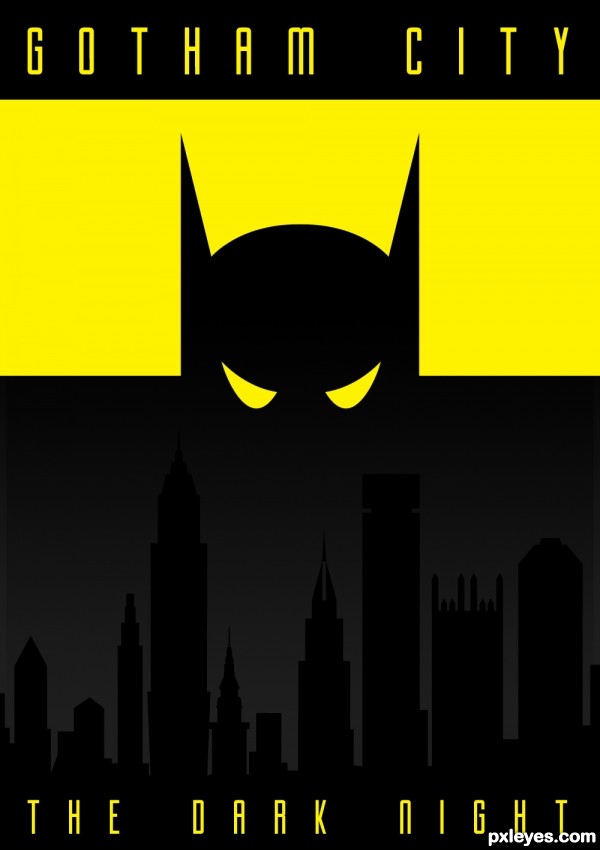
I don't get how this isn't retro? would it help if I added scratches or fading to it? just saying "not that retro" doesn't help. it just says that it is retro, but only a little retro. I think it has an art deco feel to it which in my opinion is retro. Had I wanted to make this modern I would not have used just flat graphics with a slight gradient to give the piece some interest. I would have used a full figure of batman and a detailed image of a city. please give constructive criticism if you are going to critique someones art, so it helps them out. thanks.
Author, I agree with you. I really like your entry, but yes I think a little texture would have helped this make look more retro.
Howdie stranger!
If you want to rate this picture or participate in this contest, just:
LOGIN HERE or REGISTER FOR FREE
Very well done.
Thanks!
Howdie stranger!
If you want to rate this picture or participate in this contest, just:
LOGIN HERE or REGISTER FOR FREE