Photoshop Pictures: Knight (page 4)


results 16 - 20 of 29

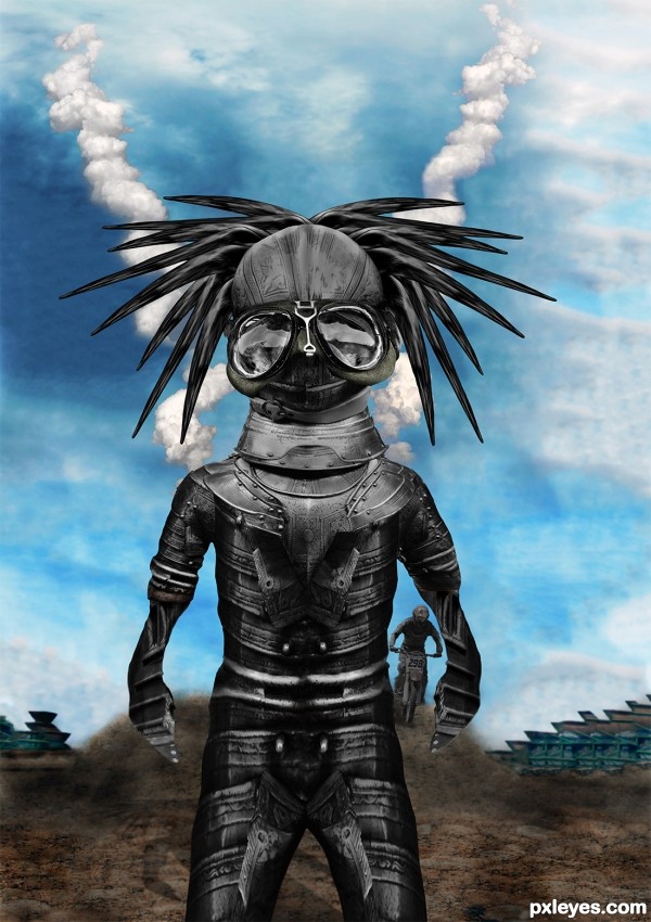
Motor Heads - created by xwd


Motor Heads
Favs: 3SBS: 18Hi-resRank: 4/10Score: 55% (20)15392 views

See SBS
The buildings in the back where created with the Content aware System in CS5 Extended on the Rusty Metal Picture

A good example of Content Aware in CS5 can be seen Here http://www.youtube.com/watch?v=NH0aEp1oDOI

;) (5 years and 3272 days ago)

6 Sources:

avatar CMYK46
CMYK46 says:

Head's kinda big, arms are kinda short, hands look flat. Source link for sky is missing.

avatar greymval
greymval says:

Not bad as creation, and if you wanted to distort the proportions on purpose, well done.
Is just that, when you do difformities, is better to explain in the description that it was by artistique choice, cause well intended people like CMYK might try to help and get undiserved thumbs down ( not that he cares, but you get the principle). Good luck man - i'll check Content Aware, thx 4 sharing.
EDIT: CAS looks like a Really Smart Healing tool, you should check that out folks

avatar erathion
erathion says:

Head and the body are well made IMHO...love the background too very much...i know its to late now but would be great if u had the chance to do something with the hands...they look to flat now...any how i love this positive crazy creation...best of luck author

avatar CorneliaMladenova

Cool black-beatle headed monster

Howdie stranger!
If you want to rate this picture or participate in this contest, just:

LOGIN HERE or REGISTER FOR FREE


Knight in shining armor - created by contay


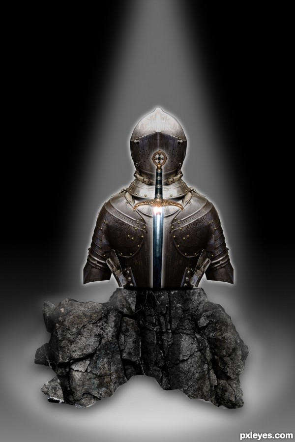
Knight in shining armor
Favs: 0SBS: 29Hi-resRank: 9/10Score: 51.8% (0)11697 views

Knight in shining armor and the sword in the stone that defeated him, now set in a display (5 years and 3276 days ago)

3 Sources:

avatar Syntek
Syntek says:

It lacks a bit of depth and shadows on the side of the rock, but the idea is excellent and nicely executed.

avatar CMYK46
CMYK46 says:

You could have extended the arms downward to go behind the rock. (You still can...). I don't think they had short sleeved armor back in the day.
Also, the glow around the sword should be different than the glow around the armor to help it pop.

author says:

Thanks for the feedback fellas. I cant get the arms extended, and it be the quality I like. It just becomes a pixelated mess, and throws the rest off.
Thank you both very much for your critique, and I will try harder on the next contest.

author says:

Thanks for the feedback fellas. I cant get the arms extended, and it be the quality I like. It just becomes a pixelated mess, and throws the rest off.
Thank you both very much for your critique, and I will try harder on the next contest.

avatar greymval
greymval says:

You know you can edit your entries until the contest closes right?
IMO, you lack background, I know it's extra work ( and my least favorite part of chopping) but it adds a great effect, why not try some paved stone on the floor and placing the scene in a catacomb, ruins, cracked earth, on a hill with mountains around -I'm brainstorming right now.

author says:

Yeah I know. Call me lame or any other name that you would like. maybe I'm over the top in my line of thinking but I feel that I should stick with my original submission the way I submitted it. Believe me this isn't because I don't value the critique because I treasure it. It's exactly why I compete. Back to my point though I feel that I learn a greater lesson if I suffer the consequences now instead of constantly retooling what I have already presented. I feel I should have taken these things into account before I presented. They are all great observations/ suggestions and I wished I would have thought of them myself. You better believe I will on the next one. That's for dang sure.
I was actually thinking of placing it in a museum I just couldn't ever reproduce what I was envisioning. I will learn with time and the great feedback that I get here.

avatar greymval
greymval says:

It's cool author, no one's calling you lame, and you have some nice adult-ish arguments there, with which I don't totally agree, lol.

author says:

Yeah I can see both sides of the argument, take the advice, improve it, win. You know what I might start a thread in the forum after the contest has finished because I would really like to hear all the views on it. Maybe I am out of line in my stead fast and most likely over the top manner of competing.

Howdie stranger!
If you want to rate this picture or participate in this contest, just:

LOGIN HERE or REGISTER FOR FREE


night knight - created by mircea


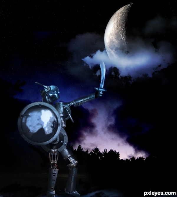
night knight
Favs: 0SBS: 1Hi-resRank: 5/10Score: 57.1% (15)12331 views

night after night fighting a losing battle

(5 years and 3298 days ago)

2 Sources:

avatar nanaris
nanaris says:

super, good luck!

avatar Chalty669
Chalty669 says:

Really nicely done! I see a face there, maybe some glowing eyes to go with it? Up to you, good luck!

avatar arca
arca says:

Good creation! He looks like he is challenging the moon! Very Don Quixote-ish!

avatar pearlie
pearlie says:

Cool hydraulic legs there! Nice work, author. Yes, agree with Arca!

avatar JPDesigns
JPDesigns says:

Clever title

avatar erathion
erathion says:

cool thing author...good luck

Howdie stranger!
If you want to rate this picture or participate in this contest, just:

LOGIN HERE or REGISTER FOR FREE


Sir Sniff'alot - created by PixelWhisperer


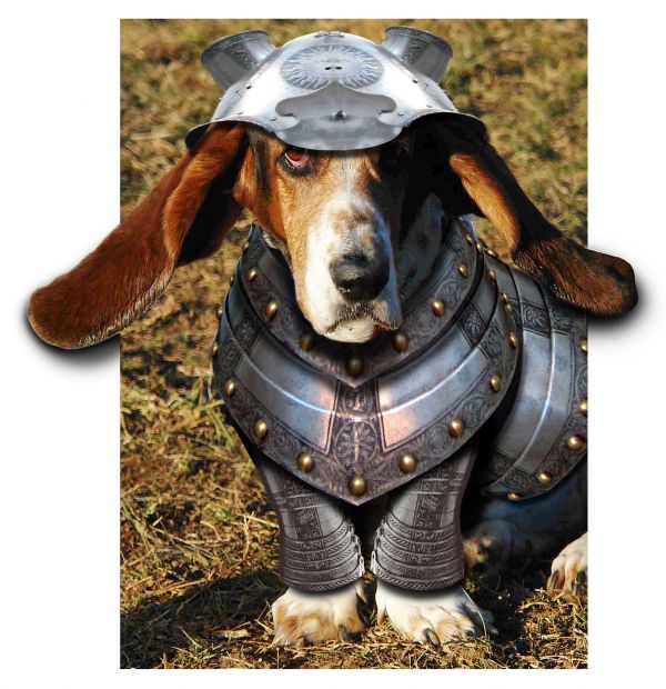
Sir Sniffalot
Favs: 0SBS: n/aHi-resRank: 6/10Score: 59.5% (0)14974 views

Hope this one's ok... my 1st ever entry got removed as I wasn't fully aware of how to upload sbs!!(eyes like blue lagoon) ... So let's try again, hope it's up to par, comments greatly appreciated Thanks. (5 years and 3532 days ago)

3 Sources:

avatar CMYK46
CMYK46 says:

Nice job, except dog's shadow is opposite light source on his head, and you seem to be missing a link for the feet and/or background.

author says:

shadow on ground to left not dog's? ... the feet belong to the dog and he's sitting on the background ... all in dog source

avatar kyricom
kyricom says:

He looks pretty intimidating

avatar erathion
erathion says:

Nice work...good luck

avatar CMYK46
CMYK46 says:

If the feet in your entry belong to the dog in your source link, where does the grass come from? Look again at the light source on the dog head. Light is from left. Shadow on ground next to dog is opposite.

author says:

sorry... i'll rectify the link as soon as i can find it !!

avatar Govindrathod

Nice try....Shadow is a problem otherwise a nice work,.....

avatar hereisanoop

i think it will be more good if you get rid of the white space... and fill it with grass background... and fix the shadow too.. Nice work, good luck..!

avatar jawshoewhah
jawshoewhah [banned] says:

CMYK is right.

avatar shaadow
shaadow says:

helmet need to a little more round... agree with 'CMYK' and hereisanoop about the shadows and the white background.. But this one looks very nice... good luck to you.

avatar demi
demi says:

Nice blend.....Good one...

author says:

OK ...sorry folks, posted wrong link ... I think if you look at it you will see that the shadow is NOT the dog's (If i get a chance i'll clone it out, but given the original shadowing on his face i didn't think i needed to).... as for the shape of the helmet: the shape of a basset's head, isn't 'round as such, plus i wanted the helmet to cover the join of his ears too

avatar erikuri
erikuri says:

Cute (in spite of not liking this race of dog...)

avatar Drivenslush

very adorable

avatar inanis
inanis says:

this is pretty. good luck to you.

avatar dollmommy
dollmommy says:

Nice work, Love the dog.......Good Luck

avatar shgallerymag

This is on a hilarious level of awesomeness. The armor looks like it was made for the little guy, fits perfect.

Howdie stranger!
If you want to rate this picture or participate in this contest, just:

LOGIN HERE or REGISTER FOR FREE


The Knight's Templar - created by Graphopoly


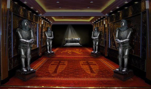
The Knights Templar
Favs: 1SBS: 9Hi-resRank: 1/10Score: 59.2% (37)13319 views

(5 years and 3567 days ago)

5 Sources:

avatar erikuri
erikuri says:

The perspective of the crosses needs to follow the one of the carpet, I think...

avatar Govindrathod

Beautiful image...great work...

no avatar
maXed says:

indeed erikuri. work on the perspectiv.. and the thingy they are standing on doesnt really follow the carpet

avatar Suky04
Suky04 says:

very creative!

avatar erikuri
erikuri says:

Now the carpet looks natural!

avatar loopyluv
loopyluv says:

Nicely done!

avatar demi
demi says:

Beautiful

avatar langstrum
langstrum says:

This is the winner, for sure

avatar hereisanoop

very well done ofcourse!

author says:

thanks everyone!

no avatar

Only thing I find wierd about this is that the perspective goes to a point just below the light source at the back, but the light source is just to the left of it. So it makes it look off kilter in the back. Good composition, though.

avatar CMYK46
CMYK46 says:

Well, it's a lot better than the rest...good luck, author.

no avatar

Lovely work Author. G/L.

avatar Lelaina
Lelaina says:

Congrats for your first place, Graphopoly!

avatar chakra1985

Congrats!!

Howdie stranger!
If you want to rate this picture or participate in this contest, just:

LOGIN HERE or REGISTER FOR FREE