Come my people, taste and see that I am good! (5 years and 2638 days ago)

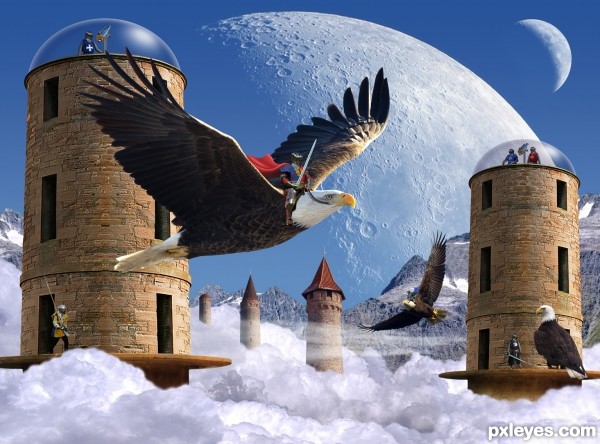
Nestled in a huge valley at the top of their world an ancient city floats among the clouds. The technology for the floating city is long lost to the inhabitants who now dwell in this fortress city in the sky living in a medieval society and relying on the wonders left to them by their ancestors they harness the giant eagles for travel and to defend their homes.
http://www.pxleyes.com/photoshop-contest/20172/silo.html Silo contest by patty
http://www.flickr.com/photos/digitaltrails/6903131724/in/photostream flickr by digitaltrails
http://www.flickr.com/photos/calilily/42482831/sizes/l/in/photostream/ flickr by calilily
http://www.flickr.com/photos/steveberardi/5275774830/ flickr by steveberardi
http://www.flickr.com/photos/usfwsnortheast/5277661905/ flickr by U.S. Fish and Wildlife Service-Northeast Region
(5 years and 2861 days ago)
Good fantasy image. I can imagine being one of those guys! 
Such a cool image, would make a wonderful illustration for a storybook! 
Nice. Reminds me of that old arcade video game - Joust 
Great imagination,very clever. Nice execution.
Love the quality of your image....so clear...sharp, and the colors are awsome. GL author.
Aaaand congrats also for your third place!
Whaaaaaat Lelaina said! 
Congrats again! 
Congrats Rein....another example of good work!
Thanks again to all for the comments and congrats! 
Howdie stranger!
If you want to rate this picture or participate in this contest, just:
LOGIN HERE or REGISTER FOR FREE

(5 years and 3426 days ago)
I know everyone is into that whole MOOD feel, but I think your SBS shows some very nice images with color, don't fear it.. you have control over it... I can see you have great talent in this area.. experiment.. (lovely image and great thinking.. reminds me a lot of the old Merlin/Camelot movies of the old days.. good luck author and very good job 
very good job GL 
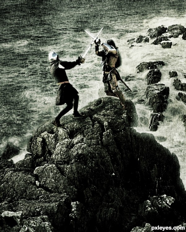
I like the feel of this entry! Only suggestion would be to add the rain on a new blank layer and change the blend mode. It just seems really harsh right now. Good luck!
Agree with chalty
Agree with Chalty669...and 
Congrats!!
congratulations...
Howdie stranger!
If you want to rate this picture or participate in this contest, just:
LOGIN HERE or REGISTER FOR FREE

Thanks:
http://www.sxc.hu/photo/406969
knights fighting
jmjvicente
http://www.morguefile.com/archive/display/94472
one knight on horse
ronnieb
http://www.sxc.hu/photo/1208374
other knight on horse
kamila t (5 years and 3941 days ago)
LOL... I kinda find the whole scene funny...  However the knights fighting on the bridge might need some shadow below their feet...
Also the knight on the right( in the bridge) need some masking between his arm... 
Edit: Ahhhhh.. A stalemate... Nice... And the pic looks better now... 
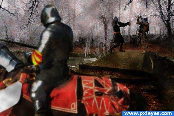
Thanks for the advice.... I think I fixed it!? Primarily I was trying to get rid of the rails and make it look good!? The picture is a chess metaphor kings fighting and last soldiers are the knights on the horses.... it should be a draw and no one wins.
this is just a great take on the source.. good luck (you are an old soul)
I'd lose the mounted knight in the background...it looks just like what it is: a statue, and placing it between the two fighting figures is distracting. Also, you lost some of the foreground knight's sword.
Looks better now...good luck. 
Aww now it's not a stalemate anymore... I liked the previous one better... This one fine as well( I already had cast my vote, so doesn't matter)... However instead of removing that knight you could have done an another thing...
But no need to edit it anymore, cause too much editing can ruin the feel of the picture... Just saying this so you can apply this to an another image...
Instead of removing that horse rider, you could have blurred him a bit and also blur the background( blur the background more than you blur the horse rider in the back...)
And then you could have blurred the horse rider in the front as well... This would have created a nice dof and more focus would have been drawn to those two swordsman on the ground...
As I said no need to edit it anymore... Was just giving an example... 
arkncheeze.... I thought about CMYK46 remarks and made adjustments... with my metaphor for chess as the main thought, I'm a chess dork, and even with removing the knight from the background it's still a draw in chess unless the lonely king makes an obvious blunder... lol....thanks for the comments and advice it's truly appreciate and helpfull...hopefully hear from you again.
This is great! Love the imagination, author! Shadows of foreground knight would be better darkened a bit more.
EDIT: Foreground Knight looks excellent now! Great job!
Very cool! Some shadows on the front knight will be nice! And maybe you should blur the front knight to add some "Depth of Field feel" to the image  Good Luck
Howdie stranger!
If you want to rate this picture or participate in this contest, just:
LOGIN HERE or REGISTER FOR FREE
Perspective's a bit off, but it's a great idea!
Thanks!
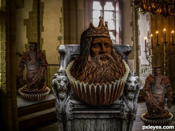
Delicious idea!
Appreciate it!
Howdie stranger!
If you want to rate this picture or participate in this contest, just:
LOGIN HERE or REGISTER FOR FREE