Only source used to create the figure,
Thanks to floridawing for the temple stock (5 years and 3304 days ago)
- 1: temple

(5 years and 3458 days ago)
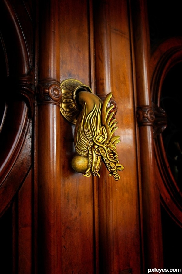
So realistic, that I can hear it knocking... 
I agree, great blending job.
Elegant simplicity ... lovely work and so believable.
Very very nice work author...My only one small nit pick is about the color if the dragon head...Watching the rest of the image,brown color of the door,other parts of the knock u could down it just a bit dragon head,just slight reducing of the yellow-gold-ish color...Any how this is awesome entry...best of luck
no light effect on the dragon - since the material s bronce/gold - even though this s dop paint it must ve light effect.., this make more like 3d merge with photo not photorealistic... wrong shadow base on light source that drop on the door...
I Toned the color highlights down a little.
The level of realism here is impressive. Very creative and original use of source. 
thanks all for the comments.
thx 4 attention/update - but it s still like 3d merge.., give more light drop - playin w/ texture - fix the shadow of the dragon on door ll make this a brilliant photorealistic lookin... but this got me 100%vote 4 the idea/attention/update - gl author.., this ll stand againts hood ornament 4 photorealistic lookin.., n me think this maybe the winner...
Liking the color and tone
excellent execution  Well done & GL
Howdie stranger!
If you want to rate this picture or participate in this contest, just:
LOGIN HERE or REGISTER FOR FREE

(5 years and 3587 days ago)
PURRRRRRRRRRRRRRRRRRRRRRRRRRRRRR!!!
Howdie stranger!
If you want to rate this picture or participate in this contest, just:
LOGIN HERE or REGISTER FOR FREE

Thanks to leisha for the use of her image (5 years and 3589 days ago)
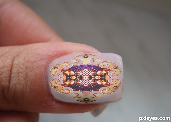
unique nails, but imo the shadow on the nail is too sharp. Maybe blur it bit 
Thanks for the comment!

very nice good idea
Very good!!! Looks convincing!
Howdie stranger!
If you want to rate this picture or participate in this contest, just:
LOGIN HERE or REGISTER FOR FREE
Nice work my friend!
cool work...gl
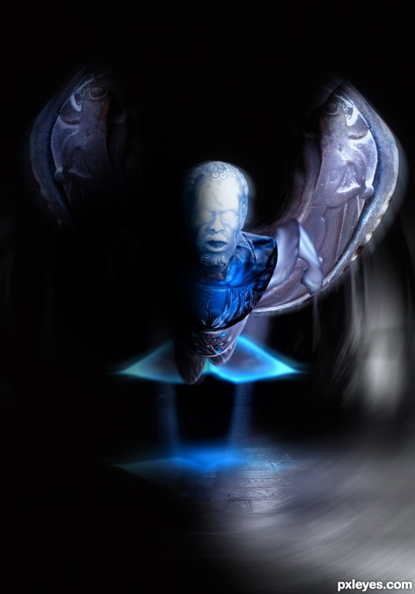
Your edges are a little inconsistent where the arms join the body, and the top of the head is a bit too high contrast for the overall "mood" lighting. If your light source is that strong, the LH side of your image shouldn't be so dark...
Something rather surreal and creepy about this. I really like it. I like the blue color and how you executed the stream.
@mossyB made adjustments to the joining of the arm to the body and the strong shadows on the LH. Thnx for the nice comments pals, i appreciate
Congratulations!
Congratulations!!! Have a cookie!
note: cookie is purely hypothetical.
Congrats!!
thnx guys, for the congrats nd cookie ory
thnx guys, for the congrats nd cookie ory
Howdie stranger!
If you want to rate this picture or participate in this contest, just:
LOGIN HERE or REGISTER FOR FREE