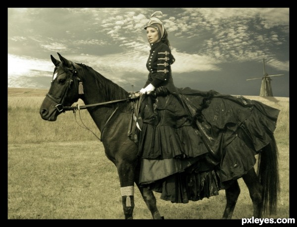
Angie-http://angiestock.deviantart.com/
yenhoon-http://www.sxc.hu/profile/yenhoon
Thanks guys for the great resources...
(5 years and 3676 days ago)
- 1: Lady and horse
- 2: Sky
- 3: Windmill
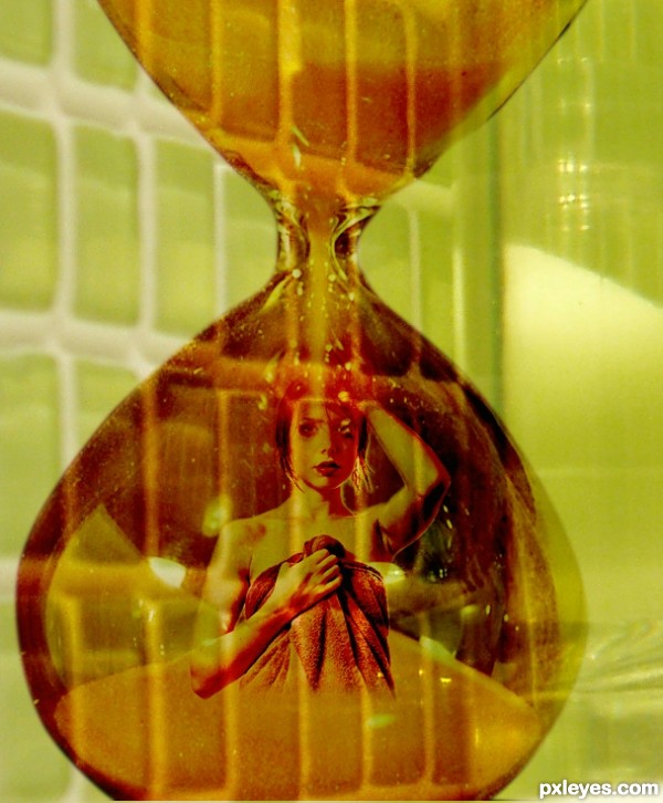
lady shower (5 years and 3698 days ago)
good luck
Howdie stranger!
If you want to rate this picture or participate in this contest, just:
LOGIN HERE or REGISTER FOR FREE
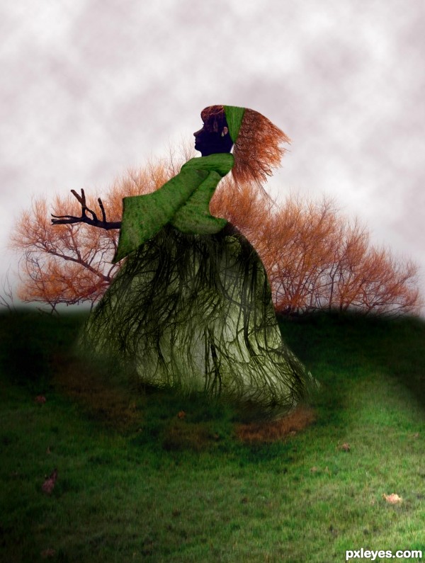
Rising lady from the ground... made by the original tree. No extra photos. (5 years and 3738 days ago)
very different approach author.. GOOD LUCK!!!
Nice entry . Good luck
Interesting idea, poorly executed.
try using the "select color range" tool to get rid of all the white spaces in between the branches, either by simply deleting the white, or changing it to another colour (green maybe? haha).
Thanks for commenting. I will try to improve my work.
done!  Thank you
nice i like how you made the background and the lady face , gl author
great work and veryy different idea
oh, this is much better GL
Very good! =)
Nice.
Wow! A witch raising from the underground... amazing! 
Very nice idea......Good Luck Author.
Congratulations!!! 
thanks to all
Howdie stranger!
If you want to rate this picture or participate in this contest, just:
LOGIN HERE or REGISTER FOR FREE
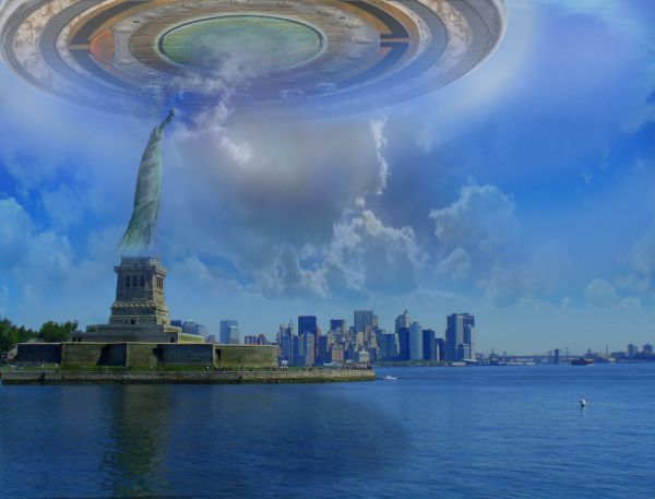
As dozens of onlookers watched in utter shock, the magnificent statue seemed to dematerialize, and was swooped up in a w-h-o-o-s-h into what many report as the largest UFO that has come this close to the mainland. None of the people on the ground were harmed. Film at 11. (5 years and 3763 days ago)
I like your UFO and it's in a dramatic setting. However, the water reflection doesn't match the vanishing point of the water itself. The huge UFO does not seem to be casting any shadow (light source for background seems to be high upper right). And I don't get the big cloud weirdly coming in to the center of the UFO. Also, the odd gradient border on the lower half is inexplicable and adds nothing to the image IMO. (Using the source image without correcting the slanted horizon/statue made positioning your UFO even more challenging.)
Independence day!!! 
Agreed with Dan. Like the UFO, but not blended very well into the image. Remember, one thing is to make a UFO, another is to make it realistic enough that someone in high-def could not tell the difference.
thanks for your comments, Dan, made some changes per your critique.
like this very well done..
Bit better now, but still kind of fuzzy. I think it's the clouds--it's impossible to blend them over all that realisticly. Perhaps a clear sky would make a cleaner effect? It's up to you. Also perhaps you should overshadow liberty entirely, as the UFO is directly above her.
thank you, gamemastertips, you're right, now she's in shadow, but I want the clouds to stay, so they 'go with her' up into the ship. I have sharpened the ship a bit also using the method in a tut I found.
cool ship, nice work friend. 
wonderful idea ! amazing work ! 
Author, Dan was strait to the point. He wasn't rude or say anything like this sucks. He also made a lot of good points. Sounds like you are the one that can't take constructive criticism.
Excuse me, jawshoewhah, but I certainly DID make some changes per the critiques, and took them gratefully. It is still MY chop, tho, and I left the things in that I thought it needed - IMHO.
I completely agree that in the end it's the author's artistic perogative to do whatever he or she wants (consistent with the theme, of course  ).
).
Howdie stranger!
If you want to rate this picture or participate in this contest, just:
LOGIN HERE or REGISTER FOR FREE
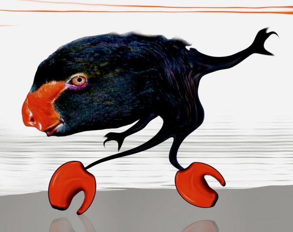
it's the fame monster (5 years and 3791 days ago)
BWHAAAA HAAAA HAAAA HAAAA HAAAAA (Now give er gawd awful shoulder pads and set Elton John on Fire) hehehehehehehe... (The heels are priceless!!!!) super duper good luck author!!!
edit" confused why this hasn't gotten more responses... oh heck in a hand basket... great job.. as it should be
Haha well done !! Good luck

Howdie stranger!
If you want to rate this picture or participate in this contest, just:
LOGIN HERE or REGISTER FOR FREE
Excellent image... very creative use of the different elements of the source. Great job.
I like the antique mood of the image!... GL, author!
Very very nice work. Only one thing: the added part of the horse head doesn't quite fit. But that's almost unnoticeable
this is fabulous! definitely my fav so far! Good Luck!
Awesome entry, surely different approach than others had. Best of luck to you!!
Woah! You created a very nice mood!
Amazing work!
congrats!
Congrats for your second place, Erathion! What a great week for you
Hey, Neb! You are on a really nice wave this week! Congratulations!
Congrats!
Howdie stranger!
If you want to rate this picture or participate in this contest, just:
LOGIN HERE or REGISTER FOR FREE