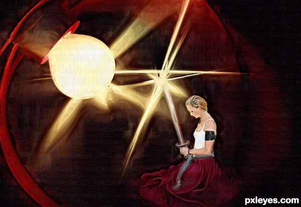
thankyou for the brush to env1ro and
Lisajen-stock for the pic of her (5 years and 3250 days ago)

I did a lot of work on this image than you can really tell. Unfortunately I was flattening as I went, not ever expecting to enter it in a contest. So my step by step is going to rather lack luster in terms of number of steps. (5 years and 3258 days ago)
Very elegant!
Thanks! that was my intention! 
IMO white should be on the outer edge of the hair, not so much in the middle. Good pic, though. 
nice work gl author..!!
THANK YOU!
congrats...
Howdie stranger!
If you want to rate this picture or participate in this contest, just:
LOGIN HERE or REGISTER FOR FREE
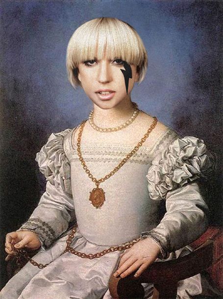
(5 years and 3264 days ago)
You need to source the original painting as well!
Uppss!..thanks for telling me that..I'll do it right now
I would say that the head looks to big, but this is Lady Gaga so the image should be a bit out of the box like herself 
HEAD TOO BIG!
Fixed the head..
i think make it a little more small, would be unreal..
but there it is.
Good choice. The black values on Gaga's face are too dark for the rest of the image though. If you lighten them slightly (Image>Adjustments>Selective Color>Blacks) to better match the darks of the painting, it will be more consistent.
Thanks...MossyB
made that change,its much better!.

The black lightening bolt is still the darkest, least noisy element in the image and thus does not seem part of the painting. More problematic is that a Renaissance Lady Gaga would change not only her hair but also her clothes. Wearing male military attire, for example, would no doubt have seemed outrageous at the time.
head too big???
Howdie stranger!
If you want to rate this picture or participate in this contest, just:
LOGIN HERE or REGISTER FOR FREE
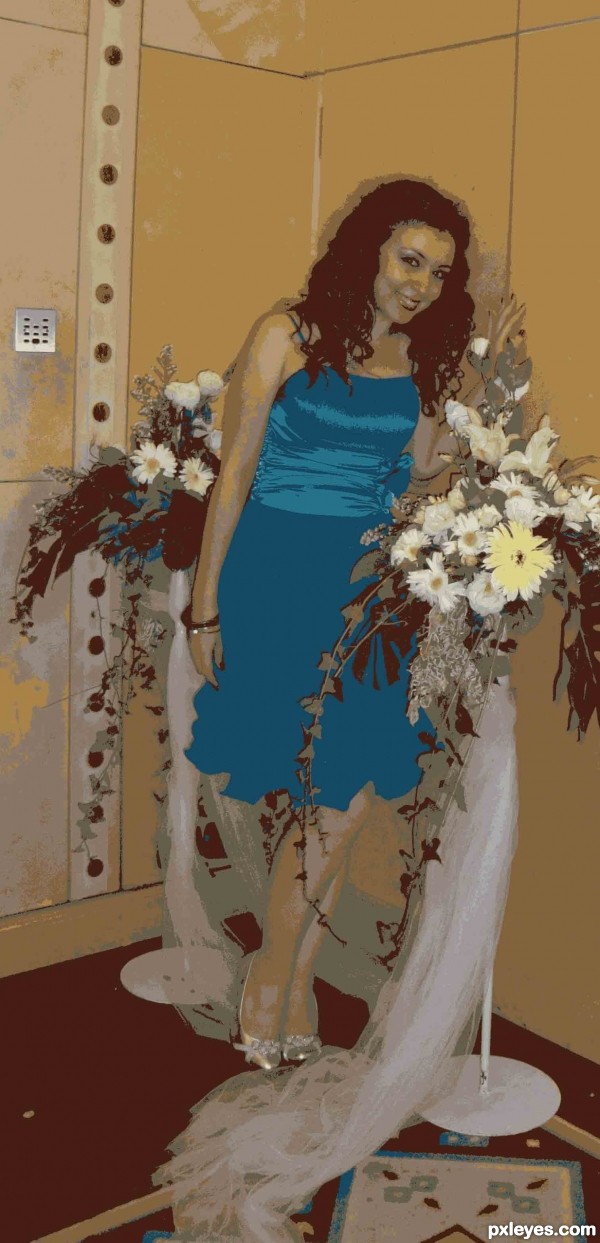
16 Colours used in this ..... (5 years and 3284 days ago)
For the dress color ... I changed it from the color palette later ... and I merged some colors ..
The contest is to "decrease the color depth anywhere from 2 to 16 colors (1-4 bit)." You're not supposed to additionally play with the image by then changing and merging colors. That is unfair to the other entries.
I changed and mergerd the colors from the (16 colors) color taplette .. I just selected what colors I need to stay and what colors I don't need ..and what colors are not supposed to be together ....
I hope this is legal ...and tnx 4 da advice....
you still changed the colors? You are supposed to only decrease the colors used.
Alright ... now I give up ...u r 2 now
I've returned the colors to their original situation .....
Hope u like it now ..
actually, I'm glad you did because I like this A LOT better!!!
Howdie stranger!
If you want to rate this picture or participate in this contest, just:
LOGIN HERE or REGISTER FOR FREE
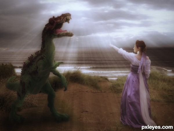
(5 years and 3290 days ago)
I think the lightning effect (spell) should be on her wand, not so far away. Great image!
Very nice colors, GL!
suggestions:
1) change the dinosaur to a medieval dragon or some creature same as the era of the lady
2) do a "lens flare" at her wand, or a lightning ray towards the dragon, some smoke
Howdie stranger!
If you want to rate this picture or participate in this contest, just:
LOGIN HERE or REGISTER FOR FREE
looks good author..
looks good author..
nice author..gl
The woman is too well lit on her back, considering the strong light source in front of her.
love the Environment you created author.. much like a painting
thank you for all your comments
Lovely
Howdie stranger!
If you want to rate this picture or participate in this contest, just:
LOGIN HERE or REGISTER FOR FREE