photos in SBS mine. (5 years and 2419 days ago)

(5 years and 3296 days ago)
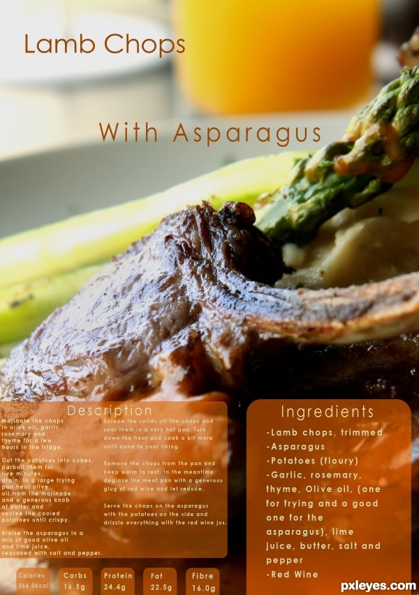
Sounds delicious, but the light reflection off the pork chop is too high contrast, looking more like a glare than a highlight.
You've also misspelled "ingredients."
Ohh thank you i didn't notice.. must have pressed "e" twice by accident...
I'll fix the contrast too 
the text of your description need to be centered to the panel with an equal gap seperating the 2 columns and give more space on the left side text (its a guillotine operators nightmare).......sorry to be picky but I do this for a living 
Sounds good, but the small text is barely readable in high res.
Right on theme with an upscale-magazine layout. Unfortunately, the glare on the pork chop hides the central ingredient. I think making "Lamb Chops" and "With Asparagus" bigger and having the former slightly overlap the latter could be more dramatic. Also, traditionally the ingredients come first (i.e., on the left side here) followed by the instructions (i.e., on the right side here). (I suppose alternatively having the ingredients higher than the instructions might visually convey the traditional ordering arrangement even if the physical arrangement is non-traditional.)
Very nice! GL!
Howdie stranger!
If you want to rate this picture or participate in this contest, just:
LOGIN HERE or REGISTER FOR FREE

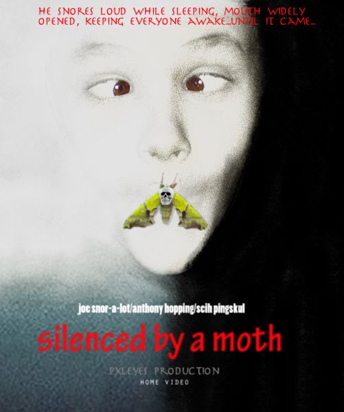
1. select and place the head of the boy in a background w/ a black and white gradient color....clone the mouth away.
2. desaturate the head and make a sepia tone.
3. color both side of the poster white/black accordingly and the lower left dark blue.
4. use a soft brush around the face, white on the left and black on the right side, to have a fade effect.
5. add a film grain filter
6. use dodge on the left side of the face to remove film grain and lighten face.
7. use burn tool on the right face to darken.
8. select and put the moth on mouth. make new layer and color the mouth then set them to 'linear burn'.
9. put skull on moth and place text. (5 years and 3700 days ago)
LOL! xD
This movie looks pretty awful! But the poster is compelling nevertheless. (Quibble: I think I would delete the "was" from the movie title.)
'was' removed lol. thanks!
very nice...lol...good luck author
Check your spelling, red type is blurry.
thanks CMYK46! i overdid the blur on the red text. i blurred it a little to further blend in the image.
Looks better, author, but it's "snores".
hahaha thanks again...english is not my native language so i appreciate it if you guys let me know early =)
Congrats for 2nd
Congrats for 2nd!
Congrats! 
Congrats for your second place, Ricky!
Howdie stranger!
If you want to rate this picture or participate in this contest, just:
LOGIN HERE or REGISTER FOR FREE

This will be stuck in your head forever. :)
This was mostly just blending.
thanks melbia for girl pic, and has been notified.
Thanks general2 for school photo and has been notified. (5 years and 3863 days ago)
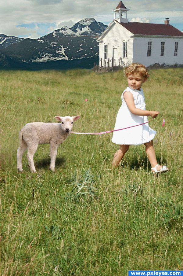
Great, sweet image with excellent blending of sources. One suggestion...either change shadows of lamb and girl to match direction of shadow on steeple or remove roof shadow and match that to light source on girl and lamb. Might be easier to remove roof shadow and create new one. Does that make sense??! In other words, make ONE light source casting ONE directional shadow. 
EDIT: Looks 
good catch thx
How sweet  That was the first english song I learned
  Just a few things: Maybe you can work a little bit more on the leash, it looks broken and on that place, where it looks broken is a strange blur. It's between the lamb and the girl. And maybe you can also try to cut out the lamb a little bit better. You can see the former background around the lambs legs. There's a piece on it's foreleg and a big piece on it's hind legs. But other than that it's a really sweet composition
  Good luck!
Other then the break and the wierd blur in the middle of the ribbon its cute 
extremely cute
 Great piece and some nice blending. The perspective is a little off on the building, mostly noticeable on the wall closest to us. If you're using photoshop you can warp it into shape. Also the top edge of your mountain is too sharp. Add some haze over it and blur the top edge to give the piece more depth. You can use an eraser with low opacity and high falloff to blend the top into the sky more and get a little color bleed/light wrapping going on. The back edge of the meadow is also too blurry. Try breaking that edge up a bit more. Keep up the good work!!
granted you have been given some very grand suggestions from some of the best of the best of this site... but you know what.... you captured the image of the song in total perfection... (I'd give you 100 score but I'm a bit of a bastard LOL) great work (don't worry.. high marks ... giggle snort)
wow!its so adorably cute.wat a cute tot.u need to blend the background properly
This is so cool! Right on theme. High marks 
Great work..so clever 
Good improvements! Looks much better now  Good luck again!
Sweet image.
Congratulations 
Howdie stranger!
If you want to rate this picture or participate in this contest, just:
LOGIN HERE or REGISTER FOR FREE
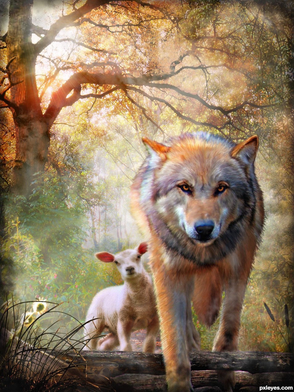
Powerful image & great color!
Thanks so much
Fabulous lighting and composition!
Thank you
love the colours..and looking into the eyes.. nicely done author
very great work love it
  gl author
thanks!
Beautifull GL
GL
Outstanding work...good luck!
haha thanks! like your new profile pic
very very beautiful.
thank you
Fantastic work - this is one of my favorites.
thank you
dat's a lot of smudge tool.. woo HOO.. great job
darn toot'en it is lol wacom very handy!
it could be a great book cover very nice work
ooo nice thought... thank you.
Congrats, well done!
thank you
Congrats!!!
thanks
Congrats!!!
thank you
Congrats!!
Congrats Nicky , wonderful work, I feel like the wolf is going to walk right out of my computer screen
cool! thanks
congrats on a well deserved win ..powerful image ozipop
thanx David
Congrats, this is just wonderful
thank you Vibeke
Howdie stranger!
If you want to rate this picture or participate in this contest, just:
LOGIN HERE or REGISTER FOR FREE