I used the clone stamp tool to remove the humans and some adjustment layers to create the mood.
I did not use any external sources or brushes. (5 years and 3298 days ago)
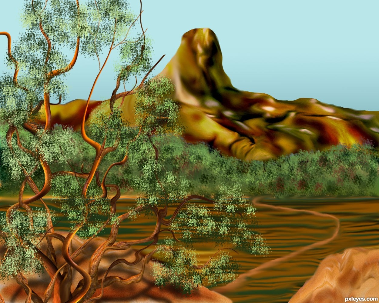
Image source used in the making of this landscape. Made changes...thanks for suggestions. (5 years and 3303 days ago)
Beautiful color scheme, but the composition really needs some work...
The tree trunk looks nice, but everything else is quite blurry looking, especially the tree leaves. The odd horizontal lines in the lower third are confusing and distracting (but not enough to overcome the blurriness), and the white road  visually cuts your image into two pieces.
Thank you MossyB, I think it is the smudge work that makes the image blurry. Any suggestions to make it sharper.. Not much time to make changes.....
You can try smart sharpen on the foliage layer, but it will leave "halo" artifacts...
In general, avoid the smudge tool.
I'd paint out that horizontal road and the lines beneath it, and if you must have a road, make one that curves from the tree up to the right over the "mountain."
Very nice, GL!
I know it is a probably too late but adding grain can help give a sharper look to smudged images . A good way to do that is to add a new 50% neutral gray layer (fill empty layer with gray) and the run the grain filter on it. Once you have the layer done you can set it on Soft light blend mode and then set the opacity on whatever looks best. For sharpening you can duplicate your finished image, apply the High Pass filter to it at about 2-5 % (depending on the image resolution). Then set the layer on Soft Light or Hard Light. Set opacity at what you want. There is more but out space 
Nice concept ... just a quick add on to my suggestion. You can "paint" out some of the High pass layer if you find it is sharpening something too much. Just turn the layer back to Normal and the using a 50% gray brush set on 50-75% opacity to paint out the over sharp (usually white) lines.
Composition is a hard one ... I know what Mossy means but you have framed the image nicely. I think the biggest problem there is the mountain in the very center and the white line. Other that that it is a great "painting". Definitely heading in the right direction!
Thank you Arca, let's see what I can do. Not much time left, will be a busy day today for me, but I appreciate your suggestions, it will help in future entries.
good work author gl
Looks better, author! Nice effort!
MossyB, Thank you, your comments and suggestions always give a help.
Great improvement!
Beautiful entry author...changes that u made fit perfectly...work on a tree is master piece...well done
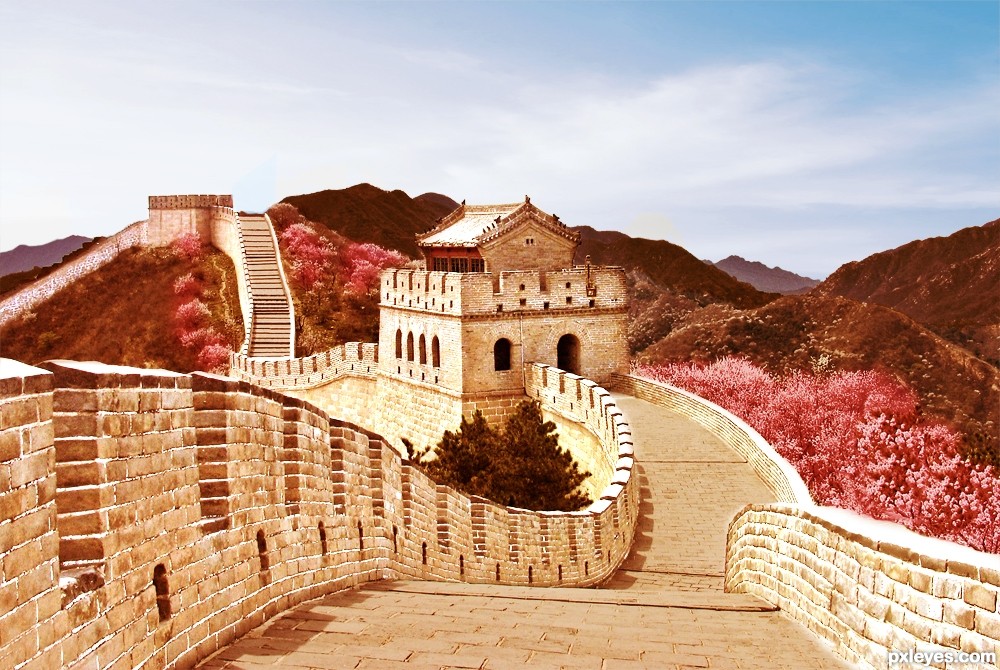
Howdie stranger!
If you want to rate this picture or participate in this contest, just:
LOGIN HERE or REGISTER FOR FREE
(5 years and 3324 days ago)
Nice one.
Howdie stranger!
If you want to rate this picture or participate in this contest, just:
LOGIN HERE or REGISTER FOR FREE
(5 years and 3352 days ago)
cool work, author! best of luck to you!
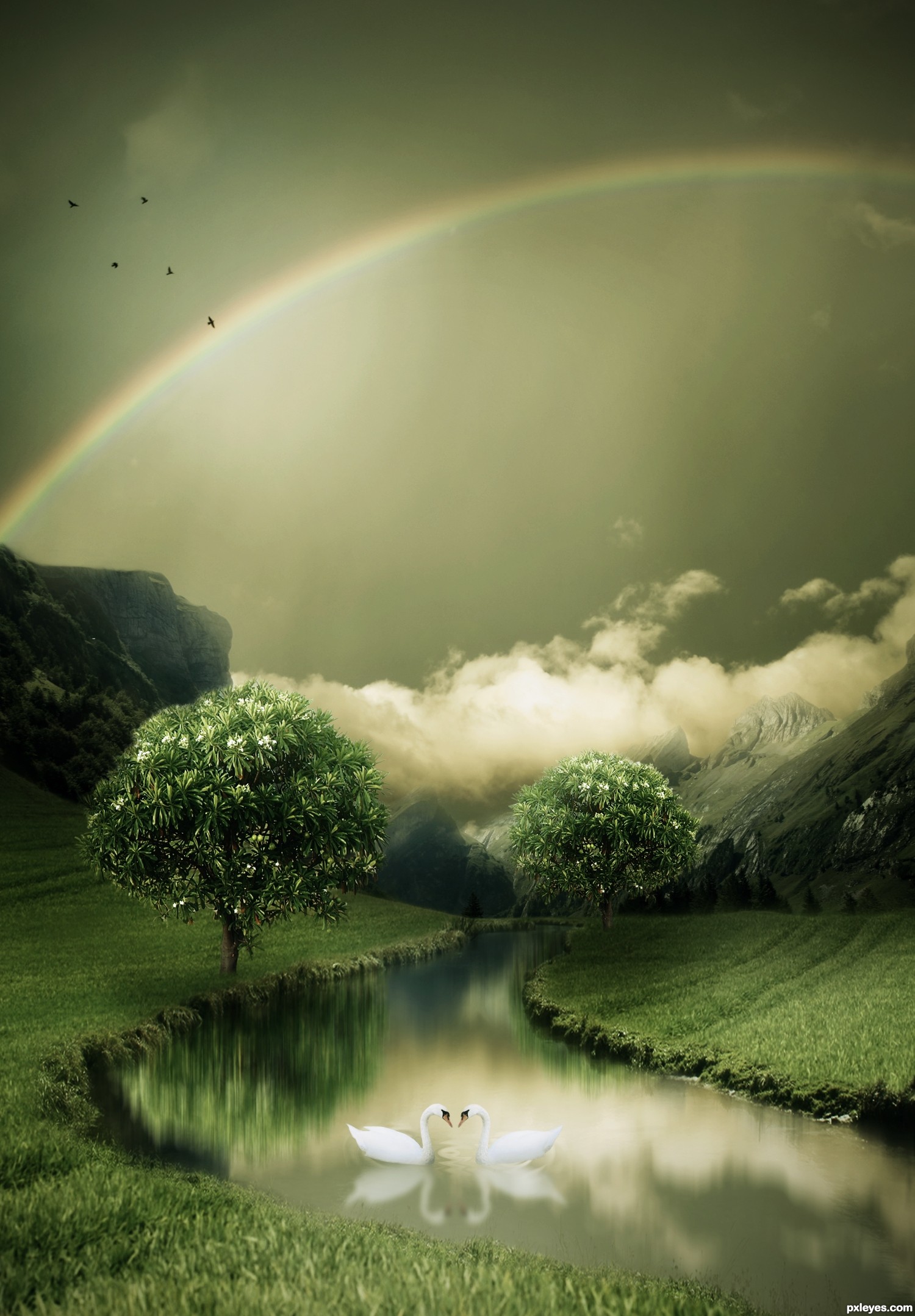
Tree reflection is too blurred compared to swan reflections, but this is still a nice piece of work...GL author. 
Edit: Thanks CMYK46 to point out.
Too cool execution author...Very very well done!
so mystical, good luck!
Very, very pretty work, author!
Best 1 in the entry..good luck
Lovely view........Great job and good luck Author.
congrats!
Congrats for 1st, nice
Congrats, lovely work
Thanks friends..love you all!
Congrats for winning!
Congrats!
Congratulations for 1st place win....this is awesome work.
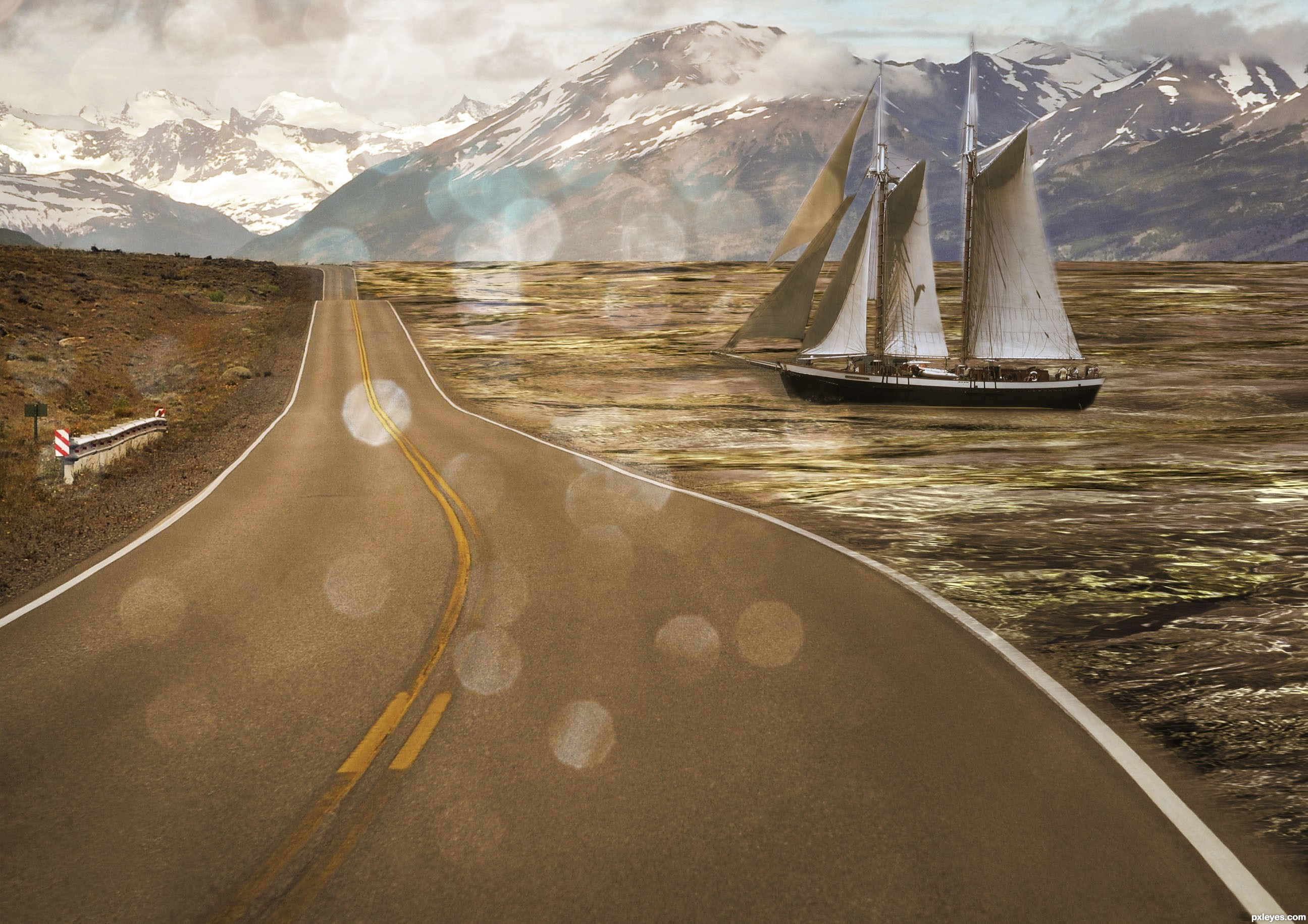
Howdie stranger!
If you want to rate this picture or participate in this contest, just:
LOGIN HERE or REGISTER FOR FREE
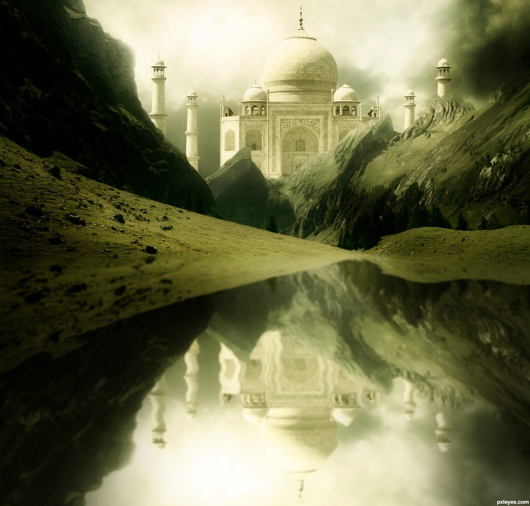
Thanks to this tutorial @ http://www.phototutorial.info/?p=33 for helping me to made water reflection. (5 years and 3360 days ago)
I love the Taj Mahal it's one of the most beautiful structures ever created. I like the color of your image. I do feel the reflection is a bit too uniform and rippled, might look better if it were a little less so since the water itself is so placid IMHO.
This is a beautiful shot. Agree with spaceranger about the reflection. It would also be really effective if you lowered the opacity of the reflection too. It would give this a more subtle, realistic look to the whole image. Nice job!!
EDIT: Looks 
edit: Changes has been done. Thanks you spaceranger & pixelkid for your opinions.
I like the changes, much more subtle and has a nice tranquil feeling.
Well done. IMO the reflections of cliffs and Taj should be bumped up towards the waters edge more, as you would not see that much of the reflection. Maybe a tad ripple in water near bends in structure. Love the depth and lighting! GL Author!
beautiful!
Beautiful scene author...Very moody and mystical....best of luck
Thanks sgc, Androla and erathion for your appreciations.
Howdie stranger!
If you want to rate this picture or participate in this contest, just:
LOGIN HERE or REGISTER FOR FREE
Photography and photoshop contests
We are a community of people with
a passion for photography, graphics and art in general.
Every day new photoshop
and photography contests are posted to compete in. We also have one weekly drawing contest
and one weekly 3D contest!
Participation is 100% free!
Just
register and get
started!
Good luck!
© 2015 Pxleyes.com. All rights reserved.


Howdie stranger!
If you want to rate this picture or participate in this contest, just:
LOGIN HERE or REGISTER FOR FREE