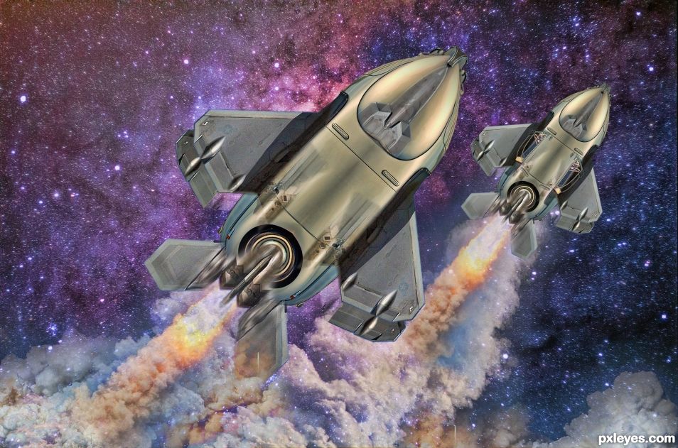
The old timer was secretly a transformer. He decided to transform into his super powered rocket form, clone himself and go where no man has gone before. :-) (5 years and 1267 days ago)
- 1: Space background
- 2: Rocket launch
- 3: Plane
- 4: Smoke

The old timer was secretly a transformer. He decided to transform into his super powered rocket form, clone himself and go where no man has gone before. :-) (5 years and 1267 days ago)
(5 years and 1567 days ago)
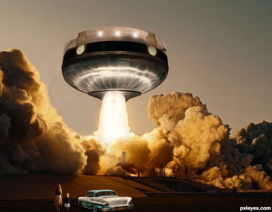
Nice clean chop, but the rocket exhaust doesn't look like it's coming from beneath the ship, but rather the side nearest the viewer.
Fun swirly whirly effect just love the lighting
Placing the upside down "house" top point infront of fire blast then experimenting with removing with a circular erase brush might help make and add to an illusion of the fire coming out of the saucer/house. At the moment, it looks like the exhaust is kind of floating in front of the spaceship and not coming out of it from the bottom.
The people and car are spectacular, the texture effect is awesome. The clouds as well. Great Job!
I am added to the same critics you have from CMYK and Drivenslush, just correct the exhaust and you will have a wonderful image. Nice work.
cooollllll... like the effects. The smoke looks real. the whole scene is realistic!
Congrats!!
Congrats! 
Congrats!
Congrats!!!
Howdie stranger!
If you want to rate this picture or participate in this contest, just:
LOGIN HERE or REGISTER FOR FREE
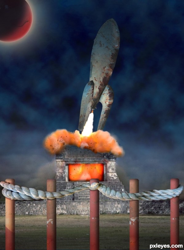
The texture of the piling caught my attention, and I've used it on the rocket and for the planet, as well as a smaller version in the foreground. (5 years and 3547 days ago)
Good work, nice kind of retro mood... 
I'm liking the pylons and rope barrier in the foreground your fire has a nice glow to it also, good job.
is this medieval Houston?!?...cool job author...best of luck
LOL, no this is a relic from the Mayan civilization - they were quite advanced for their time.  Don't you know about the Mayans' expedition to Mars?
I heard for that but i was thinking that the Saturn is their goal...
Cool idea..... and nice job!
very awesome!
Howdie stranger!
If you want to rate this picture or participate in this contest, just:
LOGIN HERE or REGISTER FOR FREE
(5 years and 3548 days ago)
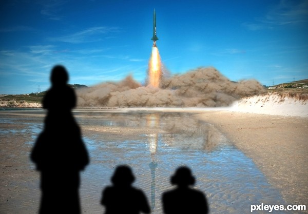
I would've been cool if you had made the rocket from the tower which was already there. Nice entry and good luck!
Author, Chalty had a good idea...it's not too late! 
PS: The reflection would be foreshortened a bit.
Nice idea. And also agree with both. 
The shadows are way too dark. Also the perspective of them (especially the left side) is way off, they're cast on the ground as there are no obstacles, so it shouldn't cover things from the hills.. Now it looks like the shadow is both out of perspective and also miles long.. Scale them smaller and use the perspective tool
are those shadows or silhouettes? either way, they don't really work with this lighting
Howdie stranger!
If you want to rate this picture or participate in this contest, just:
LOGIN HERE or REGISTER FOR FREE
Nicely done.
Thanks Bob.

That is great.... Good luck.
Thanks for the fav George.
Congrats again Angel
Congrats!
Congrats skyangel
Congrats!
Congrats!!
Congratulations....
Thank you everyone
Congrats Skyangel!
Congrats Angel!!
Thanks guys
Howdie stranger!
If you want to rate this picture or participate in this contest, just:
LOGIN HERE or REGISTER FOR FREE