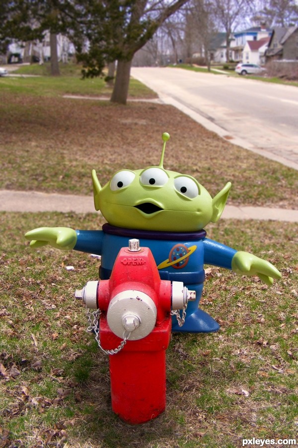
Background source image is my own, shown in the SBS. (5 years and 2641 days ago)
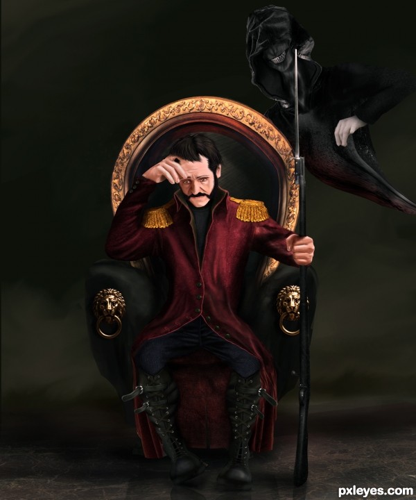
I was going to name this work as (Before the Battle) because my first inspiration made me draw the face stressed out, but i wanted to use the source image in more than just texturing, so i decided to make that evil character which imposed upon me changing the name, there were few options those related to wars and can match my entry, so i picked this one because this evil character represents war makers.
I spent hours and hours painting this to get the original concept i was thinking about, some flaws must be made during the painting process, therefore feed back is appreciated.
Many thanks to silegl69 from sxc.hu for his permission on the statue photo.
Edit: Further modifications have been done. (5 years and 3192 days ago)
No comments, just WOW!!
Yes, I agree. Fantastic piece. Very well done!
Amazing
Kowabunga 
Its very dark and beautiful. Wonderfully done!
thanks a lot for the nice comments 
Incredible work, very good job! Isn't the chair a bit too light on the left side (the gold bar), with the man sited there should be way less light going there. High votes and fav from me 
Thanks Akassa, modifications done 
Now beat that!!! excellent job
JEEZ, you have loads of talent! this is fantastic work. 
Excellent job. Certainly an original idea and great execution.

Absolutely wonderful work!
Congrats, wonderful work 
thank you for your nice comments and congrats 
Howdie stranger!
If you want to rate this picture or participate in this contest, just:
LOGIN HERE or REGISTER FOR FREE
(5 years and 3341 days ago)
nice work good gl
nice work good gl
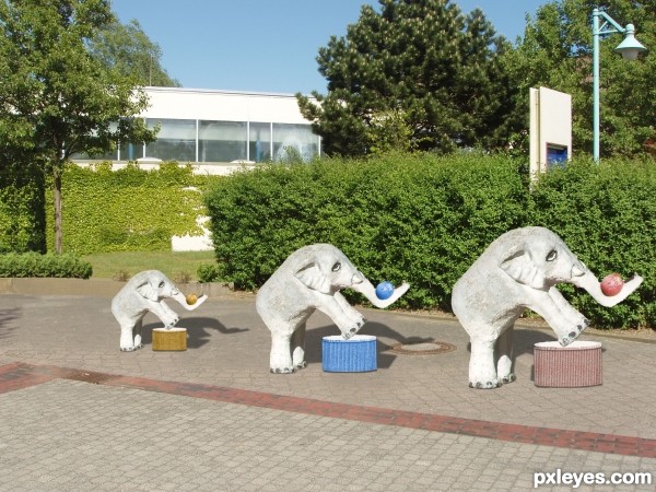
the stands are a bit out of perspective with the ground -- a bit of rotation would improve them -- need some shadows to fix them to the ground -- a bit of dodge ( in the middle) and burn (on the outside edges) would also give then to depth as they seem to lack any depth
Thanks Guys Hows this Alan2641 I did over any better?
Howdie stranger!
If you want to rate this picture or participate in this contest, just:
LOGIN HERE or REGISTER FOR FREE
(5 years and 3491 days ago)
like the image .... unfortunate you don`t have friends to fav and comment ... best of luck though

Its all good Geexman, i appreciate your comment, its been a while i choped on Pxleyes 
He looks also like a sorcerer 
very very nice imagination author...great composition with lovely mood...well done
Howdie stranger!
If you want to rate this picture or participate in this contest, just:
LOGIN HERE or REGISTER FOR FREE
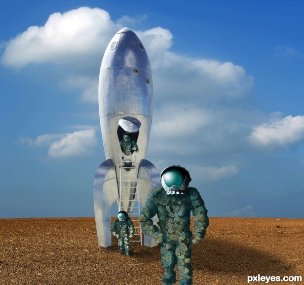
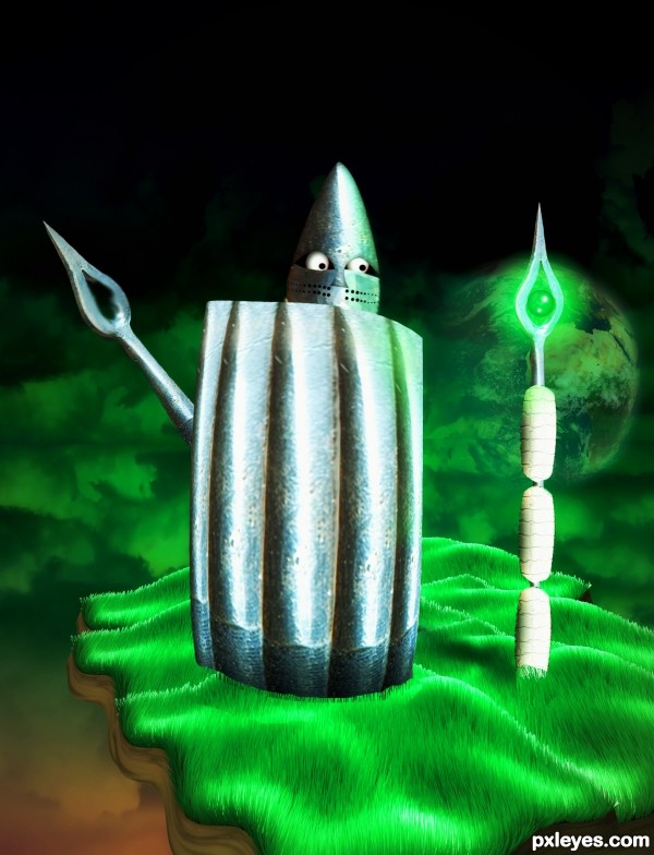
Visitors from the planet of the Sponge People. :) (5 years and 3515 days ago)
I like it, nice job on the helmet visor.
made me smile i like it. not sure about the guy standing in the distance tho with him being an exact copy of the the guy in the foreground, maybe flip him horizontally or move an arm or something. might look good still without him.
edit ..actualy i like how it looks like there marching out one by one might not look as good without him
The lighting is wonky. The ship is lit from the upper back, while the helmet shows an upper front light source, and the sponge man under the helmet shows no real light source at all on his shoulders... The shadow of the spaceship should be more to the right, and the base of the ship needs to show highlights more than reflections, particularly the LH side.
The duplication of the sponge spacemen is also too obvious, with the poses too similar, with the lighting problems at the base of the ship emphasized by the "cookie cutter" spongeman placement.
Mossy: Look at the source pic of the rocket. Then look at the shadow on the hatch. This gives you the angle of the sun. If anything, the ship's shadow could be rotated a bit more clockwise. If you compare the sponge guys to the original you'll find quite a bit of highlights on the lit side, and corresponding shadows on the other. Sponges don't exactly reflect a lot of light, know what I mean? 
As for the highlights on the visors, they may not be exactly correct, but they look way cool.
i think you should get rid of the lighting on the helmet of the guy getting out... hes in the shade...
Taintedhockey, thanks, I agree...toned down his highlight, and also darkened some light areas on the foreground figure so he's not exactly like the background guy. 
Good one!
Helmets. Are. AWESOME.
Good luck!
very cool construction author...best of luck
Howdie stranger!
If you want to rate this picture or participate in this contest, just:
LOGIN HERE or REGISTER FOR FREE
Nice blend, humorous and well done!
Thank you!
Absolutely love the humor
Appreciate it!
Howdie stranger!
If you want to rate this picture or participate in this contest, just:
LOGIN HERE or REGISTER FOR FREE