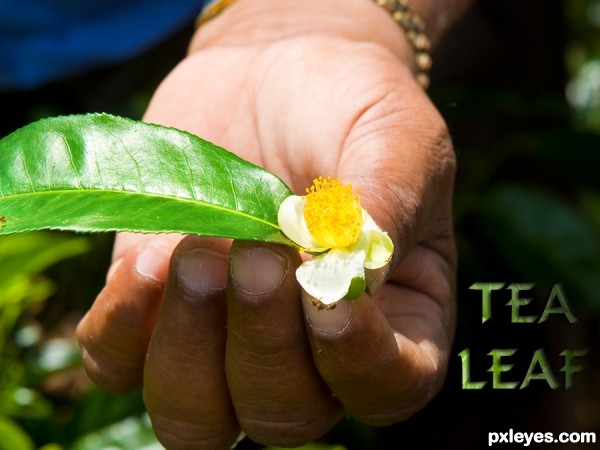
Thanks for the image of leaf and hand by minglespy. (5 years and 3593 days ago)

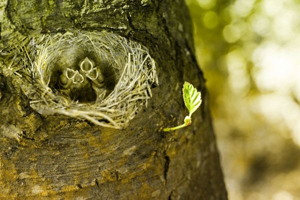
In this entry, I combined a photo of a bird's nest with the tiny leaf. I just used "magic wand" to erase the unnecessary details plus to make the fusion more realistic, I applied a brown color overlay effect.
Please Vote for my work! It would be very greatly appreciated. Thanks! =) (5 years and 3619 days ago)
Think about it, how can a nest be made on a tree like that?
Idea is interesting, but Ressiv has the point; nest needs at least a branch to hold it. Or a hole in the trunk. 
I agree with Ressiv and erikuri, but I think the intent was to imply a hole in the tree with the depth of the nest itself. Perhaps some more shading would create more depth (under the nest, perhaps). Nice blend regardless.  Good luck.
I guess, I missed some details to put the bird's nest with... well, Thanks for your comments I got enlightened^^
great idea ! g l
a hires would be nice
not a bad idea
Howdie stranger!
If you want to rate this picture or participate in this contest, just:
LOGIN HERE or REGISTER FOR FREE

Brian Lary-http://www.sxc.hu/profile/blary54
Thanks for the fantastic leaf texture
Please,watch high resolution before voting...Thanks (5 years and 3717 days ago)
he..he..really nice one..gl
Good work author.
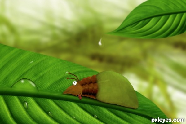
Looking its face I notice it's really thirsty... I just don't know if it's thirsty for water!... 
Very cute!
cute bug, he is sitting on his dinner 
beautiful, nice colors
Haha nice jon 
Its really cute....... 


i like his face expression.... nice work author.. gud luck ..... 
very good construction, love it.
The mug of the bug is fantastic 

nice job..gud luck

Howdie stranger!
If you want to rate this picture or participate in this contest, just:
LOGIN HERE or REGISTER FOR FREE
Hay all,
Here is leaf Icon.
Hope you like :) (5 years and 3738 days ago)
Is it 420? Already!?!?!?!?!.. get out the Rice Krispies, Beer and a Jar of Jalapenos we're going to Disney World...hehehe (and why does it feel like a hamster built a nest in my mouth) giggle snort


shouldnt the icon be mainly green though? just a suggestion...
I tried green color but its not looking that good 
Thanks for your suggestion.
It's not my cup of tea (or as we say here in Brazil, it's not my beach) but it's a nice icon (I mean the design... )
)
Thanks for your comments erikuri,
Please let me know if you think this need to improve 
Nothing to improve; it has an icon face... 
ahh gold from the 70s  nice one and happy 4/20
Ohh, pretty good ! 
Howdie stranger!
If you want to rate this picture or participate in this contest, just:
LOGIN HERE or REGISTER FOR FREE

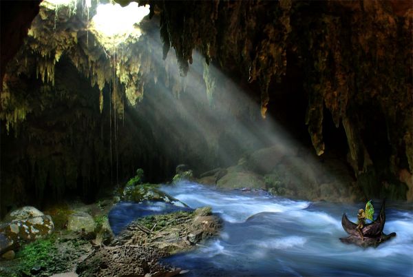
Thanks to the Content users at http://www.morguefile.com for the river file and the Faeries (5 years and 3783 days ago)
Good try, good luck. Probably a little more blending.
Howdie stranger!
If you want to rate this picture or participate in this contest, just:
LOGIN HERE or REGISTER FOR FREE
Very CBR.
Oh dear, sorry you think that Lamantine, quite a bit of work went into it, and I've seen a LOT worse! (See SBS)
I have to agree with Lamantine!
You only used the source in the text?
...and a 9 step sbs to show it.
i think you could have made the source more relevant to the piece. such as making a background for the hand to be over instead of the original sources background. would have brought more attention to the source image of the contest.
No CMYK46, I also used it for the leaf in the persons hand and used overlay and a few other things - it's all in the sbs. I think jadedink has viewed them, if so - thanks!
Ah jadedink, I used the whole of the background image because it was a tea plantation and that was the whole point of my pic - making the single leaf into a tea leaf. I really don't want to say this: but tea comes from leaves...... THAT'S the point I was making.
my point still is, you can't really SEE the source being used. i mean, i HAD to look at the 9 step sbs just to see if you'd tried to use the source in any other way.
Don't take all of this the wrong way, its just, there are SOOOO many entries in different contests in which the source is minimal, or...barely seen at all. I was just trying to be helpful in suggesting using it in a way which people could see without having to look through 9 steps on how to make a leafy text.
I don't get it...except for being lighter, the leaf is the same as in the source pic.
CKYM46, that's a compliment really although I appreciate that you didn' mean it to be. Well - the leaf is taken from the source image as shown in step 6 of sbs and then I used overlay. So in all the source image is used roughtly nine times in all to create this picture. That's 8 times to make the text and once for the leaf. Now I'm leaving the building!
like the font. good luck Author
It's hard to deny the author's observation that "I've seen a LOT worse!" Nevertheless, this still seems rather slight. Making the text a lot more prominent, and perhaps more of an advertising message instead of just a label, might help.
Seriously, not much use of the source here. I don't need to go to your SBS to see where you used it.
This isn't CBR'd. It's minimal use and you COULD have used more of the source.
Yes, seriously jawshoewhah, you're right!
Howdie stranger!
If you want to rate this picture or participate in this contest, just:
LOGIN HERE or REGISTER FOR FREE