(5 years and 582 days ago)
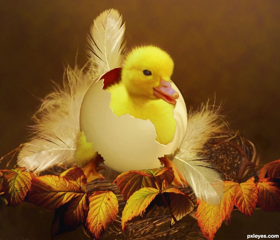
- 1: egg shell
- 2: feather
- 3: nest
- 4: nest 2
- 5: autumn leaves

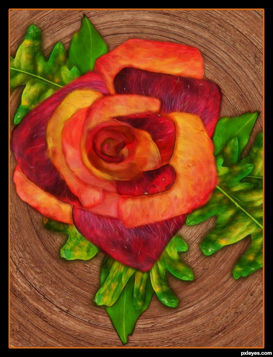
Source leaves were cut out, flipped vertically and horizontally and placed on opposite side. Autumn leaves cut out and pasted in center.
Layers were darkened by duplicating the layers on multiply mode.
Font is Hobo Std. Wood grain texture from source was used to fill the font. Drop shadow effect was added to layer style.
Art filters used were fractalius and oil paint.
Simple border added.
Happy Thanksgiving to all. (5 years and 963 days ago)
Howdie stranger!
If you want to rate this picture or participate in this contest, just:
LOGIN HERE or REGISTER FOR FREE
(5 years and 963 days ago)
Congrats SA.
Thanks.
Howdie stranger!
If you want to rate this picture or participate in this contest, just:
LOGIN HERE or REGISTER FOR FREE
(5 years and 1349 days ago)
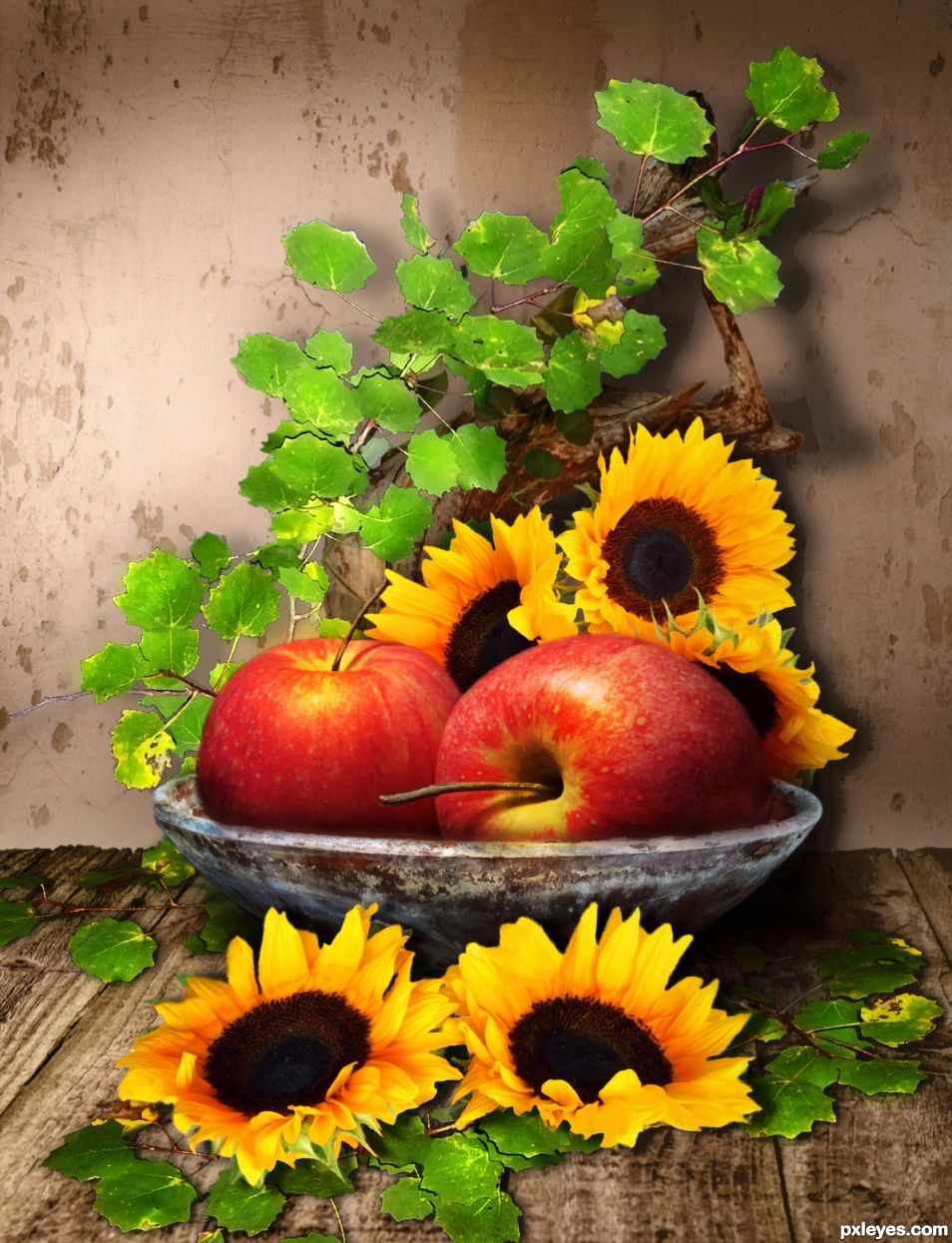
Look at the lighting on the apples and cast your shadows accordingly.
I did. I also added more shadows on different angles to imply more than one light source. It needed a shadow on the wall to bring the objects forward.
Are the shadows not dark enough?
I am sure you have seen pictures with multiple shadows before?
If not, google multiple shadows.
Not everything has just one shadow at the same angle.
At the very least there would be a shadow on the bowl corresponding to that of the apple above.
OK, I will make the shadow on that side darker.
Better? I darkened the shadows on the right and lightened the ones on the left.
Very Van Goghgaly.. hehehehe
Thanks Drivenslush, I'm glad you like the art filters. 
I like to work on a still life. For me, (my personal observation), the apples are to bright, and so it is the image. But this is me. You are the author and I respect your idea. Nicely done... good luck.
Thanks George.
Howdie stranger!
If you want to rate this picture or participate in this contest, just:
LOGIN HERE or REGISTER FOR FREE
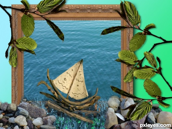
Used Photoshop to build up the image. Using layers, selection tool, eraser, free transform, and drop shadow filters.
UPDATE changed the perspective of the water, and added pebbles so they don't look like they're floating :) (5 years and 2694 days ago)
I think some perspective to the water inside the frame would help make it more believable; would like to see a high res image too!!
What I like : its so easy made, just put some pebbles here and some leaves there, and it's
done, nice!
What I like : its so easy made, just put some pebbles here and some leaves there, and it's
done, nice!
What I like : its so easy made, just put some pebbles here and some leaves there, and it's
done, nice!
Howdie stranger!
If you want to rate this picture or participate in this contest, just:
LOGIN HERE or REGISTER FOR FREE
Thank you CMYK.
Congrats !
Thank you Lolu.
Congrats Skyangel
Thank you Sylvie.
Congratulations....
Thanks George.
Congratulations and great work
Thank you Wyndham. When are we going to see more of yours?
I'm a little bit stuck right now, but working on it
Howdie stranger!
If you want to rate this picture or participate in this contest, just:
LOGIN HERE or REGISTER FOR FREE