source only (5 years and 3852 days ago)

study of shape
all source
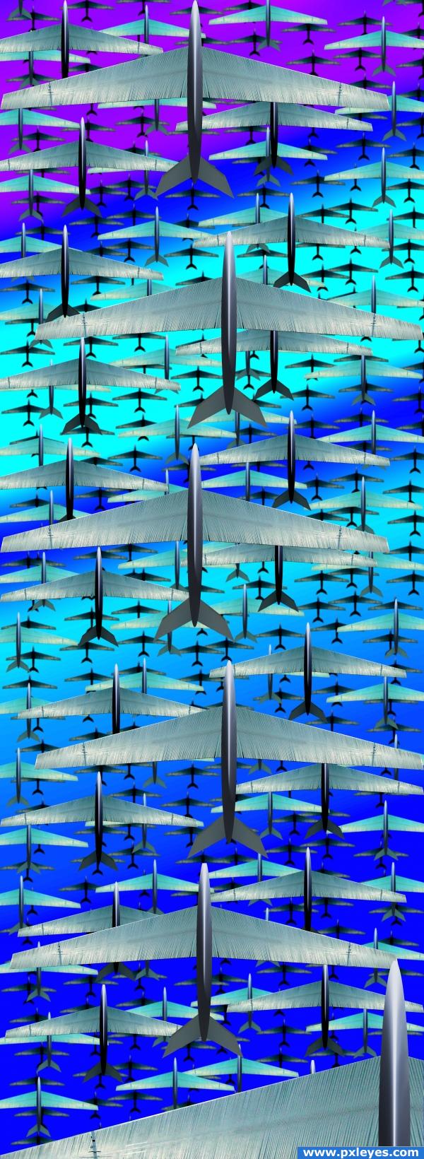
no rudders on purpose (too busy)
Imagine this as a giant Panel/banner
10 feet high in an airport (5 years and 3915 days ago)
Very, very nice, my one problem would be that with thge planes that are further down, there is a bit of a white halo, since they aren;t on the other ones i take it it was intentional, but i think it draws attention away from the ones closer to the viewer, so whoever looks doesn't have their own freedom to explore the image. Good luck!
Ponti, I forgot to turn off the glow when I saved it (I was experimenting with a night look and it just got to dismal.. all fixed now
nice job on this a lot of work done here
very nice work... cool idea...
Looks great now!! Good job!
Fantastic work, great depth.
im lovin the image i think the bodies of the planes look great! and i just love the wings but, why did you leave the pole in the wing? thats probably the ONLY thing that bothers me this image is unbelievably awesome and i still cant get over how cool the wings and bodies are i mean, you couldnt have even done a better job on them and the idea to come up with this was incredible i have to give you credit for that too! and lets not forget the stabilizers! those are awesome they're even 3-d! also, dont forget the back ground! the gradient added to it adds a great deal of umph to this image
Tuck, I kept the pole to make sure the source was seen, I was afraid if I cleaned it out the source wouldn't be seen, if I were to submit this into a PUBLIC art competition I would have definately deleted.. but I like how it brakes up the repetition any way  thanks for all the nice comments
  you are all too kind
Great! I love the image, and not deleted pole. Looks like a line for a wings flip. 
I have vertigo looking at this pic..I need a monitor at least 72'x72',Lol, or an airport on my room, is great, we are living in an eye civilisation, our eyes needs to be shocked , its a long discussion here, your work make me think at of lot of things, good luck.
congats!
Howdie stranger!
If you want to rate this picture or participate in this contest, just:
LOGIN HERE or REGISTER FOR FREE
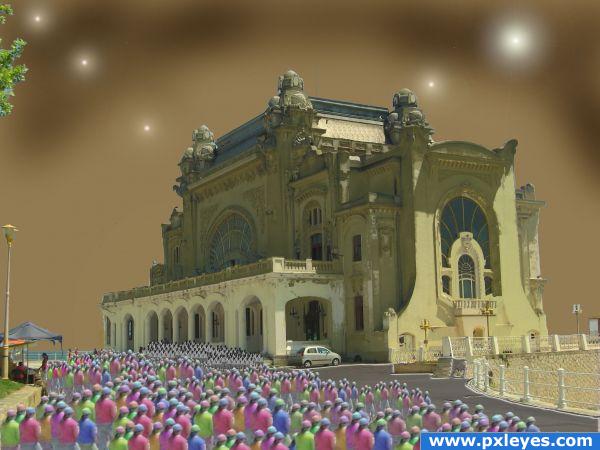
A high res would be great, to see the details. One thing is see right now, is that you forgot to erase a part of the former background where the little pavilion is on the left side. And you need to fix your source link, it doesn't work right now. Good luck
Thanks Lelaina. Your comments were very helpful. Fixed what I could. Thank you!
This is a unique use of the source image. Wasn't expecting this one!
There is something about this picture that makes me want to keep looking at it, particularly the people and the sky.
Howdie stranger!
If you want to rate this picture or participate in this contest, just:
LOGIN HERE or REGISTER FOR FREE