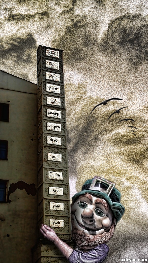
Used Adobe InDesign and two PxlEyes sources by EmiK and Artgirl1935. (5 years and 2725 days ago)

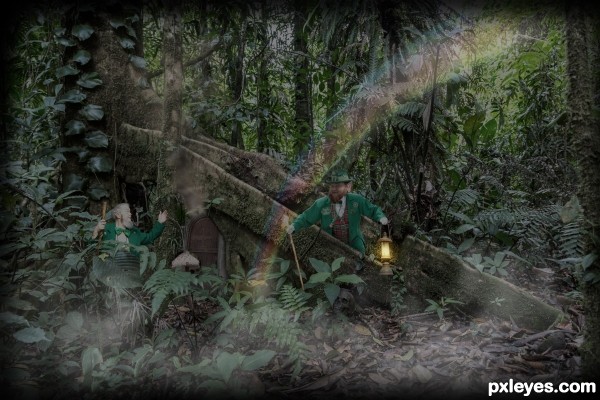
Ah, Leprechauns - a type of male fairy and a class of faerie folk that live near Fairy Rings, which are ancient Celtic earthworks. According to Irish mythology, these wee folk were once mighty warriors. An evil magician and his army conquered Ireland in a battle and banished them to live underground. Some say these dwarf-like creatures live inside giant caves or hollows of trees, with a door that can only be opened by a magic word.
Years later, they emerged from the depths of the earth and have come to be known as Leprechauns, a Gaelic word for shoemaker, which makes sense, because the occupation of a Leprechaun is a shoemaker to the fairies - fairies dance a lot and need good strong shoes.
Other than making shoes, leprechauns spend their entire lives collecting and hoarding gold coins. These coins are kept in large, cast iron pots. No human knows where they're kept, but some people say a Leprechaun’s pot of gold can be found at the end of a rainbow. Beware! Leprechauns will do anything to protect their pot of gold from being stolen - they are full of trickery and pranks, and often try to move their gold so that it is no longer at the end of the rainbow and no one will be able to find it.
Smoke brushes, thanks brusheezy:http://www.brusheezy.com/brushes/1830-real-smoke-photoshop-brushes (5 years and 2841 days ago)
I like, is well done, but I just think that the brightness of the lamp should be better worked, because it seems to be "no life" in the light that emanates.
Thank you for your observation, Daniela. At this point, there is a yellow layer behind and one in front of the lantern (not at full opacity, tho), plus a very small lens flare in front in the center. Do you have any suggestions? I didn't cut the lantern glass, wonder if that would help if opacity is lowered there.
I would not give a hint that I would not do in my job!
Thus, if it were mine, I would light the brightness of the lamp.
A new layer above the image, blend in Color. With a soft brush in yellow or orange (test both to see which looks better) I would click only once.
After that, a new layer, blend in Overlay (can get good at Soft Light or Color Dodge) and paint the same way I did before.
Well, once I played with it in this work here: http://www.pxleyes.com/photoshop-picture/4f70ee202a5e9/A-Light-In-Darkness.html
I'm no authority on the subject, I'm just giving you recommendations for things I would do if the job was mine.
Good luck author!
Your lantern is beautiful, thank you! Back to see what I can do.
EDIT: Made some adjustments, this looks more 'alive' to me, thank you!
Yeah, I think the lamp is perfect now!!! Much better!!
Good luck! 
Thank you for the push, Daniela! Still learning... 
Woo HOO Luck of the Irish to you author 
Thanks a bunch, Ernest! 
Yes now it is better, but maybe a light from out could improve the scene, it seems to flat. IMO
I was thinking of a lair as secluded, deep in the woods and therefore kind of dark, but I went ahead and brought in some light via the rainbow. Thank you for your comment,Roberto.
Hi Resolution is a must see. Lots of detail author, looks good.
Thank you, Loyd! 
Howdie stranger!
If you want to rate this picture or participate in this contest, just:
LOGIN HERE or REGISTER FOR FREE

(5 years and 2875 days ago)
Howdie stranger!
If you want to rate this picture or participate in this contest, just:
LOGIN HERE or REGISTER FOR FREE

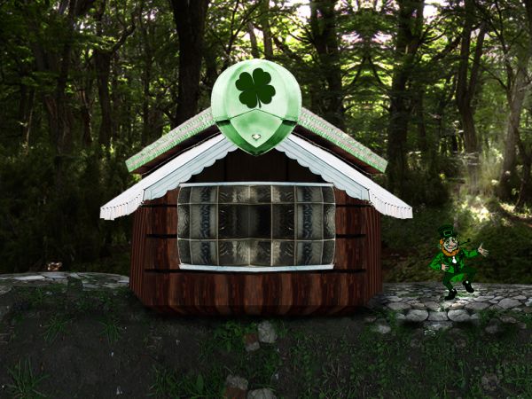
Thanks to CG-Textures for the backdrop and ground as well as Obsidian Dawn for the leprechaun and Shamrock Brushes (5 years and 3673 days ago)
Howdie stranger!
If you want to rate this picture or participate in this contest, just:
LOGIN HERE or REGISTER FOR FREE
happy card very cool
http://www.youtube.com/watch?v=mUmZ60-hC00
Honey, please don't torment me with that country music, heavy metal for me only LOL
Congrats!!
Howdie stranger!
If you want to rate this picture or participate in this contest, just:
LOGIN HERE or REGISTER FOR FREE