Thanks to ubrayj02 and lennon-stock for the source images. The background image is my own. (5 years and 2912 days ago)

Thanks chinatiger,NASA. (5 years and 3282 days ago)
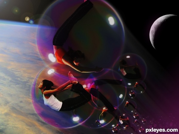
Source link for the moon? Nice job here, but I'd rotate the moon clockwise to align it with the light source. GL author. 

I like this 
little nic-pic --- the models are all in the same position - if you could turn them ever so slightly, it would be more interesting to me...
I write it down once more how it is necessary to prepare brush.Exhausting SBS to make.
okay author! i did not know they were your own brushes, forgive me. very well executed and very impressive sbs. best of luck!
O.K.
cool work author...gl
Howdie stranger!
If you want to rate this picture or participate in this contest, just:
LOGIN HERE or REGISTER FOR FREE

(5 years and 3514 days ago)
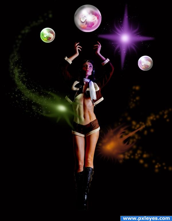
What's up with the ugly liquification of the limbs?
Yup the liquification is a little weird, but I like the idea
I don`t think it`s specially ugly ! Only like the effect, i wanted to make a surrealist pics ! As if she is disclocated by the jump  )
)
Well, the idea is very nice, but I have to agree that the liquification is a bit awkward...
I agree with your critics that`s why i rectifed and hope you`ll prefer it know ! Thanks to all for your comments 
wow nice, keep it up
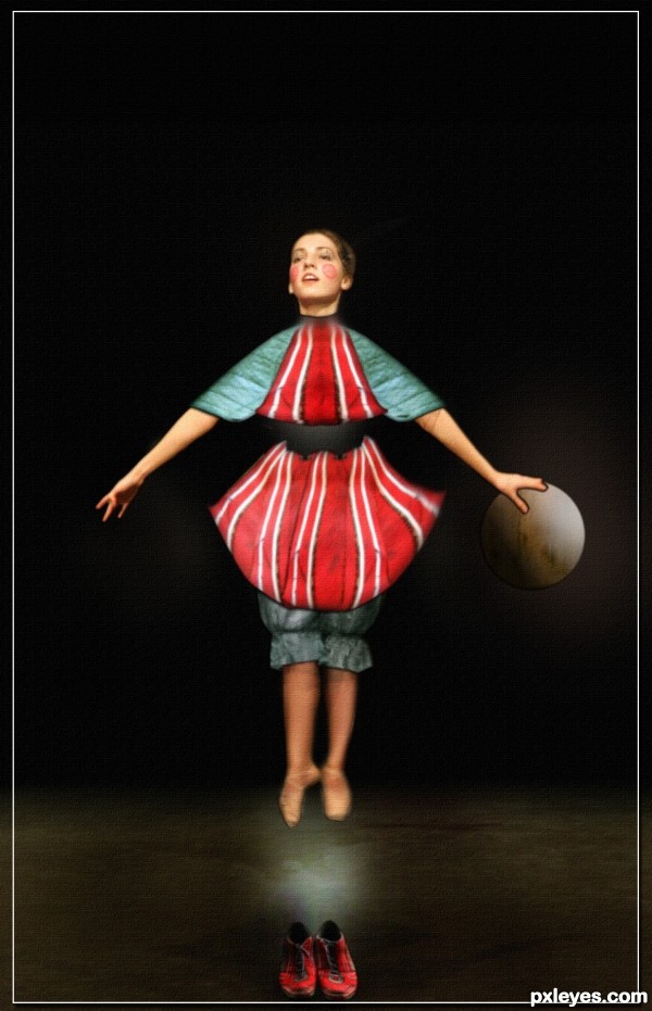
Oddly interesting. I really like that the source image is discernable. The smudgy costume edge below her neck seems out of place given the clear edges everywhere else. I think the way the belt appears to be negative space allowing the background to show through is a cool effect that could be mimicked in a neck band.
cool work...gl
Howdie stranger!
If you want to rate this picture or participate in this contest, just:
LOGIN HERE or REGISTER FOR FREE

Marcus J. Ranum thanks for the fantastic picture of the girl (5 years and 3812 days ago)
can hardly see the source image. I didn't even realise it was the petal contest at first. no offence, as it might have gone darker when uploaded.
What a lovely entry. Good work too!
Fantastic work,i like color very much
Nice work!
Interesting image but minimal use of source...
source is there, seen worse for sure  good luck Author
nice 
good work,gl
Howdie stranger!
If you want to rate this picture or participate in this contest, just:
LOGIN HERE or REGISTER FOR FREE
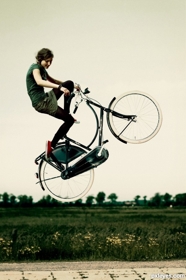
Really nice job blending girl image with bicycle...along with painstaking outlining the spokes of the tires. Only issue for me is that it almost looks like this scene could happen with gravity. I think the subject needs a shadow or more objects to make this truly look like zero gravity. Good job though...
Okay, where's E.T. in the front basket wrapped in a blanky! hehehe.. good luck author, cute vision
Excellent...Simple, yet effective. Nice job Author.
You did a wonderful job here blending colors and stock, high score from me =)
Howdie stranger!
If you want to rate this picture or participate in this contest, just:
LOGIN HERE or REGISTER FOR FREE