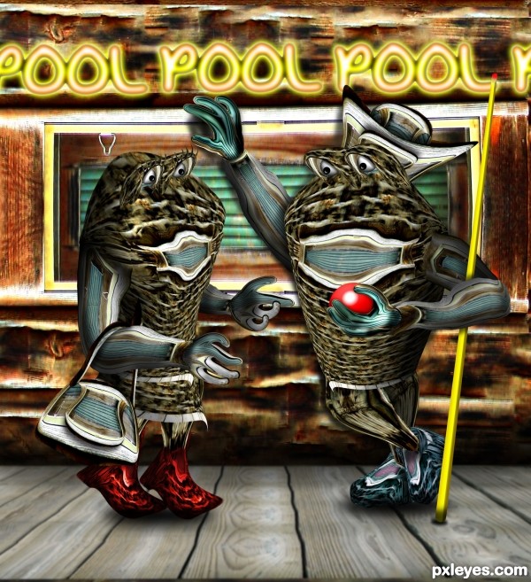
Old Movie from 1973
NOTE: ONLY THE BACKGROUND WAS USED, I didn't use the bench at all
Zpaint Button used for Cue ball (5 years and 3576 days ago)
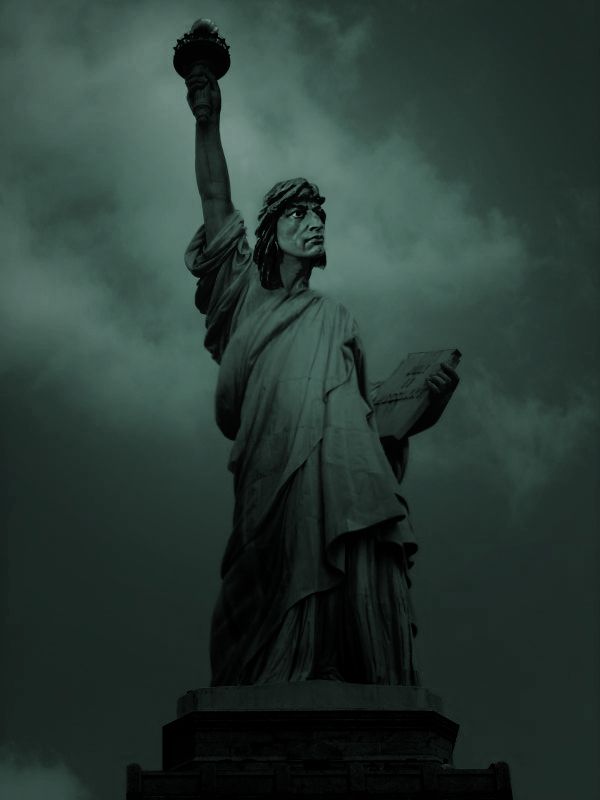
Create simply using hue-saturation, solid color, gradient-map. (5 years and 3685 days ago)
great idea GL
great idea, nice blending 
Very fun!
So cool...good luck author
Wunderbar... That is all i have to say. 
Is this really the best source of the statue of liberty you could find? It's a little dark. The head seems a little small for the proportion of the body.
Nice idea and a good work . . . . All d best . . . . 
Howdie stranger!
If you want to rate this picture or participate in this contest, just:
LOGIN HERE or REGISTER FOR FREE
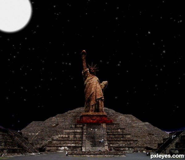
i started by removing the background of the statue of liberty. I then used different textures i pulled off the flickr. then I got the aztec temple removed the sky and added one i made myself. then i changed edited the final product with a levels adjustment layer.
thanks to:
Akoarasin, peterpan harris, diongilard, & junto for the sources (5 years and 3745 days ago)
Moon should be at upper right to match light on statue. Please fix link 3.
very creative
very creative
Lady Liberty looks like she's toppling backwards. Your source pic was taken at the base of the statue looking up so it doesn't match the perspective of the step pyramid which was photographed from a distance for a more head-on perspective. It should not be too difficult to find a Statue of Liberty pic taken from more of a distance away.
agrees with cmyk......... and else is very well done.... still the doubt is, how this fits with the theme...... (may be only for me)... but nice work... Gl
Agree with CMYK on the light source.....otherwise a nice work....
Good Luck on this entry!
agrees with cmyk and Dan. Better luck next time 
Howdie stranger!
If you want to rate this picture or participate in this contest, just:
LOGIN HERE or REGISTER FOR FREE
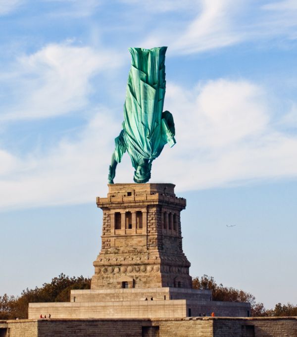
(5 years and 3756 days ago)
should have foot for the statue and base under the finger... still good idea
Howdie stranger!
If you want to rate this picture or participate in this contest, just:
LOGIN HERE or REGISTER FOR FREE
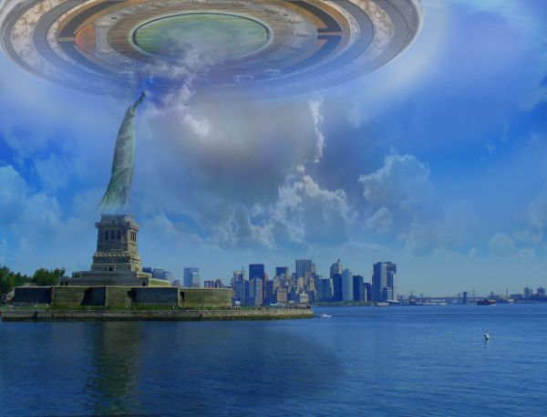
As dozens of onlookers watched in utter shock, the magnificent statue seemed to dematerialize, and was swooped up in a w-h-o-o-s-h into what many report as the largest UFO that has come this close to the mainland. None of the people on the ground were harmed. Film at 11. (5 years and 3758 days ago)
I like your UFO and it's in a dramatic setting. However, the water reflection doesn't match the vanishing point of the water itself. The huge UFO does not seem to be casting any shadow (light source for background seems to be high upper right). And I don't get the big cloud weirdly coming in to the center of the UFO. Also, the odd gradient border on the lower half is inexplicable and adds nothing to the image IMO. (Using the source image without correcting the slanted horizon/statue made positioning your UFO even more challenging.)
Independence day!!! 
Agreed with Dan. Like the UFO, but not blended very well into the image. Remember, one thing is to make a UFO, another is to make it realistic enough that someone in high-def could not tell the difference.
thanks for your comments, Dan, made some changes per your critique.
like this very well done..
Bit better now, but still kind of fuzzy. I think it's the clouds--it's impossible to blend them over all that realisticly. Perhaps a clear sky would make a cleaner effect? It's up to you. Also perhaps you should overshadow liberty entirely, as the UFO is directly above her.
thank you, gamemastertips, you're right, now she's in shadow, but I want the clouds to stay, so they 'go with her' up into the ship. I have sharpened the ship a bit also using the method in a tut I found.
cool ship, nice work friend. 
wonderful idea ! amazing work ! 
Author, Dan was strait to the point. He wasn't rude or say anything like this sucks. He also made a lot of good points. Sounds like you are the one that can't take constructive criticism.
Excuse me, jawshoewhah, but I certainly DID make some changes per the critiques, and took them gratefully. It is still MY chop, tho, and I left the things in that I thought it needed - IMHO.
I completely agree that in the end it's the author's artistic perogative to do whatever he or she wants (consistent with the theme, of course  ).
).
Howdie stranger!
If you want to rate this picture or participate in this contest, just:
LOGIN HERE or REGISTER FOR FREE
Good, looks different
hehe, wonder who made this image? cool image author
ROFL! Great ... what a wonderfully fun image!
Nice, he's chatting her up, huh?
And she's falling for him!...
Howdie stranger!
If you want to rate this picture or participate in this contest, just:
LOGIN HERE or REGISTER FOR FREE