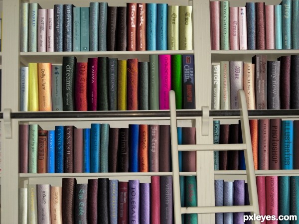
thanks to;
jsmidt: library (5 years and 3129 days ago)
- 1: library
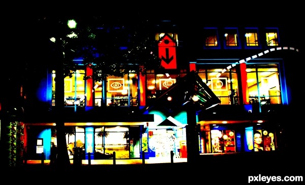
Reduced to 9 colours (5 years and 3187 days ago)
cool
Great start pic with great cropping. Very compelling.
Howdie stranger!
If you want to rate this picture or participate in this contest, just:
LOGIN HERE or REGISTER FOR FREE
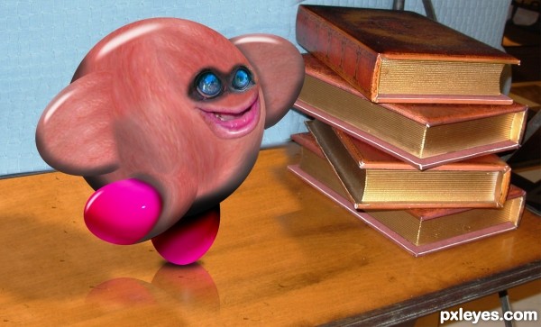
based on Kirby the video game (5 years and 3479 days ago)
that freaks me out a bit
meeeeeee tooooooo hahaha
very nice.... love the smile.. 
ROFL ... super fun.
 GL!
GL!
cool funny work...GL
Howdie stranger!
If you want to rate this picture or participate in this contest, just:
LOGIN HERE or REGISTER FOR FREE

Yeah what can i say (:? (5 years and 3706 days ago)
I really like this, its going in my favs too.
wasnt this from the "pop out book" contest?
it sure was, think it might have been pulled as off theme, nice image though and fits nicely into this contest 
Definitely fits this theme better than the pop up book contest. 
yes it was pulled off, i was quite angry about that, worked a long time at it. and i'm realy glad i can now post it in this contest!!
Pretty 
Nice work,maybe to cast a bit lighting to table and to edges of the book to...gl
Lovely work....The lion is awesome...too good...
cool
Howdie stranger!
If you want to rate this picture or participate in this contest, just:
LOGIN HERE or REGISTER FOR FREE
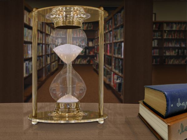
1st step edited one hour glass from image.
2nd Used half and duped and flipped it
3rd made up a table top with grain and color
4th Brought in background and started to edit it.
5th brought books to table and did reflections on table
6th brought glass in and set up reflections and shadows and did sand redo and use background with glass. (5 years and 3708 days ago)
Hopefully I did everything ok this time last one I did got yanked and was unclear as to why or how I could have fixed what ever I had done wrong, So we will see if this flies or is yanked??? ; )
lol
Looks good, but both source links lead to the same image...
Cool 
Thanks Cmyk46 working on that woops now!
There we go!
Nice work.....shape of the hour glass is a little bit typical and not symmetrical....Other than that a nice work...Also you could work on the reflection of the hour glass on the table as well....
Howdie stranger!
If you want to rate this picture or participate in this contest, just:
LOGIN HERE or REGISTER FOR FREE
very good idea -- maybe some blur on the cut edges (Tops) of the books would improve this as they seem too sharp compared to the edges of the towels used for the spines of the books.
cool idea... but looks faded-foggy. You can use "curves" to jazz-up the colors
very clever
Great idea and takes lot of time to do it I would say. Only thing, it's too blurry and looks like not the real thing. If you can do something to correct this, believe me, your entry will get to the top. That's my personal opinion. Good luck author!
Great manipulation. Probably having "gradual" shadow for each bookshelf section to show the depth and very transparent reflection of the shorter books might make the image a bit more realistic. And also, having shadow that match the overall image for the ladder that fall of the books might also help?
very good hard work!
Clever concept, I would take the advice about shadows though a few little tweaks will make all the difference. Well done and GL
wonderful work
Howdie stranger!
If you want to rate this picture or participate in this contest, just:
LOGIN HERE or REGISTER FOR FREE