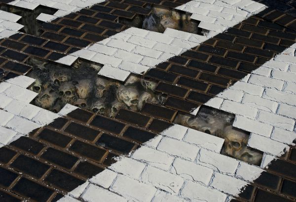
thanks to wstarr at www.sxc.hu for pic of bones (5 years and 3726 days ago)
- 1: source1

(5 years and 3970 days ago)
nice idea good luck!
This is a very interesting concept.. I think you should refine it...focus the spatter so it doesn't look so confused (works in larger venue, but in a small logo, it's hard to read) and Define the letters some how.. like darker borders etc).. it's a very clever concept.. good luck!
nice design, but again its not Pixeleyes but PXLEyes..good luck
haha thats awesome 
splash! nice, gl
splash! nice, gl
splash! nice, gl
GL!
Howdie stranger!
If you want to rate this picture or participate in this contest, just:
LOGIN HERE or REGISTER FOR FREE

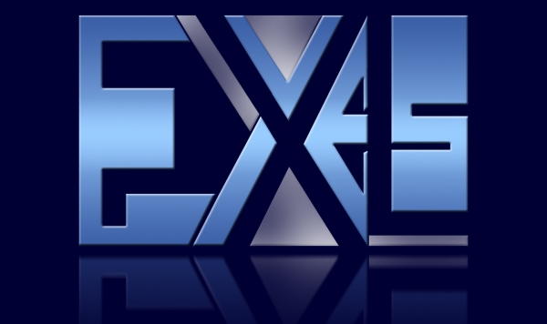
I tried to make a text illusion (5 years and 3971 days ago)
exes? this is not software site!  good luck!
edit: but if you know how, then you can use Exel's tables in your work! 
it says : PXL on the transparent part and EYES on the blue gradient .....anyway
what is writed there
the whole idea about text illusions is to follow the same color pattern for all the letter: so where is a blue gradient is a word - EYES - and the gaps between the letters formed by the blue gradient is another word - pxl...from what i know the text illusions are much more interesting if they are subtle..maybe i am wrong..anyway it was an interesting experiment for me 
i like't but is not verry readable....my opinion...the colours is ok.....gl
yes, now i can see, but what says that third part of color then? btw i already like this one 
oh i get it now! very good but it's too subtle imho...
i know about the third color
....it was the only way to separate the letters i am trying to find a way to eliminate them....it is my first attempt to make a text illusion
ohh - i have not ever done it... it will be hard work! actually E and P are pretty clever! 
Nice idea good luck!
aaand you know what! in this are more areas, what are not letters - what about to try that everything put to one third part?
i have done that and put it in a sbs file
hmmm... yes this is not that good... 
yup..i know
get a room already you two.. sheesh
very hard to read this .. nice concept
good colors and effect, but name is not clear
Great use of negative space!
very hard to make out what it says ..
Its a bit hard to tell what it is. 
It's appreciated that you played with shapes and rest shapes. The result is interesting, but also confusing. I guess for a logo you need a strong image and although it doesnt have to mean that the viewer has to see without thinking what he/she's looking at, I do think there has to be a certain link with the word PXLEyes. However, as creation nice work. Good luck!
barely readable..
it says what exactly? 
GL!
Howdie stranger!
If you want to rate this picture or participate in this contest, just:
LOGIN HERE or REGISTER FOR FREE
The bricks need thickness.
the skulls look too ummm ... mushed together.. you should give them some defintition
Freaaaky ;P
Howdie stranger!
If you want to rate this picture or participate in this contest, just:
LOGIN HERE or REGISTER FOR FREE